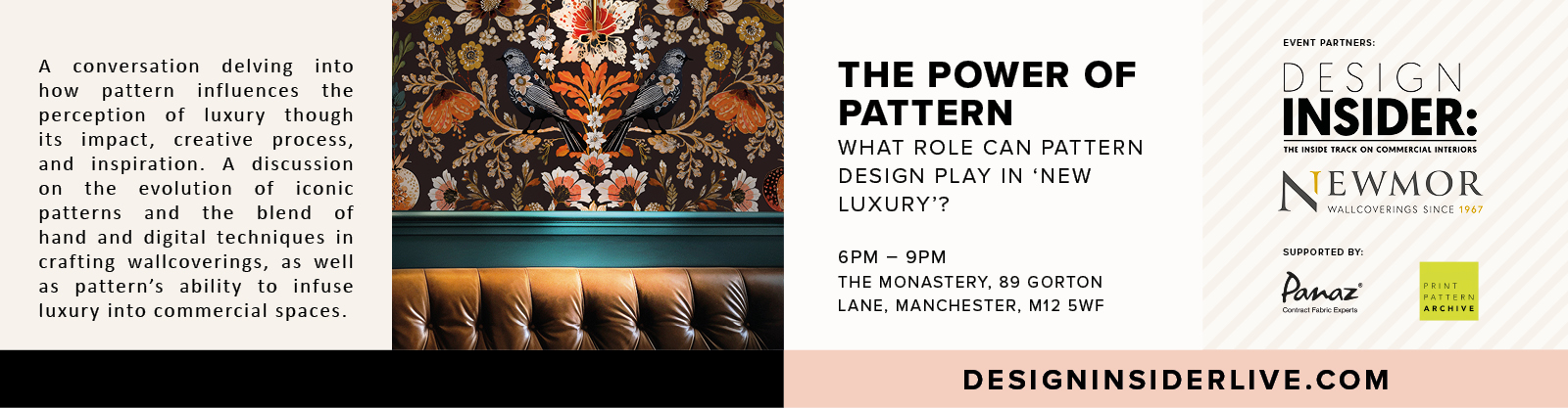


Q&A with Carolina Calzada, Colour Hive
Design Insider met up with Carolina Calzada from Colour Hive to discuss trend forecasting and the Pantone colour of the year.
Can you tell us how you get into design?
I have been working on the design industry for the past 10 years.
I come into this industry because of my marketing skills, when I was hired for Global Color Research (this was our previous name) to help design strategies to help the company grow, my main focus at the begging was looking after of MIX magazine.
At that time colour forecasting and trends what not as popular as these days so we did many seminars and disclose our methods of research in order for people to understand the importance of colour in the creative process.
Working with trends is very rewarding as less directional of people thinks to us is a source of inspiration and a very powerful tool to engage with your customers.
The essence of our work is forecasting, colour is the tool we used to communicate those trends and how impact design. Over the years I have become fascinated with people reactions to colours and how over the season colour evolve.
And how you ended up at Colour Hive?
A year ago Global Color Research became Colour Hive.
Colour Hive offer the same services as Global Color Research but now as part owner of the company I have partner with a great company in the world of colour, which is Duha Group.
The opportunities for us has grown quite fast as now we have representatives around the World through the 5 companies that compile Duha Group. We have plans to expand and open new offices but also we are focus in educational programmes and work with many of our customers to help them in product development or marketing strategy.
In our London studio we are very much focus on research and art direct different project as well as edit our trend and forecasting publication; MIX magazine.
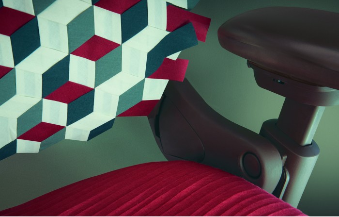
“green as a trend colour is a re-connection with the nature, living more often in a digital world invite us to go back to experience more and more”
So what do you think of the Pantones colour of 2017 – greenery? Is this a reaction to design becoming more biophillic?
At Colour Hive we feel than green as a trend colour is a re-connection with the nature, living more often in a digital world invite us to go back to experience more and more that is why we looking for this return to nature but is also a representation of optimism and renewal. The seek for better times in the upcoming years.
In our forecast at MIX magazine we have been seeing how greens are presence in many trends but towards 2016/17 we also see how the green lose some momentum and turn more into blues which I feel is quite interesting.
In some of our trends for these season as ABYSS, PLAY or GLITCH you can see how these green tones are saturated colours to reassure lush, recreation of natural landscapes but also this citrus look give a tone of sophistication.
So what do you think will be the main drivers that will affect the furniture industry in 2017?
After the political upheaval of 2016, there is likely to be a period of uncertainty which will inevitably affect consumer confidence. In this sort of environment, designers need to return to the basic premises of good design and ensure that products are either useful or beautiful (preferably both). The furniture industry’s growing interest in craft and authenticity reflects the consumer’s willingness to spend money, but only if there is real, often emotional, value to what they are buying. This is particularly true when it comes to colour; people are becoming increasingly comfortable with playing with colour but mistakes will be harshly punished in 2017, so it is vital to make the right choices.
2016 saw a lot of spaces becoming more comfortable in terms of materials, especially within the office and the rise of soft seating, do you see this trend continuing?
Spirally house prices mean that Generation Z is unlikely to be able to join the property ladder any time soon. We believe that their unrealised home ambitions may lead to an increased domestication of offices. Forward thinking manufacturers are already heading in this direction with sophisticated colour use, tactile textiles, soft seating and an almost total elimination of straight edges; essentially a complete deconstruction of the traditional office model. We look closer at Generation Z offices in issue 46 of MIX Magazine.
What about hotels and restaurants? And even care home?
The global trend for localism is strongly reflected in hotel and restaurant design and represents a significant challenge for the group hotel industry. Clever chains are responding by abandoning the homogenised look in favour of individualised design that places enormous emphasis on a sense of place. Interior designers are utilising colour in particular to make individual statements and create a boutique feel that allows visitors to feel properly connected to where they are staying. We will be looking at this subject in more detail in issue 48 of MIX Magazine.
And lastly, If you could sum up design in one word, what would it be? And why?
Colour.
Far too many designers and architects still treat colour as an afterthought, yet colour is an enormously important part of why we choose a design in the first place. We are on a mission to ensure that colour is properly appreciated and used effectively, especially as colour palettes are becoming increasingly experimental and brave and consumer demand has never been more sophisticated.