


A Conversation Between: Jim Biddulph & Adam Nathanial Furman
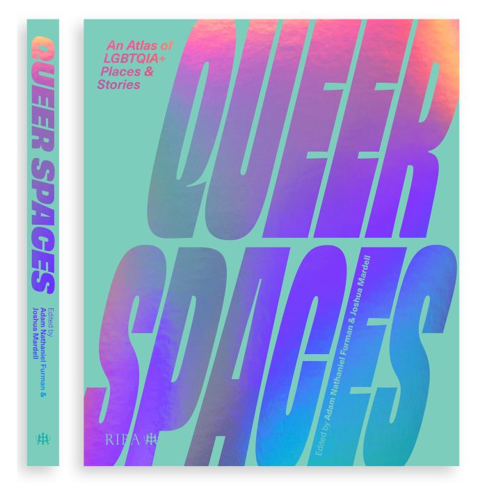
Even as we continue to rumble our way through the 21st Century, the categorisation of people in relation to their work is still regularly normalised as a means to understand one and other within western society. But for many, myself included, the question “So what do you do?” requires a far longer and more nuanced response than most are looking for, or are really prepared to get their heads around. This disconnect between identity and occupation is arguably no more apparent than within the creative industries, and given its long perceived image as the more ‘serious’ of practices, architecture is surely perceived to be one of the more universally recognised and authoritive labels available. But having trained in architecture, the prolific output of Adam Nathaniel Furman is far from what you’d traditionally expect of an ‘Architect.’ Works ranging from large-scale installations, product, furniture, interiors, video, drawing and painting are not only broad in scope, but also full of bold colour and vibrant pattern that defy conventional tastes and expectations. Not only that but Adam has even been working on a radical new anthology that recognises seminal, and yet until now uncharted, LGBTQIA+ architectural projects. Queer Spaces covers 90 historic, contemporary and speculative examples and has already been described as a “Luminous queer archive-cum-party in its own right, avowedly diverse, multiple and full of life” by acclaimed essayist and novelist Olivia Laing.
I had a chat with Adam to find out more about the book and their diverse practice.
JB: Given that it is due to be released, perhaps we should start with the book Queer Spaces, which you have co-created with architectural historian Joshua Mardell. Can you tell me a little bit about it and how the project came about?
ANF: I had quite an isolated, often humiliating, and sometime outright hostile experience going through architectural education, with many of the topics that I was interested in, and wanted to include in my work falling within what one might consider Queer themes. As the curriculum contained only a long list of famous canonical modernist or classical architects, there was absolutely no record, let alone teaching, of the full diversity of architecture that had been created by, and for, those who were not part of the hetero academic and male world of high architecture. Because of this it was very hard to find examples and references that would act as support to my work, effectively having to mine one’s own history from scratch, whereas all the other students had whole libraries and instant references at their disposal. This absence often led to work that did not “fit in” within these accessible lineages being dismissed out of hand, often on very disparaging and othering terms. My dream was to make a book that would be an easily accessible, on hand resource that was a gateway into the insanely rich history of queer spaces throughout the past 200 years, and all over the world, that have always been suppressed within architectural discourse and education.
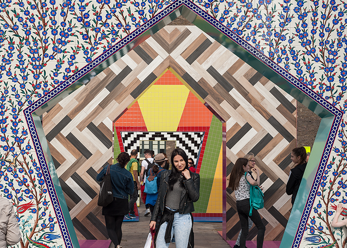
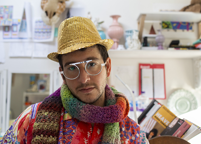
Photo by Andrew Matthews
JB: In terms of your own practice, you work in such a broad range of media – what is your approach to making new work? Do you start with a particular material or theme and go from there, or do these multiple elements inform one and other as things progress?
ANF: My process is rather traditional, and always the same. I start by reading, experiencing and absorbing as much of the site, project brief, background, and context of the project as possible, and then take a break and let it percolate in my head. Usually after a week or so, ideas, shapes, concepts make themselves known; usually when I am daydreaming while having coffee, or in the shower, and they get quite angry the more time that passes, demanding to be let out onto the page. So I draw, sketch, then I paint, and once I am happy with a general feel of form and colour, I move onto the computer to work up the idea with the correct dimensions, proportions, thicknesses etc. At this point I will often make a model, then modify the digital file depending on any changes made while working with my hands, and then I move onto creating technical drawings. The colour and form tend to come together from the very beginning, informing one another’s development.
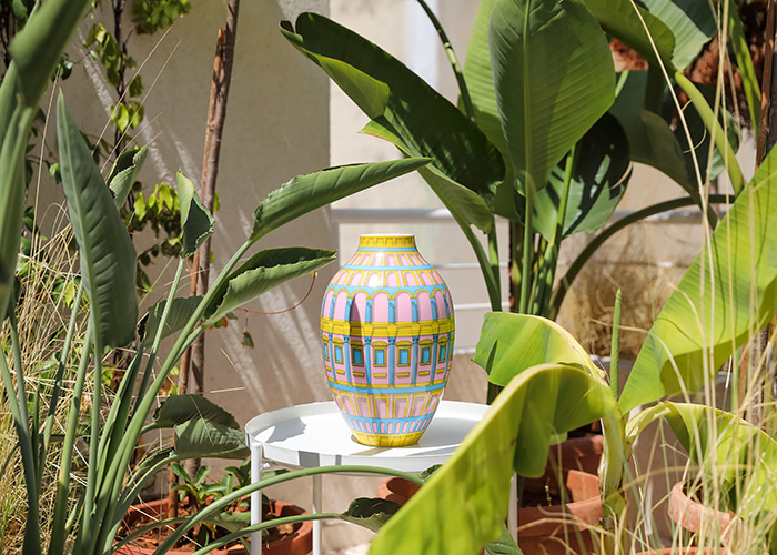
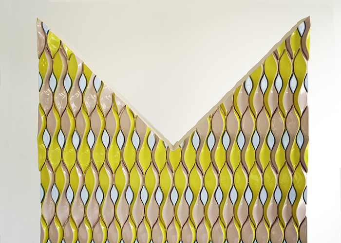
JB: Am I right in thinking that you started making work in ceramic? It seems to be a material that you have at least worked quite consistently with – are there specific reasons for this?
ANF: I started painting and drawing. Ceramic came when I was at university as I wanted something to work with that was both low and hi-tech, that I could make myself with great ease and pleasure, but which could also be scaled up to be manufactured just as easily, and a material that could create tiny bijoux objects but also huge architectural elements. Ceramic is miraculous in that it is all of these things, and on top of that, it is an amazing material to come at art history through; one can learn so much about cultures and historical periods from the ceramics, they are little synecdoche’s of their surrounding socio-political & economic contexts.
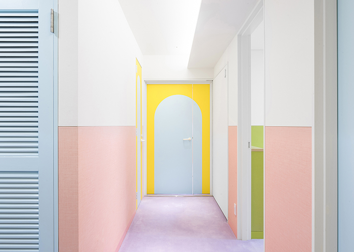
Photo by Jan Vranovsky
JB: Colour and pattern combine in a big way within all of you work – why are they important to you? When did this start and are there specific influences?
ANF: I come from a very colourful background, a mixed home, with influences from all over the world, and some very strong and beautifully eccentric matriarchs who had the most incredibly distinct senses of style, which I obviously absorbed. The dominant feel was what some philistines might call Kitsch and Camp, but which I would say was luscious and exuberant and evocative. Further to this, and coming out as a teenager in 90’s London, I experienced a highly aesthetic, radical queer culture that was colourful, loud, bold, bright and fiercely proud, which heavily influenced me, and naturally made me feel even more convinced of the beauty of the family context from which I had emerged. Architecture school and the profession afterwards did its very best to erase all of that, but it only made me fiercely attached to exuberant visual expression as a mode of personal affirmation even more, so that pattern and colour, and shapes and forms that are ambiguous and allusive, have become deeply meaningful to me in spatial and design practice.
JB: As well as relatively small-scale products you also work in large, public-scale, often where the outcome allows for physical immersion. Are there challenges to flowing from one to the other throughout your project?
ANF: I see my product and furniture design as being driven by very similar motivations to the large-scale public artwork. I see both as serving the quotidian and the everyday; making the background of our lives a bit deeper, with a sense of care and love and pride that makes life that much more substantial. One just happens to be at the scale of the city, for many people, and the other at the domestic, for the individual; but both serve the same purpose in my eyes.
I don’t necessarily think it poses challenges as much as simply being different to smaller scale work. As I am trained in architecture, shifting between scales is an absolute pleasure, rather than a challenge. I think I would find only working in one scale all the time challenging!
JB: Given that you’ve worked with such a breadth of media, colour and scale, where do you see your work going in the future? Are there as yet unseen or fulfilled ambitions for you practice?
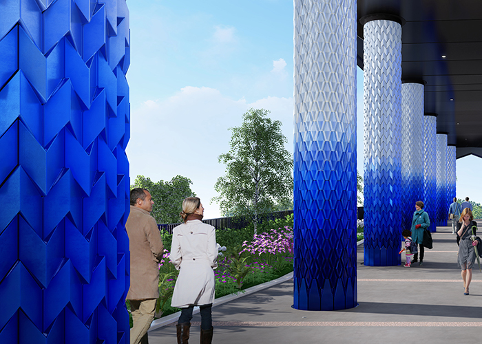
ANF: Oh, plenty, there are so many things I would love to do, from working in broadcasting, to designing a full elevation of a good-sized building or two, to doing some retail interiors. I am always eager and excited to try new things. I am particularly excited about College Road Tower in London, for which I have designed the ceramic cladding for the first seven or so metres, creating large, 3 dimensional tiles that will glitter as you walk past them.
Click here for more information and to pre-order Queer Spaces.