


A Conversation Between: Jim Biddulph & Field Day Studio
Marrying rich design concepts with tasteful material and colour palettes is no simple task. Creating spaces that are immediately warm and welcoming yet oozing with style and detail is in many ways the holy grail of interior design, particularly when it comes to spaces that people live in. For design duo Jess Gibbons and Kat Turner, finding this balance has become a calling card for their London-based practice Field Day Studio.

But then again, they’ve got plenty of very involved and beautiful projects under their belts in the near-decade since setting up the studio together in 2013.
They met at KLC School of Design in 2012, with Kat having studied History of Art at York University and Jess Psychology at Manchester University. Following their studies they were asked to work on a project as graduates and enjoyed working together, finding common ground in a conceptual approach, stylistic preference, and meaningful provenance. When more projects followed, they cemented what they were doing and are now a team of 3, with the introduction of Emma who provides studio support. They’ve since been featured in Homes & Gardens Ones to Watch feature for their centenary addition and received a Best of Pinterest Award in 2017.
I joined them for a chat to find out more about who they work with and how they go about their projects.
“Post Pastoral” , Photograph, Christoffer Rudqvist
JB: Let’s start with the all-important people in your projects, your clients. How do you go about choosing them? Are there particular types of clients or projects that you focus on?
KT: We look for clients that are drawn to properties with history and character. Our ideal clients are looking for interiors that resonate with them on a personal level, and don’t mind us getting under their skin to get there!
We tend to work on residential projects as we’ve established a way of working that caters to a personal experience and developed relationships with suppliers in the residential sector. That being said, we’ve worked on a commercial project where we treated the brand as the client and the results were just as effective!
JG: Post Pastoral was our first project together, and a great opportunity for us to practice the kind of interior design we were passionate about. The client wanted the interiors to feel full of charm and of the period without feeling saccharine or pastiche. Our approach was to interpret the space through the lens of Ted Hughes, using a visual language that was full of contrasts, natural textures and depth.
JB: It feels like you create a very personal space, and each project feels meticulously detailed and considered – how do you work with your clients in order to achieve this?
JG: Our process goes through various stages of getting to know our clients; asking the right questions both big and small, written and verbal, to establish what matters to them. Understanding their response to images of spaces or remembering their experience of spaces can be a really helpful way of gauging what they value most.
After a written brief and an in-person meeting, we tend to allow at least a couple of weeks to percolate on what we’ve learned before we arrive at our concept for the project. Once we’ve landed on a concept we’re happy with we apply it to the scope and present our initial direction to the client – this process varies greatly depending on the scale of the project. We then take client feedback and develop the design further, culminating in a second design presentation for sign-off. Many of our projects take a year from initial discussion to completion.
“Where the land meets the sea” Photograph, Emma Lee
JB: You’ve mentioned concepts a few times, are there specific things you lean toward or are inspired by when developing a concept for a space? Creating such poetic names for each project suggests an interest in language and literature perhaps?
KT: We are inspired by all sorts of things when coming up with a concept. Poetry, literature, art, nature, fashion, culture. Essentially, the design concept will come from getting to know a client and conversations in the early parts of that relationship lighting a spark. It is a reflection of them as people: what we feel makes them tick, what inspires them and makes them happy.
Our Devonshire project Where the land meets the sea is a nice example. In this concept, each client was represented by their connection to the land and the sea. Both elements were reflected in each space alongside one another, to harmonious effect. Here the Devon earth pink and blacksmith forged handles sit alongside the watery hues of the zellige tile.
JB: I’ve noticed with all your projects that there is a wonderful balance of aesthetic and functional aspects at play, how do you go about this?
KT: We’re passionate about our interiors being as rewarding functionally as they are aesthetically. The basis of our process in understanding what matters to our client, and their directing the concept means that they’re always at the heart of our thinking. The concepts direct both our function and style choices so they sit naturally alongside one another – this could be anything from layout to handle choice.
“Golden Hour”, Photograph, Dean Hearne.
JB: A sense of place also really comes through in your projects, how do you respond to the surrounding environment of a project location?
JG: Where a location is important to the client, we take time to understand what makes it unique. We’re interested in the geography, flora and fauna, social and economic history – information that can provide inspiration for our concept. This can inform palettes, material choices and furniture styles.
Our clients for the Golden Hour project had a connection to Scandinavian design and to the stunning location of the property. They were keen that the home reflects their contemporary tastes, but feel sympathetic to the setting. So we created a scheme that softly blended natural textures with contemporary lines and Scandinavian shapes.
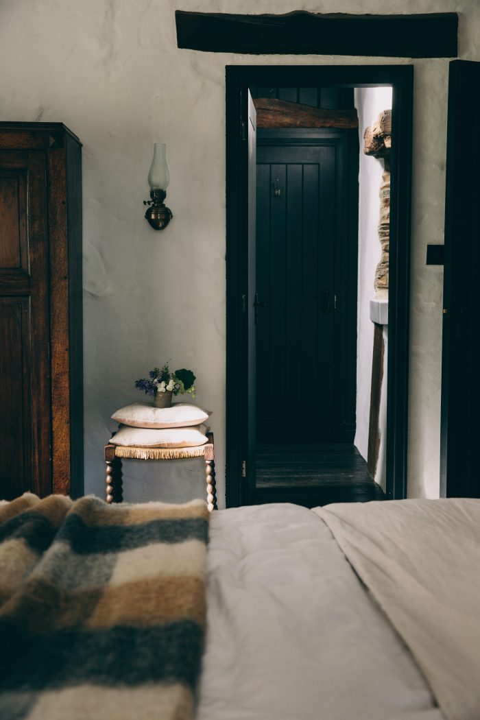
“Born Amongst the Hills”, Photograph, Dean Hearne.
KT: The local vernacular played a large part in our approach to the interiors of our Lake district property Born Amongst the Hills. The client wanted the property to belong to the location, and feel as if it had “been there forever”. We painted all the woodwork in black, to recall the black-painted window frames typical of the region, and retained much of the original stonework.
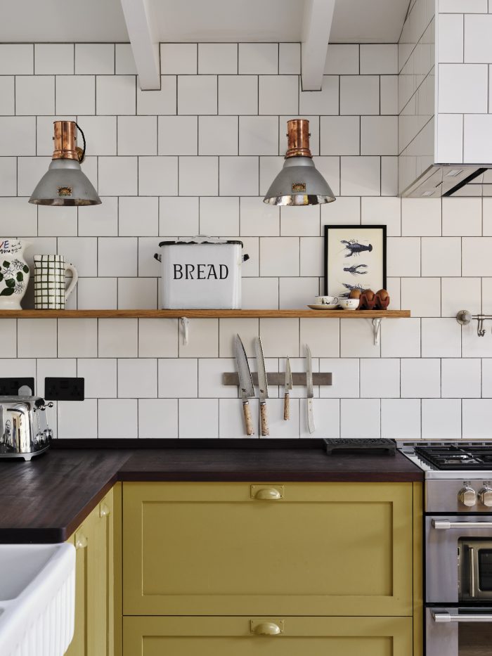
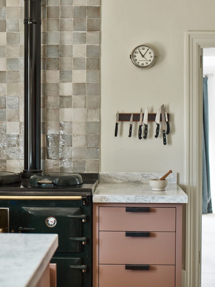
“Making Waves”, Photograph, Dean Hearne.
JB: Your overall palettes, and objects, are always considered and tie together beautifully; can you tell me more about how you specify materials?
JG: Our project concepts inspire the balance of textures and the palette in each space. Depending on the direction, the concept might call for more or less natural materials, resonate with a particular location or story, or be a particular hue that the clients respond to. We have certain suppliers that we tend to revert to for the right material, but if it’s not something we can find with someone we’ve used before, we dig around until we find someone who does!
The materials and palette in the kitchen of our Making Waves project were inspired by a vintage image of a child leaping in the air. The image represented our client’s affinity with vintage iconography, and the joy they felt at the prospect of their new family home. The Sapele worktop recalled the child’s leather brogues, alongside their dirty green socks. The vintage detailing carried through from the nostalgic feel of the image.