


A conversation between: Jim Biddulph & Mat Barnes, CAN Studio
Amid the many new builds one sees popping up around the country it’s not very often that you find any that stick in the mind. The same cannot be said of projects carried out by London-based CAN Studio. The buildings they work on are uniquely colourful, tactile and memorable, in no small part because of a playful and often unexpected application of materials.
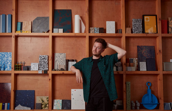
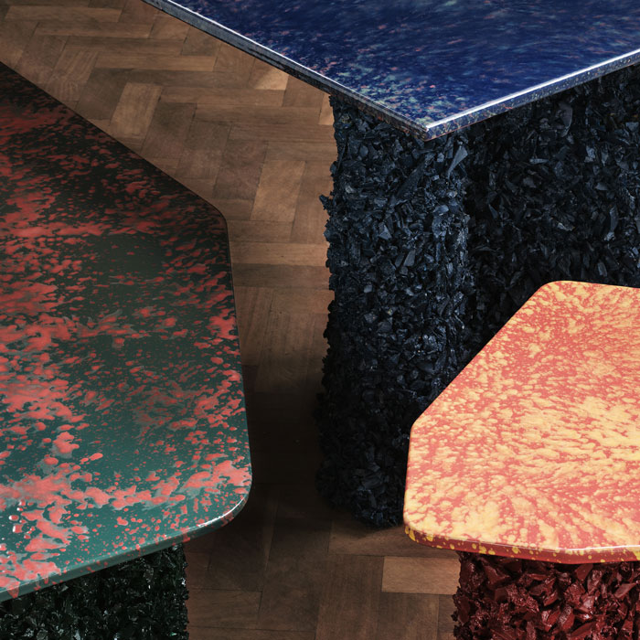
Director Mat Barnes set-up the studio in 2016 whilst working for Paul Archer Design where he assisted in the design of high end residential projects. This led to a move to Studio 54, where he was an associate and working on larger scale jobs, but within a few years his own practice began to takeover and in 2018 he made the full-time leap with CAN Studio. Whilst relatively new, the studio is multi award winning, most recently claiming a Best Elements of Surprise award from Wallpaper for Liquid Geology. This explorative project, which grew out of self-driven research into alternative material usages for furniture production, has culminated in a range of tables that combine recycled rubber chips and enamelled metal. Mat was also awarded RIBA Rising Star status in 2021 and teaches architecture at the University of Liverpool. We spoke to discuss more about how the studio approaches new projects and why materiality plays such a big part in what they do.
JB: Let’s first start with the people you work with; your clients. Do you tend to work with a particular type of client or project – residential for instance – or are you open to all types of work?
MB: We try to work on as wide a range of projects as possible to keep things interesting in the studio and to test new ideas out. Currently, we are working on a new public sculpture in Portslade with the artist Felicity Hammond, a new office fit-out, and an interior for a charity in Cambridge. We’re also working on the conversion of a WW2 RAF bomber command building into a house and an exhibition design for the Farrell Centre in Newcastle in addition to 5 private residential projects in London.
JB: And how do you go about choosing them? What kind of conversations do you have at the start of (and during) a project with them?
MB: They choose us! The conversation and approach are very much tailored to the individual project but we start with research into the cultural, historical and urban contexts of all of the projects. Then with the private residential work, we really try to understand the client’s aesthetics and tastes. We ask them to provide us with a pragmatic written brief which stipulates function and number of rooms, and then an ‘image bank’ which we use to understand their aesthetic leanings. This shouldn’t include architecture but more colours, art, texture, materials, film sets etc. that they enjoy. We then start threading some of these together into material palettes and large elements of the design to settle on something that really represents the clients and helps increase their feelings of ownership over the final project.
JB: Your projects have a very distinct style, which I know you’ve described as “idiosyncratic” in the past, and they certainly are visually striking and memorable. How did you, and indeed how do you continue, to develop your visual aesthetic?
MB: We think that there are many answers and mixtures of answers to any design problem and the final project should be a wonderful mix of these answers and contradictions. We try and learn as much from the local histories and client histories as we can on a project in order to push new ideas. On the smaller installation and sculpture projects we have a strong emphasis on creative collaboration whether that be with artists, sculptors, set designers or graphic designers. We work closely with them, which exposes us to new design processes and idea-generating methods that allow us to constantly evolve our own process. CAN uses these ‘testbed’ projects to not only develop our own ideas and design process but to explore materials and ideas and diversify its approach to architecture. CAN sees each new project as an opportunity to be tested by the brief, explore a different design approach and learn about a new set of materials instead of proposing something we have already used on a previous project.
JB: You mentioned cultural and historical research, how are your projects underwritten by these elements? How exactly do you go about this?
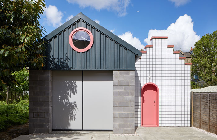
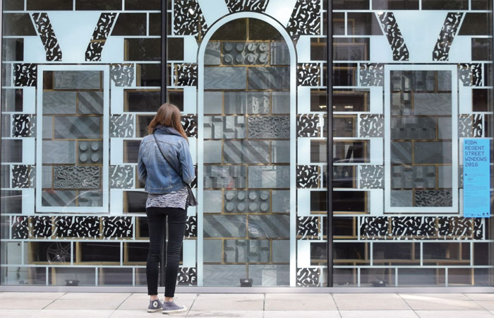
MB: These elements are not always obvious and may never be revealed to the users of the building. We try to look for hooks or references which tie the projects to either their place, their clients or some tenuous link we think is interesting. The red on Ty Coch (Red House) is a direct reference to the small castle that overlooks the project Castell Coch. Our installation and exhibition for the John Soane Museum (All That Could Have Been) draws from Soane’s approach to collecting and plays on this with the three cabinets we created.
JB: Materials and colour choices are standout details within your completed projects, how do you go about selecting them? You said that you always try to propose new materials but do you have any go-to’s that suit style and budget, or are you always explorative with these elements?
MB: We try to avoid expensive materials as all the work has already been done for you and we don’t think it represents value for money for our clients. We try and find everyday, often overlooked materials and use them in an unexpected way which elevates them from ordinary building materials to ornamental architectural features. We did this with the carved breezeblocks on our installation Blockshop where we used a 5 axis stone carving machine to carve run of the mill breezeblocks.
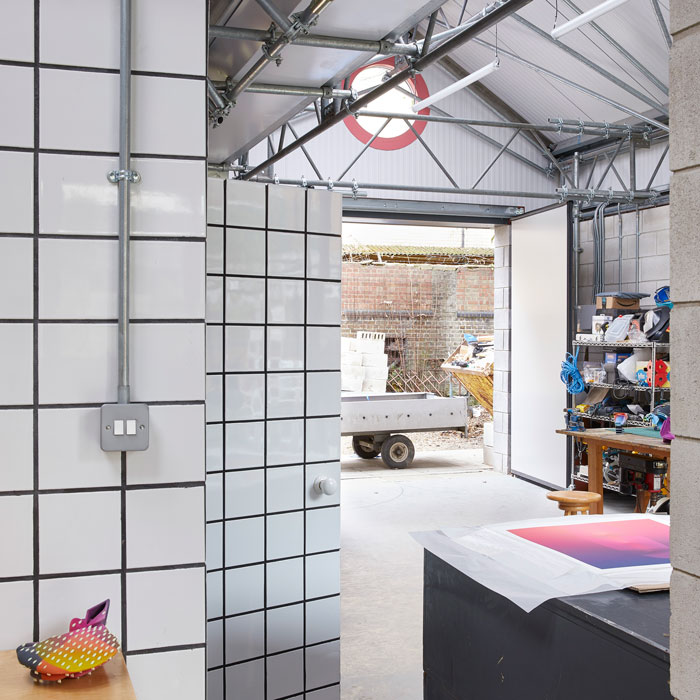
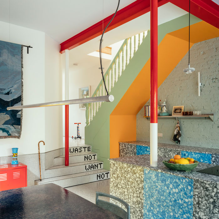
Or on Lomax Studio where we used scaffolding that the client had collected to form the structure of the new roof creating an ornamental ceiling from a very functional material. We try and treat every element of the scheme as a different design element and don’t worry too much about how they relate to the adjacent surfaces/materials. Mountain View is a case in point; materials, colours and textures are clashed throughout this project to create different atmospheres and moments.
JB: Innovative material application is explored further with Liquid Geology, can tell me a bit more about how and why the project came about and the driving principles and interests behind it?
MB: As mentioned earlier we are always interested in trying new materials and combinations on the smaller ‘testbed’ projects to see if they can eventually make their way into the architectural projects. Liquid Geology was a personal project which did just that. I wanted to test the capabilities and variety of the steel enamel finish. The tops ended up with this brightly coloured shimmering surface that rippled like water. We had proposed it on a public project which was unsuccessful but I wanted to explore it anyway so decided to make a table collection. The shimmering tops needed a material counterpoint, so we made these chunky craggy legs which are 4×4 timber finished in a mix of recycled car tyres and resin.