A conversation between: Jim Biddulph & Raw Color
Sometimes the name of a brand can be misleading but in the case of Eindhoven-based Raw Color it’s entirely on point.
The studio was set up by then-recent Design Academy Eindhoven graduates Daniera ter Haar and Christoph Brach some 15 years ago with a clear aim to make objects, textiles, installations and graphics led by strong and unwavering colour selections. The duo have since worked on numerous and often varied projects, and while they are frequently self-initiated, they’ve also been commissioned by the likes of Adidas, Forbo, Kvadrat and Selfridges to name but a few.
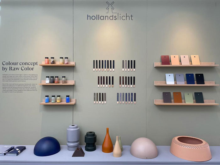
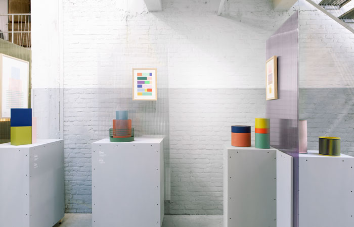
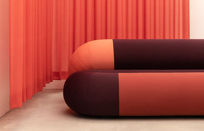
It’s no coincidence that Dutch Design Week, the biggest show of it’s kind in the country, takes place in the team’s home city of Eindhoven and this year they presented a series of installations from their distinguished career titled Multiply. On the one hand the title underlines the practices ever-expanding output in the form of final products and spatial colour experience, but it also signifies the teams immutable drive to find and bring together overlapping but unique shades in their ongoing colour research. The chromatic retrospective came off the back of the studio being awarded the Limburg Design Award, meaning the team follow in the esteemed footsteps of FormaFantasma, Sabine Marcelis, Jurgen Bey and many more. Having chatted during Dutch Design Week, I caught up with the team to find out more about how they work.
JB: You work across multiple disciplines, with colour as the common denominator, and while I’m keen to hear about how you think about and design for interior spaces, I wonder if you can explain how you perceive the relationship between photography and graphic and product design? Are they entirely blended in your minds, or do they retain a separate identity that is unified by colour?
RC: Working across diverse creative disciplines played already a big part during our education at Design Academy Eindhoven. The tutors and school system had been very open minded and we had the space to experience our first encounters ranging from graphics, products, textiles to photographing them. After graduation we had mostly 2-dimensional work including branding and textile design. Therefore we have strong graphic focus when we think in images, whether it is a photographic concept or a product concept. When it comes to translating this there are of course considerations we make. How can a graphic grid be translated into an 3dimensional object. The context of a colour is different when it comes to a seating object in a home or an animation on a smart phone. Still we like to challenge the perception of expectations of users, e.g. the Loop Designers Edition for Sandal has a very saturated and tonal colour palette. Even with the uncommercial appearance, it is selling very well.
JB: It feels like an overly simple question to ask you, but given its significance in your practice, I wonder how you select colours – are you continually collecting, sourcing and comparing colours? And how important are materials, and perhaps products, in this process – or are they one and the same?
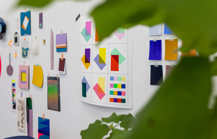
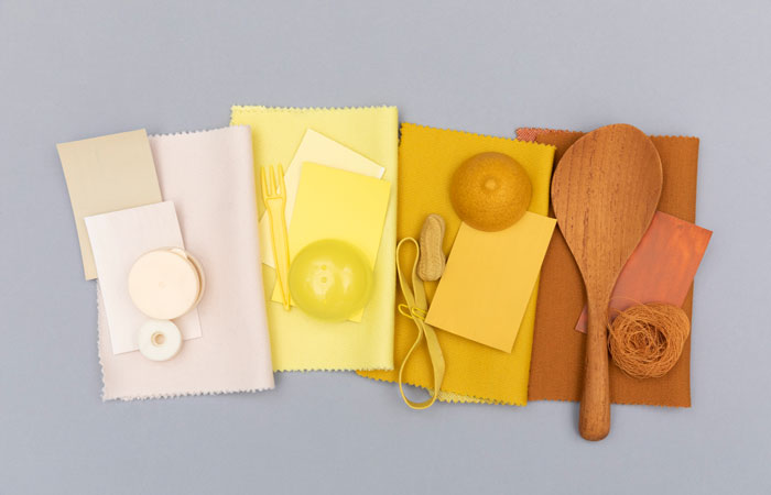
RC: Indeed selecting colours is almost a daily activity at the studio. Usually one can find different types of colour fans, books and swatches laying around, raging from Pantone to NCS, to RAL. Honestly we don’t have one way, it really depends on the project. Next to the standard colour systems we collect many inspiration pieces. This can be a translucent light blue lid, or deep brown chestnut. These pieces can serve as colour and material inspiration as well. And of course, we collect many materials and samples. Sometimes we paint, or weave colours if it fits the process. Sometimes it can be mainly screen based selection. From our experience it is also important to have prototypes and palettes surrounding us in the studio. While we work on a project, we sometimes look at a piece unintentionally, which is very important to change and alter it. A project needs time to ripen in our heads, therefore being surrounded by them is important in order to develop further.
JB: It’s one thing gathering and grouping colour but it’s another thing transforming that into products and interior applications. I’ve heard you say that you need rules for the process to really work and it does feel like there’s a bit of science at play, and yet, your work remains very playful. Can you explain how you approach rules and somehow make them fun?
RC: Our work is a continuous balancing between freedom, spontaneity and intuition and rules, logic and ratio. For us creativity can really blossom when we have defined a good framework. This context can be created by a client, but often we need to frame it more specifically. The more specific we chose the more concrete we can act and develop a project. Often we see students struggle and being afraid of taking choices. We believe making a choice creates a lot of freedom within the choice. Sounds maybe contradictory, but it’s a valuable experience for us. We don’t have to doubt about the concept anymore, we need to develop further within. You can say this counts in general also for the studio. As Raw Color We have chosen to work within the field of colour and from there we have maximum freedom.
JB: You seem to have a very hands-on approach and I’m intrigued to hear more about some of your processes. Do you both specialize in certain areas? How much do you make in house and how much is out sourced? At what point do you give the research over to someone else to finalise designs into products?
RC: Daniera and I work with a team. Mirjam, Noortje and Tijs are part of the studio for more than 5 years, plus we have a regular internship position. Therefore it is not only us any more, although Daniera and me are often more on the foreground when it comes to the communication of the studio. We do actually often make prototypes in the studio. Next to screen work, which is in fact most of our daily work, we believe that it is very important to experience physical models. We don’t have a workshop, so we work mostly in materials that we can alter easily. Paper and textile play an important role in that. For both 3-dimensional studies and in 2D. We also sometimes do basic wood and steel work. We really enjoy to have these physical project traces around in the studio. It makes a process so much more richer and we can see what happens outside of the computer. For final pieces we are in the fortunate situation that we can work with skilled suppliers or brand that have a lot of knowledge and can execute much better than we can do.
JB: On that note, I notice that you work on a mix of commission/collab projects as well as self-initiated briefs – do you prefer one over the other or is it another essential blending of minds and skills that opens you to new discoveries?
RC: Since the beginning of the studio self-initiated projects have been at the core of our DNA. This really helps us to discover new fields, feed our curiosity and define our own question. But obviously we could not exist without commissions by collaborators. We have learned so much from collaborations. They have often specific requests that fits to their context. Both trajectories are very valuable for cross pollination. And it keeps us sharp and fresh. It seems to us a bit static to only do one of them. These days it can be challenging to find time to develop our own projects, ,but we will continue try to proceed on these parallel paths for the future.