


A Conversation Between: Jim Biddulph & Steve Messam
The site specific installations dotted around Clerkenwell Design Week are often a highlight of the event for design world aficionados and the general public alike, and one of the standout pieces this year sprang out of St John’s Gate with eye-catching and potential eye-stabbing impact. The spiked inflatable titled Gateway was by County Durham based artist Steve Messam, whose hefty portfolio boasts an array of sculptural interventions within the natural and built environment, which is all the more impressive considering they are all of a scale that’s “bigger than a house.” Whilst generally transient, these characterful additions often alert us to a rich but perhaps unseen or forgotten narrative, to which their coming and going only adds a further poetic nuance. Working with such ambition of scale and output may seem like a daunting task when looking over Steve’s impressive resume, but experience of founding Fred, an annual art installation event in Cumbria, as well as working for rural arts organisation Fold, goes some way to explaining his seemingly unwavering drive and ability to pull off the near-impossible. Following the popularity of Gateway, I spoke to find out more about how his creative and indeed practical processes unfold.
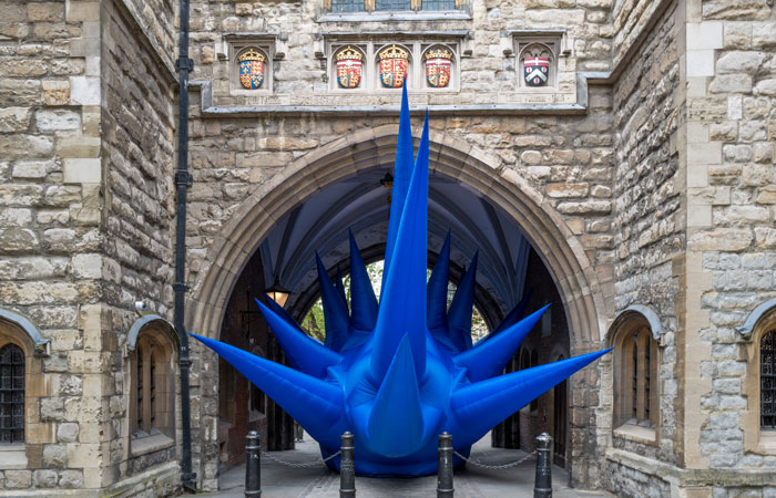
JB: Let’s start with one of your most recent projects, and one that many readers will have seen in person or across social media during Clerkenwell Design week. Gateway, a massive bundle of inflatable bright blue spikes took over the historic St John’s Gateway, and like many of your works it’s relationship to place played a key role in it’s creation and impact. Can you tell me about how you approach a site and what significance it’s unique context has upon your thinking?
SM: When I was first approached about creating new pieces for Clerkenwell Design Week I had a very open brief. It was lovely. It was more about making an impact and navigation around the festival trail than anything else, but besides that it was exploratory. So I wandered the streets – lots. I was keen to create piece(s) that went beyond the visual impact, but scratched the surface a little more. While most of the visitors to CDW come to see the showrooms and exhibitions, I felt that what was getting overlooked was Clerkenwell itself. I set out to find ways in which the place added to the design festival.
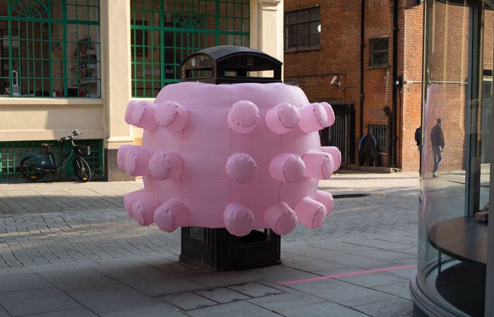
Initially I came up with 7 or 8 locations – each with their own design narrative. From the oldest underground railway terminus in the world (Farringdon) and the rich design legacy of the London Underground, to near identical pubs (breweries had their own in-house architects), and postwar gap sites. Ultimately, for a number of reasons, we settled on St Johns Gate and the iconic British phonebox. Clerkenwell was one of the first places to get the original K2 design phoneboxes and has the highest density of them to date. But also, there was this lovely dialogue between George Gilbert Scott’s K2 box on Clerkenwell Road, opposite the 16th C St Johns Gate, which is mostly a 19th century reconstruction by his uncle – J Oldrid Scott.
JB: Not only does your work catch the eye but it also sparks the imagination, often triggering thoughts and questions regarding the history of the site itself – and you do indeed often select spaces that have a rich but sometimes forgotten past. Can you tell me a little more about how you make these choices and how you go about acknowledging and even extending the narrative of the environments involves?
SM: The narrative of place is very important to me and my work. I always think of landscapes as a series of layers – not just geologically, but historically, culturally as well as visually. The same can be said of built environments – the clues are there everywhere, but because they’re always there they easily get ignored and forgotten. Most of my works are very temporary and transient, but I hope that their presence is part of that ongoing narrative – in that ‘Once Upon A Time…’ way. It starts off as a “do you remember when St Johns Gate was filled with these huge blue spikes?” and goes on to be a quirky part of the history of the area that becomes part of the character of place. And it works in part because for the few days that the piece is there, people stop, slow down and look at the place differently and ask questions.
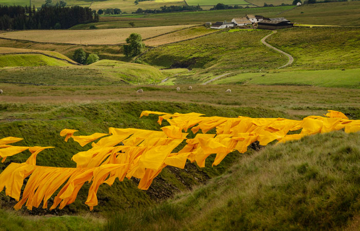
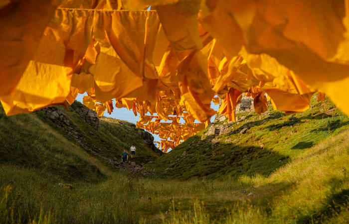
That then gives an excuse to tell more of the stories of the place. A great example of this was in Hush (2019) in the North Pennines. The landscape there is vast and fairly barren. It’s often seen as some kind of windswept wilderness, but it’s mostly human-made – the result of hundreds of years of lead mining and mineral extraction. What I wanted to do with Hush is highlight one of the vast landscape features and tell how some of these familiar shapes are human-made. Hushing is a process by which reservoirs are built on the fells and releasing the water suddenly to wash the working surface away and expose the underlying rock which is then worked on to mine the mineral seam. This is repeated until deep gorges are formed in the landscape. Hush revealed one of these by basically colouring it in – filling it with hundreds of saffron yellow flags. The artwork not only revealed the hush visually but also brought the story of these human-made features to life, to the extent that thousands more people now recognise a hush in the landscape, and know the term. On top of this, thousands of people ventured to a part of the landscape they never normally go to. There was a gate at the entrance to the fell track that usually has zero visitors a year. But over the 2 weeks of the piece, over 5000 people passed through it. Since then you see people up there just enjoying the view from the top on a summers evening
JB: Inflatable forms, which I presume rely quite heavily upon the materials used, pop up a lot in your work, although there are some lovely uses of materials elsewhere. How do you approach materials selection and how important are they to the overall reading and impact of your work?
SM: Every part of my pieces are a considered decision. Materials are part of that. The inflatables are interesting as forms and I like how they interact with architecture in particular, but the materials can be problematic in the long term. Whereas with Hush, the whole piece was made from polypropylene in the form of flags, rope and stitching, which meant that it could all be recycled together. The same can be said of PaperBridge – it was all sent back to the paper mill where it was pulped and made into new paper so that nothing remains of that work now. PaperBridge was all about the materials – a packhorse bridge made from sheets of locally produced paper in the Lake District. Paper is just wood fibres and water, so I was interested in that relationship with landscape, but also the story of paper production in a National Park and what that says about the eco-credentials of a material made in such a protected environment.

Similarly with Jubilee Arch last year in Teesdale, the 7 metre high arch was clad in the raw fleece of a local flock of sheep. Different sheep breeds are bred specifically for their landscape – there is a direct link between sheep breeds and the landscape character. It’s something I’ve been interested in for years now. I think there’s much more to explore on that front.
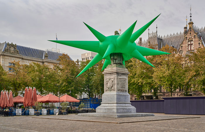
JB: Shape and form are central to any sculptor’s work and whilst you have played with a number of them over the years there are some reoccurring themes, notably spikes (which trigger thoughts of sea urchins, COVID cells and the Statue of Liberty – particularly with Oranje) How do go about devising them?
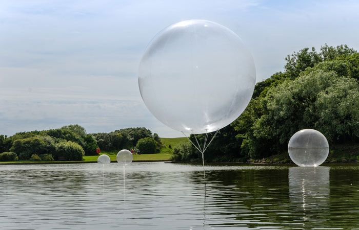
SM: The form is often dictated by the materials as much as the location. With inflatables for example the piece usually has to fill a void or wrap a structure for stability outdoors. Things like spikes then allow the piece to extend out from its original form. Spikes are great in that you can get the illusion of a large form without going large overall. There’s something quite magical too in the way that a 7m spike can cantilever out of a building horizontally using nothing but air. The shapes that I play with are always intentionally abstract, ambiguous and never representational. That people see the statue of liberty in Oranje is coincidental, but I’m quite happy about that too. Spikes are both a strong form – you can throw them in all directions and get that feeling of scale, but they are also very delicate – the surface tension decreases along their length so that at the very tips its mostly the fabric cantilevering itself out, so they move around in the wind a lot. There’s a big difference between seeing photos of my work and being in their presence. That sense of scale can be quite affecting, but so too can the movement and sound they make as well as the way the light constantly plays with surfaces. That’s an experiential thing that’s lost in photos.
JB: Form isn’t the only thing that draws the viewer’s attention with your work; colour also plays a major part, often acting like a highlighter pen upon the landscape or within a building’s structure. Is there a process behind your colour selections?
SM: Colour is the tricky one. I’m often asked why pieces are certain colours. And the real answer is that some parts of the creative process will always be a mystery to me. The pieces are that colour because that’s the colour they need to be. 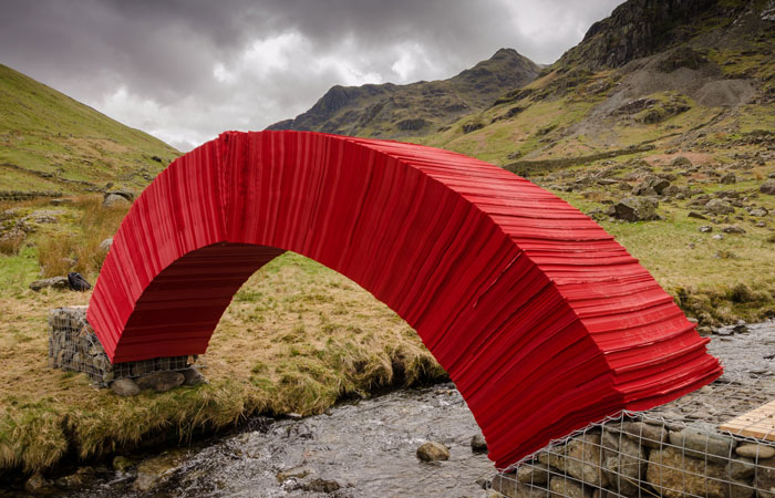
JB: As someone who has installed their fair share of installations over the years, I can’t help but wonder about the practical elements behind producing such work. How long and involved is this process, how do you even secure the permission to work at such sites and how do you physically go about fitting it all!?
SM: Gosh! the practicalities can be so very complex. No two pieces are ever the same, but that’s the bit I like best. It’s all about working out how on earth to do something but always avoiding the easy option even when it looks tempting because that way only leads to compromise and that in turn weakens the piece and the experience. I think every piece starts off by trying to really understand the location and working out from there. Having a real understanding of the location not only helps convince people to let you do something there, but also gives you the basics of how the underlying engineering needs to work. Some of the simplest pieces can have the most complicated engineering to keep them there. The trickiest are always anything on water. But the trick is to hide the engineering in such a way that the viewer never even thinks about how its done – it just happens. That extends to the install process too. No one wants to see a part-built artwork, so they are always designed to install in such a way that they just appear. It’s all part of the magic.