


A conversation between: Jim Biddulph & Wesley Meyer, F.R.A.
Making our way in the world isn’t always easy, and nor so is finding our way through the built environment, not least when many major cities in the UK are in the midst of a building boom.
Wayfinding is a regular experience in all of our lives and indeed an integral part of design, although arguably an area of the discipline that is generally overlooked. But a closer look at the portfolio of a design practice such as f.r.a. quickly highlights that there is a lot more to the sector than first meets the eye. That’s in no small part thanks to Creative Director Wesley Weyer, who along with the 10-strong Shropshire-based team, is intent on adding value and enhancing the experience of designed spaces through varying forms of wayfinding. Although his own career path hasn’t always been the most direct of clearly sign-posted.
Having originally studied fine art photography at the University of New Mexico, Wesley was initially seen to be a great disappointment to the faculty when he put his camera aside, taught himself coding, and started making programmatic internet art in 2001. As he quips, “They forgave me pretty quickly when I earned exhibitions at the Sundance Film Festival and the Museum of Contemporary Art of Barcelona within a year.” But the winding path of his career certainly didn’t end there, with a stumble into graphic design during a job at a sign shop revealing a love for wayfinding. Stints at massive firms such as Gensler have seen him work for princesses and tribal chiefs, as well as the tallest building in the world (lots of directions required there.) When the existing directors of f.r.a. Creative were set to retire he stepped in to help take the reigns, and he hasn’t looked back since.
JB: I’m aware that you’re not overly concerned with labelling the work you do, but a large element appears to be in the creating of brand identities that bring the built environment to life in new and intriguing ways – whether that’s through wayfinding, placemaking or branding. So perhaps a good question to start with is in asking what the core values of the practice are?
WM: We talk about it from the point of view of thinking, feeling, doing. We’re comfortable talking about the emotional aspects of design with clients. Even at times prioritising them above more academic or ‘design engineering’ approaches. Sometimes people need to be reminded it’s ok to trust their gut and respond with humour instead of trying to impress. Action and follow-through are key to this. We stick with our projects all the way through implementation. We have to wear the responsibility for our ideas and have the opportunity to really craft the final solution down to the last nut and bolt.
JB: Of course logos themselves are often a starting point within your projects and I’m also fascinated to know more about the art of creating new typefaces. How do you even begin to capture the essence of a brand through the character of fonts?
WM: Typography is the foundation of our projects, so this could be an essay-length answer. We select fonts in the way the architects pick materials and colours. They need to have a conceptual/narrative connection to the project. They need to perform in certain areas. They need to have a longevity to match the project. Given our projects are built for generations, this usually means skipping the trendy ‘font of the day’ things and finding options with a more classic and timeless appreciation. That doesn’t mean boring, just not trendy.
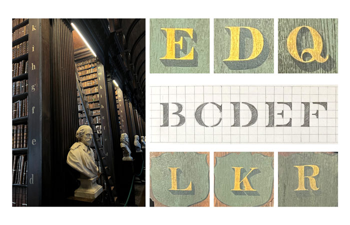
We also love type with a story. We have a project coming out this summer which is located near a very famous library. The sort of place that has oak bookshelves stuffed with leather-bound books that predate many nations. The bookshelves are organised using hand-painted letters that have been maintained by generations of sign painters. The letters are non-uniform (no two A’s look the same) but have a sort of collective cohesion. We created a bespoke typeface for our project based on these letters. It’s not a copy of them, but really more a reaction to their overall impression and collective story. It’s a great way to ground a project in its context but give yourself the chance to update things and make them feel progressive.
JB: Beyond creating typography and logos, language itself seems to play an important role in your work, not least as a means for telling stories and capturing people’s imaginations. Can you tell me a little about how you go about handling language so effectively, yet sensitively?
WM: Working with developers and architects, we often have a very direct relationship with words. On a project, a room or an area has just had a code or some architectural room label, oftentimes for years. We’re usually the first people to directly ask the question ‘So what do you want to call this?’ because we have to design a sign that actually says the name of the place.
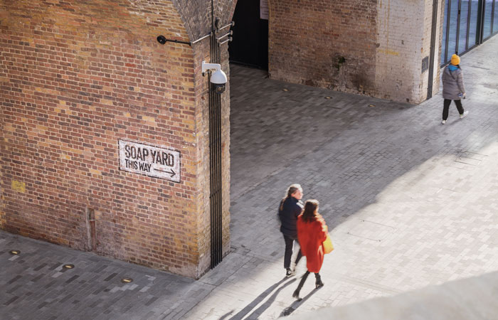
Soap Yard in Borough Yards was a question of navigation. It was called Clink Yard when we started the project. From a wayfinding perspective, we thought there might be an issue with calling it that because Clink Street and the popular Clink Prison were located close by, but are not part of the development. We proposed changing the name and in doing so, hopefully saved everyone a bit of confusion.
JB: And I’ve noticed that you even bring in the voice or hand of other creative people to help add extra flavour and personality to some projects.
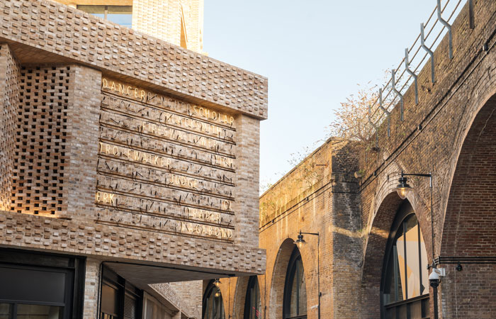
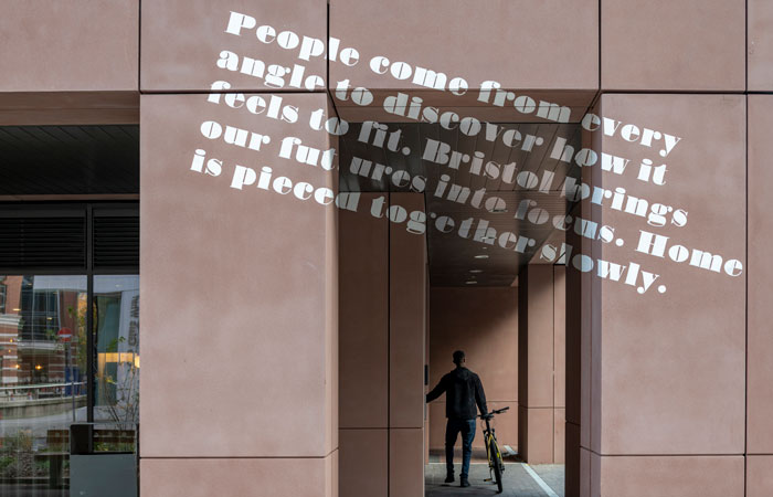
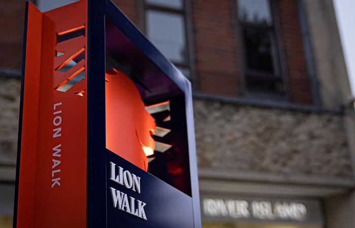
WM: Yes, we’re also very lucky to collaborate with writers and poets. For Box Makers Yard, a residential development in Bristol, we worked with Beth Calverley. She has an amazing process of co-creating poetry with communities. She creates a series of individual poems through direct interviews with people and then produces an aggregated work based on all the individual poems. It’s wonderfully sensitive and really pulls out the voice of the local community. We also worked with Beth on our recent project for Lion Walk, a shopping destination in Colchester, Essex that was lacking in a sense of brand presence.
JB: The visual language you help to create for clients is broad in scope and it strikes me that one key ingredient in doing so is materials. What is the process for selecting your material palettes when working on a brief?
WM: This is really where the intersection of brand, architecture, landscape and interiors comes to life. Quite often we are working with a brand that has only existed as print or pixels. We have to interpret that brand into materials that work dimensionally and have a relationship with the architectural design of a site.
This really amounts to us having to negotiate to break a bunch of rules. The brand rules get adapted to live in the environment. Often this means simplifying elements to be more robust and enduring. The architectural design language gets challenged in that we don’t want signs to look ‘stuck on’, so we have to work with others to coordinate or alter designs to allow for these elements. Sometimes we even have to challenge the laws of physics. On a recent project, The Fold, we wanted the lettering to be much deeper than could be manufactured through conventional methods. We didn’t compromise and instead developed a method where the lettering was produced through 3D printing. And this wasn’t for prototyping; there are 35 installed floors of these 3D-printed signs.
JB: That’s an interesting point, and indeed, whilst we may generally associate language and typography with being flat, you work in the built environment and indeed much of your output is produced in 3-Dimensions, with shape and form often playing as important a role as fonts and materials. How do you go about this?
WM: This is all about context for us. We have to be really sensitive to the space around the elements we design and think about a ‘complete design’. That’s not just about the physical space design, but what users are doing in the environment. What are their needs, emotional states, physical limitations, etc. We’re lucky these days in that we have a lot of ways to study a space for all this. Site visits are the best but we’re able to do a lot of work in 3D models now. That really helps to contextualise things and lets us find much more sophisticated spatial interplays.
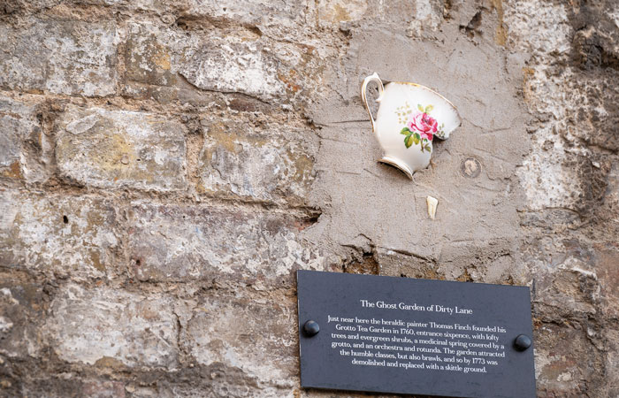
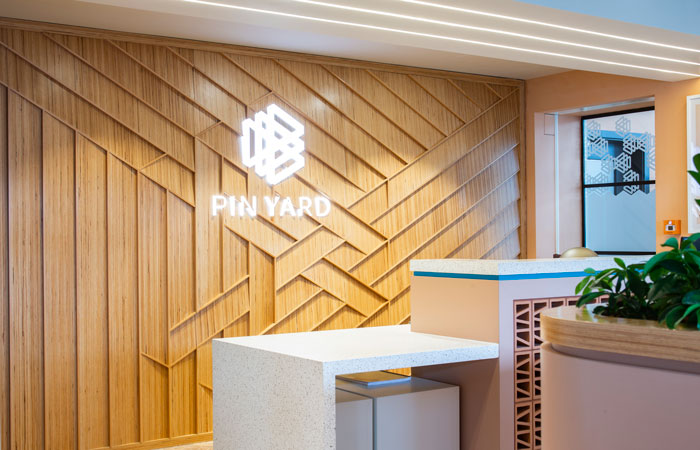
All that context lets us design at a range of intervention. Some areas really do need activation. Here we can use dimensionality to be expressive. The feature wall at Pin Yard, a residential build in Leeds, basically uses depth as its own material. Other times we want to use space to express time. Borough Yards is known for some of its larger interventions such as the oversized ghost murals and neon signs, but there are also much smaller interventions that are meant to be discovered over time. This is about user experience and rewarding curiosity and people that spend enough time in the space to find these things. We also use lighting as a spatial material. Our recent work at Lion Walk uses up lighting to add depth and separation on the wayfinding totems.
JB: Borough Yards seems like a prime example of the input you offer beyond simply designing, whereby you were finding and managing teams for the installation and generally fine-tooth-combing the intricate details of the overall project.
WM: Yes, f.r.a. are unique in this. Jamie Trippier leads our dedicated Project Management team and their collective experience is so valuable for our projects. Borough Yards is a great example of this, as we had to manage four different specialist sign fabricators during the project; each with their own unique challenges to overcome.
The large 7m by 5.6m neon artwork there has 153 cables and over 500 electrical connections running to banks of 51 transformers all housed neatly on the roof terrace above. To pull this off we had to work with the architect and engineer to redesign the corner of the building to accommodate all this and gain planning permission from Southwark Council for a work of such scale. We also had to think to the future and design in ways for components to be serviced and replaced over time.
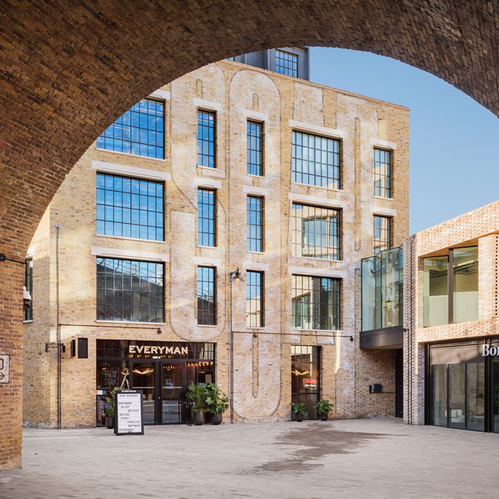
The large wall murals at Borough Yards were also a unique challenge. Due to their scale, access, and the logistical issues of their location, this was a situation where we could not have any snagging. We did extensive prototyping with the client to agree on the exact character of the painting. We then had to attend the site while the mural painting team were doing to the work. Literally a case of ‘a little more here, a little less there’ during the painting. They were great to work with and in the end, everything came off as planned.