


An interview with Morag Myerscough
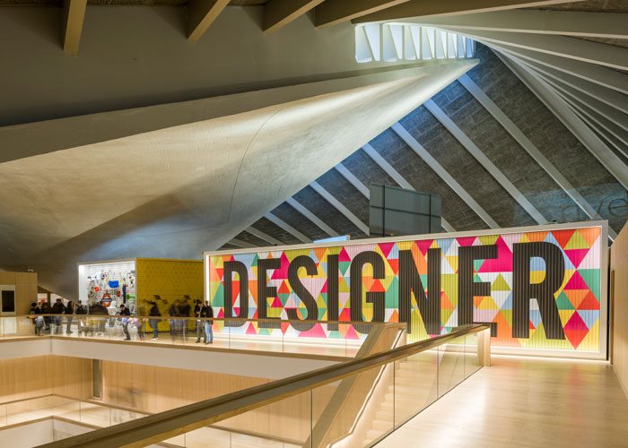
If you’ve visited the Design Museum since it’s relocation to the old Commonwealth Institute just off London’s Kings Road, you will have experienced the attention-grabbing work of Morag Myerscough. The colourful creation is a permanent fixture and a clear signpost for the on-going Designer Maker User exhibition upstairs. Comprising of tri-wall advertising boards with brightly coloured triangles that serve as a backdrop, the work sporadically changes pattern, and with it, the 3 interconnected words of the exhibition title are displayed in equal rotation.
Were you to have passed by the recently refurbished 1 Finsbury Square since the beginning of the year, you may well have witnessed Morag’s latest creation, Atoll. Designed as a centrepiece for the public square, the 2-storey structure is a celebratory beacon of colour and greenery and one that is sure to brighten even the gloomiest of London days. I spoke to Morag to find out more about Atoll and her practice in general.
JB: Let’s start with your latest piece, Atoll – can you tell me about it?
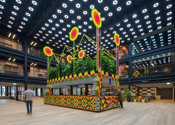
MM: Well, it’s a fearless, colourful and permanent 7.5m high structural intervention designed as a beacon for the area. My aim was to inspire passers-by – to lift their spirits whilst simultaneously encouraging them to use the new route from Wilson Street through the building and into the square. The space used to be a corporate one, but the new development is open to the public, so the piece needed to entice people in and connect Broadgate to the wider community. It’s the first of a number of new public-facing enterprises to be introduced into the space, with eateries and other commercial outlets to follow, so it really needed to grab people’s attention.
The lower level is occupied by a café whilst the upper level of the Atoll incorporates the outline of three London terraced houses, surrounded by dense planting and completed with six neon suns signifying joy and energy. The houses make reference to the area’s residential history, introducing a sense of intimacy and domesticity to the space.
JB: Yet, even though the piece sits right in the middle of one of the busiest parts of the city, it incorporates biophilic design principles. What was the thinking behind this?
MM: As someone who lives in the city, the biophilia hypothesis that humans have an innate tendency to seek connections with nature is important to me. Many of my public projects have drawn inspiration from how colour and nature help to improve wellbeing. My fascination with how the Victorians made public parks (as a child I lived very close to Finsbury Park) for city workers to get fresh air at weekends has inspired me to bring the park to the workplace at 1FA. Luke Morgan and I designed and made planters for the space and Luke fabricated a metal planting grid, which covers a large translucent screen at the back of the café area. What’s nice is that there is a 360-degree view of plants, particularly from the mezzanine levels where workers will be able to look down at the verdant planting.
JB: As well as the 2-D patterns and the colour and plant selections, the 3-dimensional elements involved in the piece really struck me – there must have been a lot of design work involved in getting them right?
MM: The materiality of the permanent installation is as important as the narrative. I spent months developing the ceramic tiling, mixing Victorian references with my own signature colours and 3-D optical patterns. The vibrant patterns on the tiles and the marine ply furniture contrast with 1 Finsbury Avenue’s symmetrically and dark bronze anodized cladding and black-painted exposed interior structure, and that was a very deliberate decision. There are also large-scale painted walls and hand made and painted seating with plenty of overstuffed velvet cushions for comfort.
JB: We’ve noticed a real spike in large-scale painted works that fall somewhere between murals and architecture, something that you are part, why do you think that is?
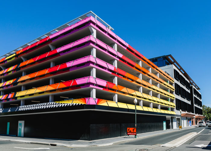
MM: I tend to build rather than paint murals on walls but I have done it a few times. In fact, my very last installation before the lockdown was TOGETHER; a mural 200m x 6m mural on a building in Perth Australia. Although right now it’s my house, which I am painting at this strange time of lockdown.
I had a small team of artists paint TOGETHER – I paint my projects whenever possible with small teams of painters. But this was just too huge for me and I would not be able to stay in Perth so long as it would have taken too long. Painting a mural is a relatively economical way to transform a whole area. It can instantly relay a message, colour and can have a lot of power. I use water based paints and rollers, which take a little longer but are hopefully a option better for the environment.
JB: You seem to have a fairly consistent colour palette, how do you make your colour choices?
MM: I took several years to find the palette that works for me. Now I work with a core set of colours. Then I add extra colour depending on the project and how I want the colours to respond to each other and the surrounding environments. I particularly love using neon-fluoro colours as they transform the colours next to them and change from day to night.
A black light on the neon can illuminate the piece in the darkness — magical.
With the tiles for the Atoll you have to work with a limited palette, as not all colour is possible due to the firing – like bright pink. So sometimes I adapt my colour choices to work best with the material I am using.
JB: There is a real physicality to your work and the colour is seldom flat or static, and always vibrant. How do you think this affects the viewer?
MM: When you are making physical work you can’t depend on colours on a computer screen. With the project in Perth, paint swatch books were sent to me as different colours to UK, so I had to very carefully choose my colours. A colour sample was painted and taken to site to ensure the colours worked in the light, which is obviously very different to the type of light I am used to in London. Because my work is very colourful people often say to me “is that for children” and I feel very sad about that, as there seems to be a conditioning that colour is for children and when we get older being sophisticated and serious, colours must be stripped out or used in a single or minimal way. I think stuff that. Why do flowers make us happy? Because they are beautiful. And why are they beautiful? Usually, it is to do with the wonderful colours.
I often see my work growing out of grey urban environments as flowers that may be there for a week or for a year. But whilst they exist there they transmit a feeling of joy. That said, it is not what I think that matters so much, it is how people respond to my work. I’m pleased to say that when they are confronted by my work, people’s reactions are expressions of joy. Work needs to have a heart and I have definitely found the more I love working on a project the better the final response once it is built.
JB: You mentioned the difficulty of working during this unprecedented lockdown, but is there anything else in the pipeline or have you found projects have been put on hold or worse, disappeared?
MM: There were lots of projects that are now cancelled, and who knows, after this I am sure there will be a big reset and we will probably approach things very differently. But I know one project that hopefully will happen next year as the team in South Africa have been building it for the last 2 years. The Temple of Curiosity for Afrikaburn (the work will not be burnt) is a temple and will have a legacy, as all the hand painted panels will be used on future projects including schools and Libraries in the townships.
But the project I am most excited about that IS happening as the money has been given to Artfelt Trust is Sheffield’s Children’s Hospital by Method Products. Initially, I designed a limited product range for Method Products. and at the outset I asked them if they would support a project I wanted to make happen at Sheffield Children’s Hospital to transform the outside courtyard for the children, (and) families and staff to use. The NHS hospital had run out of money and so had to cut this project when they were building the new wing of the hospital. I had already designed the bedrooms for the hospital, in 2017 and Method kindly agreed with enthusiasm to support the project. We are making a ‘Joy Pavilion’ and garden. So far the new planting has gone in although everything has stopped for now. I managed to get colour flooring sponsored and made sure I ordered wood and paint so I am going to paint as much of the Pavilion as I can during this time of isolation. I will not be taking any money from the Method Products. Donation; all the money is being used to buy the materials, plants, chairs and build required to transform the space. It is the least I can do; I am so grateful to the NHS for the incredible work they do. I’m also incredibly thankful to Artfelt Trust who are brilliant to work with and bring so much joy to the hospital and Method Products. for giving us the money. I just hope when we come out of this unknown time we will be able to install everything and make a place that people will enjoy.