


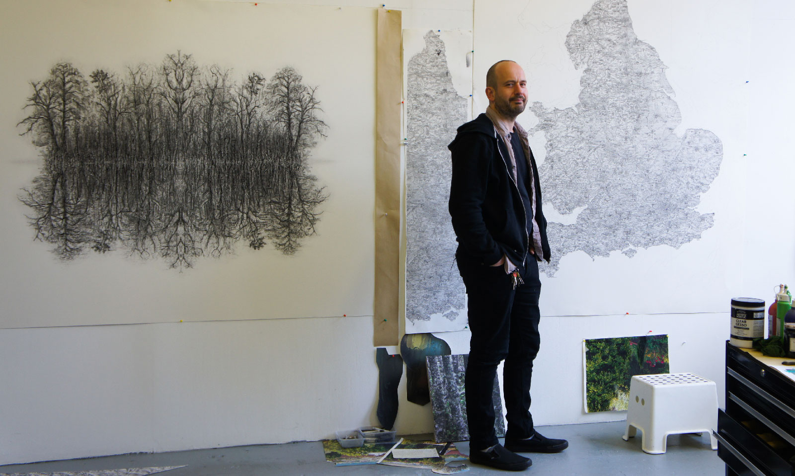
Designer Q&A: Stephen Walter
On June 9th, the day that the General Election 2017 results were announced, Design Insider met with artist Stephen Walter at his London studio and, in between a few political deviations, we discussed his artwork, current exhibition at the James Freeman Gallery and his work with Newmor Wallcoverings.
Can you begin by telling us a little about yourself?
Currently my major concern as an artist, and image maker, is an investigation into the typography of environments. I am very interested in what manifests itself in human culture, but also interested in natural elements; the semiotics that grow on landscapes and what hard human made infrastructure on the landscape tells us about ourselves and human culture. Also an interest in what actually is built, and the wider understandings of what they represent.
I am better known for my maps, and the maps are of course interested in signs and symbols.
When I was an art student I was very interested in building abstraction, as a root to not just representational art but more about the abstraction that grew up in the Modernist era. The Modernists were my influences at the time, so I was always interested in skating between gestural mark making and very pared down geometric works.
I have always been interested in ideas of utopia and imagined idealised places. This also includes a romanticisation of the urban and rural landscape, which I love. I would choose these corners of utopia and then use gestural mark making, paring down and repetition, formalising the compositions into abstract signs and symbols.
The way I got into maps was very straight forward as far as artistic practise goes, I was making works about landscape and signs and symbols and of course maps are landscapes full of signs and symbols. This allied very much with maturing to see the many contradictions which balance to make a whole. My maps were worked commercially which bolstered a heavier interest in them, both of real and made up places.
Can you explain a little more about your Albion map?
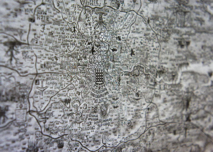
Albion is a digital print which was originally drawn in pencil, it is a folkloric landmark map of England and Wales, a celebration of the weird and wonderful local legends that I picked up through research into folklore.
South is displayed at the top. When the piece was commissioned in 2014 it was the year of the Scottish Independence vote, and Michael Drayton originally wanted his Poly Olbion poem to include Scotland but he didn’t get round to it, and I thought that was interesting.
What I am doing now is turning it back so that North is at the top because I would like it to be changing in the same way that Britain is breaking up politically and is in a state of flux. I am scrubbing out all the drawing and detail, and I think that will be an appropriate expression of the current state of the country.
Your Woodland Works are currently being exhibited as part of The Wild Wood exhibition at the James Freeman Gallery, could you tell us more about this series?
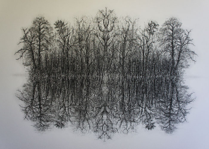
My newer works are interested in the phenomenology, existentialism, a love of trees, and the romanticisation of natural elements. My Albion map is half way between my previous maps and these new landscape works.
My woodland works are interested in metaphysics, contemplating where and how we got here, what’s the creator? what’s physics? what actually do we know about the world from our own senses. I am interested in ruminating about God and a creator, and the mysticism and wonder in the world which aids stories about it.
The Woodland series, my re-wilding series, is also about cells splitting into two, and then into four, with slight imperfections, and these little anomalies happen through the splitting process and every little bit is asking if what you are seeing is real. It is a re-wilding of the spirit as well as the physical landscape.
I start with a small drawing that I then digitally scan and then I mirror the image, and then mirror it again. I use a pale inkjet digital print of this image which I now work on top of with graphite and charcoal and so that provides this imperfect mirrored effect. This process is 3-4 months of work and so I chose to make limited edition prints of the final work.
You have launched a collection with BCFA member Newmor how did that collaboration begin?
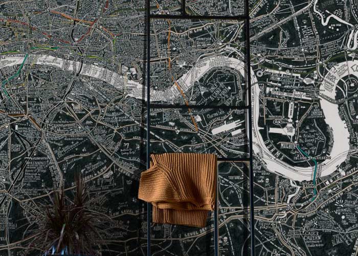
I must thank Leila Cook for recognising that my work was what her team at Newmor, and the wallcoverings market, were looking for. My collection for Newmor is a mixture of my maps, which proved very popular, and my very abstract collections of signs and symbols. I have also eked in some of my mirroring effects, alterations made from the landscape works. It is an interesting and exciting experience and we are looking to build the collection in the future.
The collection is predominantly monochrome, other than my London Subterranea which does contain colour. I have definitely been a ‘colour vegetarian’ in my artwork over the last 10 years, but I want to add more colour into my work now. I have focused on philosophical, societal and politics of space concepts, and colour is more sensual and almost frivolous than the mindful ideas that have driven my work. But it is time for colour to come back!
Contact Stephen Walter.