


Jim Biddulph & Adriana Jaros In Conversation
Having initially studied Graphic Design in her native Venezuela followed by BA Textile Design at Chelsea, Adriana Jaros has developed a striking visual style that incorporates architectural references and continues to grow in scale and/or ambition with every new piece she creates.
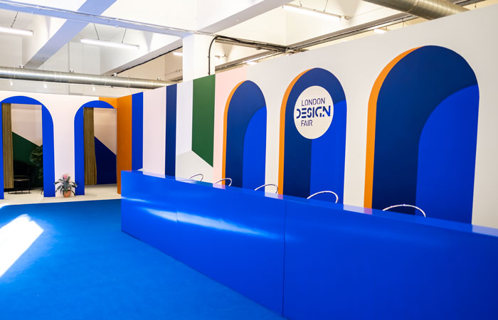
From photographic ‘interventions’ that involve illuminating and intriguing introductions of colour to large wall murals, Adriana’s work is both recognisable and arresting. Those who visited this years London Design Fair will already be familiar with it, having no doubt taken a snap (and perhaps a selfie) in front of her multi-coloured set of archways, openings and door entrances; a fitting visual metaphor for a space that aims to welcome visitors in. A self-confessed colour obsessive, Adriana can regularly be found travelling across London and further afield whilst on the hunt for colour and visual references for which to turn into graphically styled designs. So how does she make her work and what does she hope to achieve with it?
JB: Whilst you have 2 creative BA courses under your belt, your work has strong leanings towards architecture; even though it’s not a subject you’ve been taught. When did this interest develop?
AJ: This is a question I ask myself at least once a week! I think the fascination for architecture has always been there. I’ve always been obsessed with how emotions can be linked with physical spaces. The impact a space can have on our mental state deeply fascinates me. How we are able to generate wellbeing and even instil happiness in someone with just a touch of colour? I think it’s a really emotive question.
The architecture theme may also have to do with my quest for belonging. There is something pretty magical about landscapes and the way they can define who we are and how we feel about a certain place, how we feel about ourselves and in turn about others around us.
JB: So are there any particular types of architecture that inspire you most or that you tend to look out for?
AJ: Aesthetically there are some pieces of architecture that just quite simply turn my little passion spark on. For example, I am genuinely happy and deeply inspired by looking at a piece of Brutalist architecture; they fill my brain with a million ideas.
Architecture and interior spaces are some of my biggest inspirations and passions, since it’s inside of these very personal spaces that we create our stories; the narrative of our lives and feelings.
JB: Colour is clearly important in your work. How do you choose your colours? Would you say that you have a particular approach when it comes to colour?
AJ: For me, colour and the absence of it is everything! I would say colour is a ‘feelings-generating machine’ and if we use it wisely it’s a very powerful tool to communicate and to leave important impressions on someone’s life in a very intimate way.
I choose my colours from visual references. Often I am out and about and see a certain coloured door; I snap a pic and collect it into my ‘colour reference folder’… I have so many different ‘colour reference folders’!
There is also the element of context – taking a colour and using it in an unusual way. This is what gives me the most pleasure, and what I have found surprises the spectator the most. It makes them think, question and hopefully, feel.
I would also like to think that projects and ideas have a life of their own and we are the vessel to make them happen. Collaborating with ideas and colours to generate good feelings is my ultimate goal. I love to only focus on making people feel better and being kinder with themselves; I want to make them aware of the space they inhabit and to give them access to that little door which leads directly into their happy place.
JB: You’re one of a number of artists/designers who create striking large-scale murals to have emerged over the last couple of years…why do you think this ‘mini-movement’ has occurred – why murals?
AJ: I started doing murals as a way to put my aesthetic view and vision out in the world. It came almost by accident, but I paid close attention to the affect it had on passers by. That includes during the process of painting the pieces themselves. It’s like they offer a reminder to adults that they can still paint, play, imagine, and do this with their hands and not through computers, gadgets or phones. They offer unique moments of connectivity and creativity.
Murals are also a great medium to completely transform a space. It makes people smile so big so I thought, ‘right, I am into something real here, this can be a direct and raw connection into peoples honest emotions.’
I had the chance to design the huge entranceway at London Design Fair earlier this year; a 45-metre image with classic architectural features like archways with which to welcome visitors. This project opened my eyes even more to the potential there is in transforming space through hand painted murals.
JB: Collaboration often plays a role in the creation of your work, why so?
AJ: I live for collaborations! I find it extremely inspiring and challenging to work, learn, share with other creative people. Every single time I have collaborated, I have grown in so many different levels – creatively and personally.
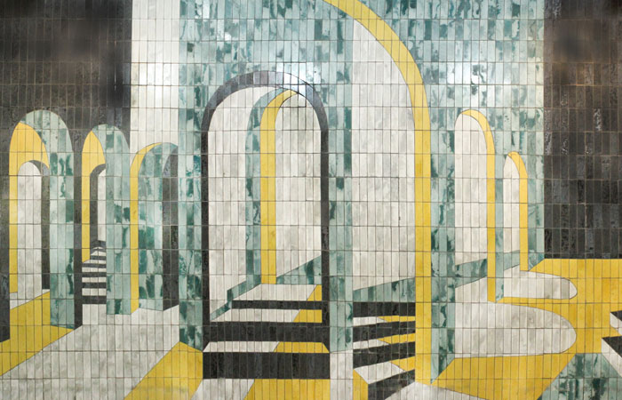
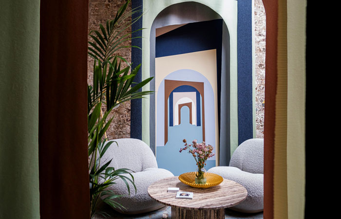
Collaboration allows you to create a projection of what you want to say to the world whilst giving you the chance to dig deeper; to find meaning and purpose in every single idea that is shared between those involved. It can also offer the chance to work with different materials whilst reaching a different audience. A nice example of this is a project called Portale, which I created in collaboration with Kate Crowley Gilbert for Milan Design Week back in April. The same can be said for Wolkberg Casting Studio, a tiled mural consisting of similar tall archways, which brought together my visual style with specialist material makers – a perfect coming together of passion for design and craft.
JB: Your recent project in East London looks incredible, are you hoping to carry on in this manner?
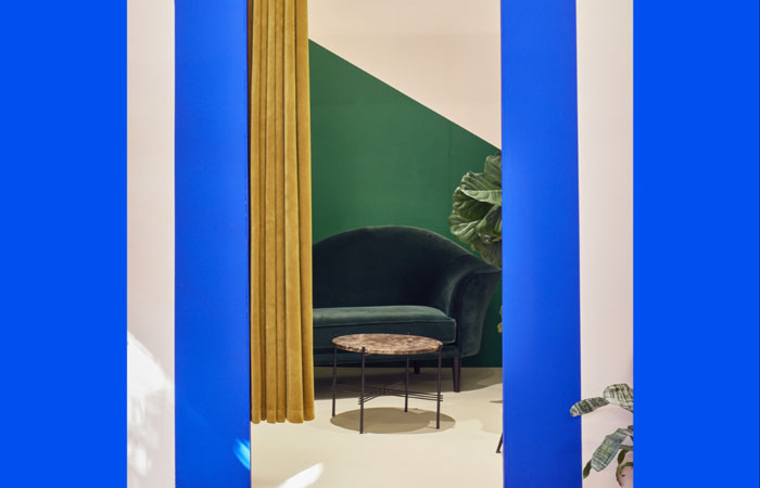
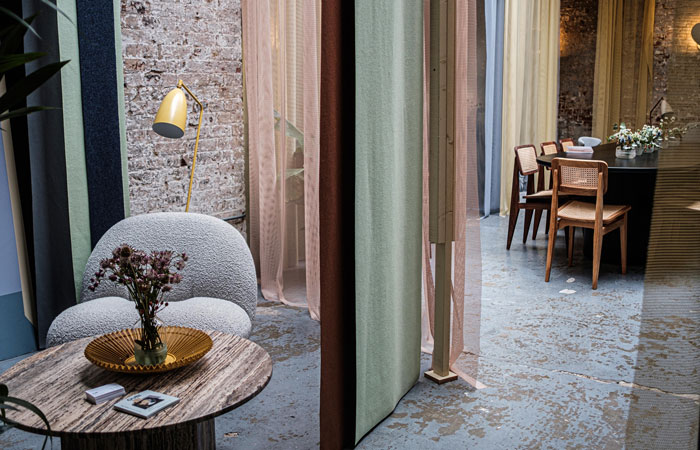
AJ: Yes, I recently designed a live pop up for Gubi at the Folk Clothing store on Redchurch St. I had a lot of fun doing this project. I got my inspiration from one of their iconic designers, Greta Grossman. I developed a concept space in which visitors can become immersed in Greta’s life and the layered space if you wish.
I split the space into small little rooms with curtains and colours. I also created an entrance where I aimed to explore ways of creating depth of field with fabric and painted murals. It achieved a sense of mirage, so that you get the feeling of traveling into a much bigger space, which added to the experience of discovery and a sense of really experiencing the pieces of furniture to their fullest potential.
Next year, I really wish to do more social projects where my art and vision can have a meaningful impact on communities or individuals in need of some colour and happiness.
For more information on Adriana’s practice and to find out what she does get up to next, watch this space.