


Jim Biddulph and Russell Bamber in Conversation
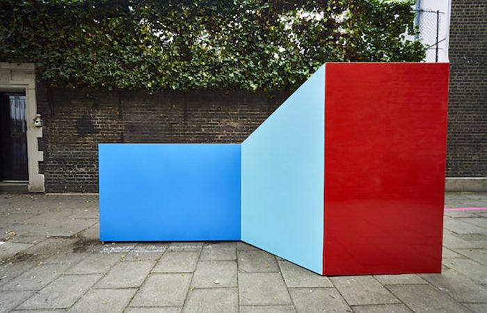
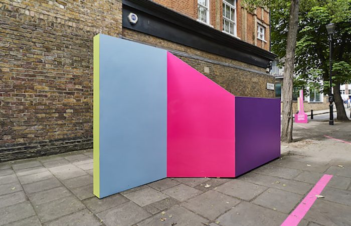
The eagle eyed of you may have already spotted the colourful creations of Russell Bamber popping up on a number of occasions this year. We noted their inclusion as outdoor installations at Clerkenwell Design Week and as well as his stand at 100% Design, an even wider audience were recently introduced to them by ITV as part of their ident series.
With sharp lines, brightly coloured panels and a mix of matt and high gloss surface finishes, they’re certainly attention grabbing objects. They arguably fit in with a growing interest in ‘maximalist’ style, where bold colour and print combine and clash, offering more impactful and strident spaces for us to exist in than the turbulent times that we find ourselves in. French designer Camille Walala’s inclusion in the list of ‘special projects’ at the London Design Festival for a second year running is testament to this uprising of positivity and unabashed colour. This ‘movement’ (rather than trend) represents a desire for liberation from the humdrum of life, with a need for distraction and an urge for celebration at it’s core.
Whilst Russell is an artist by training, the design world has taken note of his work. This may well be because the materials he chooses such as birch ply and laminate wouldn’t look out of place on an interior design scheme, although it may also be because he deliberately blends the boundaries of aesthetics and functionality, and with it, art and design. Of course, it could also be down to the fact that his work taps into the fun side of our brain and with it enraptures us with a childlike excitement that is difficult to come by in times of strife. As it turns out, Russell’s work is a real reflection of himself as a person and I sat down with him amongst layered shards of multicoloured laminate in his Hackney Wick studio to find out a little more about how he works.
JB: Unlike many of the creative people that I interview for Design Insider, you actually trained as a Fine Artist. That’s clearly given you a unique approach to creating your work, can you tell me a little more about how you started off?
RB: I studied some time ago, originally studying Fine Art painting in Cheltenham, and then a Master of Philosophy in Public Art in Dundee. I very quickly started to question where painting became sculpture and generally question the rules of art that were given to me. That led me to push my own parameters and to try out new making processes beyond what I had already been taught. I was certainly a workaholic, and still like to think I am, I certainly still like to challenge my making skills.
Because of the nature of my work, I’ve always been a studio artist and require a fair bit of space. The first studio I had was in Highbury. I won a Royal Scottish Academy scholarship, where I went to Italy for a few months, and on returning won a Studio Fellowship. That led me to a huge studio on Bermondsey Street, SE1. It was exactly opposite where the White Cube is now, I used to cycle from one end of it to the other to save time! It was an old leather factory and still had the tannalising drains running down the middle. I loved it there. I built walls on wheels so that I could divide the space down, and even had a theatre space.
JB: Wow, I’m pretty certain those kinds of spaces don’t exist in London anymore! So this space isn’t quite as big but still sizeable. Most of your work is of a decent scale, so how do you go about working in here? Given that a lot of what you do is about ‘space’ does the space itself influence your work?
RB: This studio is in a Space Studios building in Hackney Wick and I’ve been here for two years. It’s been great having it as it is much bigger than my last studio and has allowed me to make much more experimental and more architectural work. It’s amazing how quickly the space can fill up, and how much I have to adapt the space; moving benches, tools, walls and building extra storage is all part of the process, and is quite exciting. I sometimes stop and look at all the work around me and ask “how and why do I make all this? How do I select one idea from another?” But they just seem to work when they work. I get ridiculously excited when colours, surfaces and concepts come to fruition all together – its like being a kid all over again.
JB: Whilst you identify as an Artist, many might want to call you a designer and I think that’s because your work straddles the 2 disciplines so well. How do you go about describing your work?
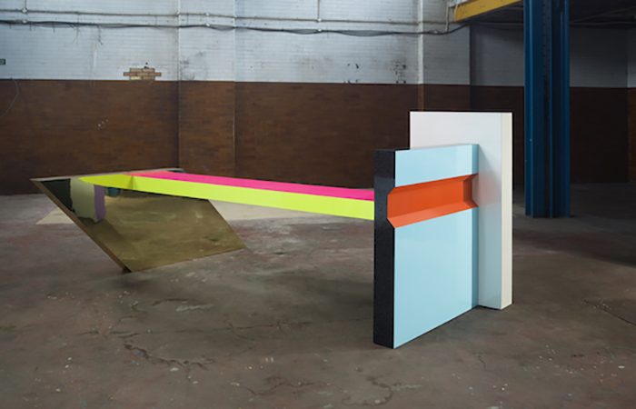
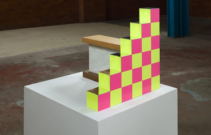
RB: My sculptures are definitely that – sculptures. It’s just that you can use them – if you want. They teeter on the edge of design, painting and architecture; selecting and employing elements freely and playfully to suggest function. They are there to agitate a space; to bring unexpected joy and dynamism to our lives, bringing a new and exciting twist to the space they occupy. They suggest function, and are functional, but their function is to tease and beguile. My mischievous use of colour and surface seduces the viewer into joyful excitement and further softens the hierarchy of sculpture.
JB: It’s quite an unusual but really refreshing approach. It must be such an interesting and exciting process for you when conceiving of ideas?
RB: It really is. I make sculptural decisions on the unlikely, unexpected and delightful meeting of surfaces. The initial simplicity of architectural form disguises the complexity of colour: form is primary, colour secondary and function way down the list, but crucial. What that ultimately means is that the actual experience of my work is what brings it to life. Being able to offer that experience to people is so satisfying.
JB: And it’s been a busy year for you, with some exciting and new challenges along the way, particularly with the TV project?
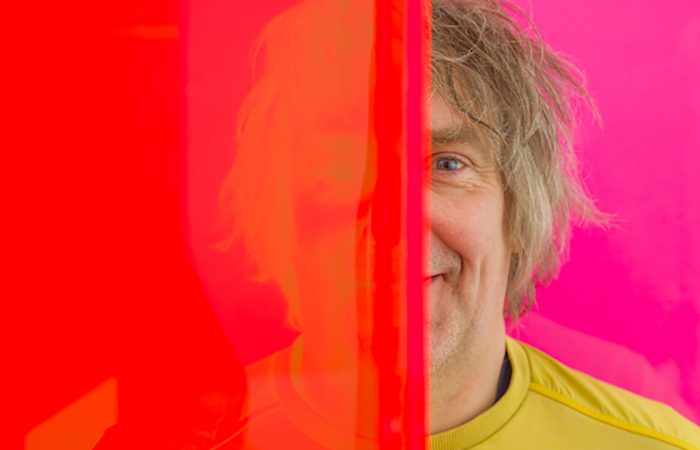
RB: Yes, recently ITV commissioned me to make an ident for all of their channels. It’s part of a series for which they asked designers to make their logo into a sculpture. I broke the logo into small elements that ignored the letters but saw the font as a construction of abstract forms. These forms I then ‘drew’ to different levels. The colours camouflaged the actual logo even more and created beautiful, unexpected reflections and distortions. Although I had a good knowledge of how the actual sculpture would look, it’s these surprises that are really exciting. There was a fluorescent pink that reflected in a gold plane and seemed to fly into infinity, it was amazing. It’s these delights that drive me forwards.
JB: And am I right in thinking that this may have led to another new development in terms of your making processes?
RB: Yes, the ITV logo also introduced me to the curve. Curves are the future! The laminate sales representative that I work with said I couldn’t bend the material that much. He told me it would shatter. Now there’s a challenge! I had to buy flexi-ply and bend that to near failure, and then laminate it. Amazingly it all held together, and now I’m introducing curves everywhere. It’s a new frontier for my work as it allows me to explore what colour reflections they create.
 JB: And whilst making is an integral part of your practice, colour remains a central column of your creative process?
RB: I spend hours offering colours up to my studio walls and seeing how they react to each other; testing different light sources and lots of different surface finishes. I guess it’s my painterly knowledge coming into play. There often seems to be an overwhelming explosion of colours, but it is the subtlety within that is important. It’s only on giving the sculpture time that you see these delights, these nuances and the real joy.
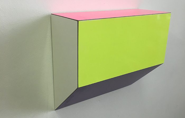
Russell has also just completed a new series of Limited Edition pieces; Single Corbels, Double (hinged) Corbels, Double Cranked Brackets and Reversible Brackets, all available in three different colourways. All signed and numbered on reverse. For more information visit his website.