


Milan Design Week 2024: A Spring Spectacle of Colourful Creations
Spring is at least vaguely in the air, and aside from buds unfurling and the animal kingdom collectively waking up, this time of year can mean only one thing: Milan Design Week. Between 16-21 April the design world once again turned its attention to the northern Italian city, keen to discover what this year’s incarnation might have on offer.
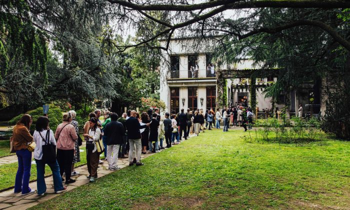
Alcova, Villa Borsani. Photo by Piergiorgio Sorgetti
Since its inception back in 1961, the Salone Del Mobile, along with Furiosalone, which grew spontaneously in the early 2000’s, has grown into one of the world’s most eagerly anticipated design fairs. Operating symbiotically, the more commercially focused Salone takes place in the vast Fieramobile halls on the outskirts of the city, while a plethora of events, exhibitions, installations and workshops continue to multiply and spread into almost every corner of the design-rich metropolis year on year. This year organisers chose Materia Nature as the theme of the sprawling Furiosalone, pointing to the need for a more harmonious relationship between nature and humankind. The emphasis was therefore on “promoting projects oriented towards increasingly sustainable and environmentally friendly solutions,” although as with all trade shows, there is a degree of dissonance to this messaging given the sheer volume of international visitors in attendance.
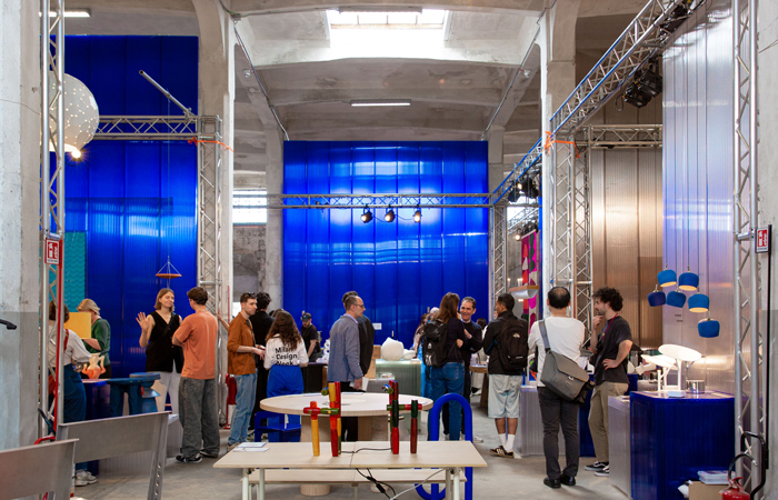
Isola Design Gallery at Lampo. Photo by Anwyn-Howarth
That said, there remains much to be celebrated at this landmark city-wide event, and as ever, this year there were plenty of material innovations and intriguing uses of colour to be found. And all alongside shiny installations by leading car brands, lighting and furniture galore, a maze of red ducting (with accompanying red Kohler toilet), IKEA ice cream hot dogs, and an interior designed by film director David Lynch.
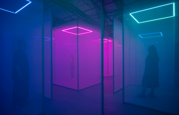
Google Making Sense of Colour. Photo by Edoardo Delille Giulia Piermartiri
Among the broad spectrum of brands using the fair to showcase their wares, Google is undoubtedly one of the biggest, and indeed their involvement has steadily expanded since debuting in 2018. As has become customary, they took the opportunity to challenge our perception of reality through a series of sensory installations, this time created in collaboration with Chromasonic. Each space of the Making Sense of Colour exhibition posed questions and triggered visceral responses regarding what colour looks, feels and smells like. Visitors were invited to enter the first darkened environment without their mobile phones, and once inside discovered an immersive room playing host to 21 semi-translucent pods that played an array of sound frequencies in accordance with ever-changing coloured neon lights, which gently beamed down from above. Enveloped by the glow of light and sounds that resonated through the body, guests were transported away from the buzz of life, and indeed the fair itself, and offered the chance to live entirely in the present moment.
Google Making Sense of Colour. Photo by Edoardo Delille Giulia Piermartiri
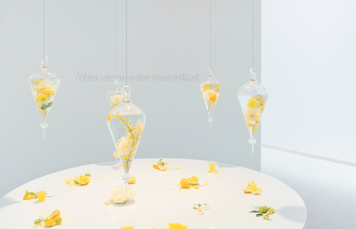
Moving through the interconnected installation visitors were met with highly stylised spaces, each a carefully curated set designed to create a deeper connection with colour. Guests were asked what colour might look, feel, smell and taste like, with visual prompts including a blue sky projected on the ceiling above, falling pink cherry blossom petals made from recycled paper and the citrus tang of traditional Italian Limoncello.
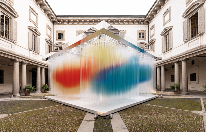
Elica Straordinaria by WE. Photo by Antinori
Continuing with the large-scale and experiential uses of colour, Japanese studio we+ beautifully juxtaposed the Lombard baroque courtyard of Palazzo Litta with suspended translucent poles to create a cloud of colour for the kitchen appliances brand, Elica. Titled Straordinaria, which translates as ‘extraordinary’, it incorporated 2 opposing masses of red and blue that each shimmered and faded around their edges to create bleeds of orange, purple and yellow. Once again, visitors were invited to enter and make their way through the ever-flowing tide of colour and light, which evoked the same sense of circulating warm air generated by Elica hoods and extractors.
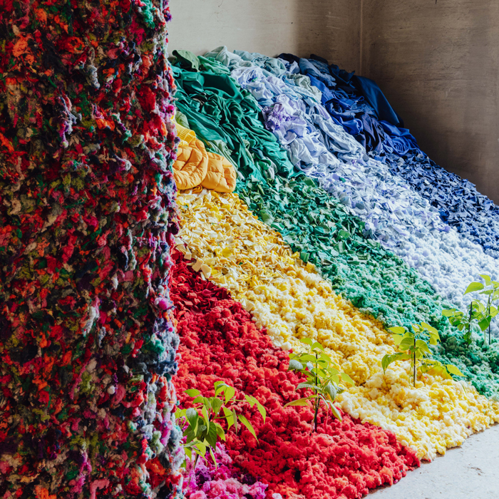
Abricax Benetton. Photo by Piergiorgio Sorgetti, Alcova Milano
Now in its seventh year at the event, contemporary design platform Alcova returned, this time across 2 contrasting venues; the modernist Villa Borsani and the more traditional and ornate Villa Bagatti Valsecchi. With over 70 leading design brands on display, it’s a go-to listing within the fair’s busy programme, and this year colourful creations and installations came to the fore. Designed by Davide Balda and Fabrica for United Colors of Benetton, Telare la Materia (I will weave the matter) proposes alternative uses for the clothing brand’s waste garments. Arranged in heaped piles of individual colours in Villa Bagatti Valsecchi, the rainbow of textiles cascaded toward the ground in increasingly shredded formations, with green shoots of sapling plants poking through at the bottom. As eye-catching as the installation may be, it also represents an ingenious new use for the raw materials, which the brand is calling ‘technosoil’. The textile fibre acts like an artificial soil and fertiliser in one, and the team has also experimented with combining it with clay scrapping from the Sile river to create a vernacular form of building material.
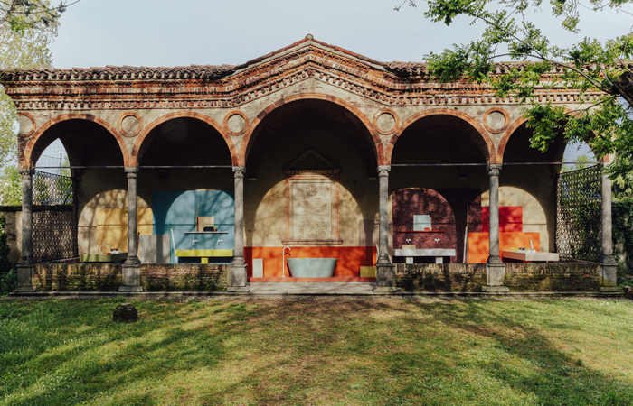
Durat. Photo by Piergiorgio Sorgetti, Alcova Milano
As the title suggests, Porta del Colori (Portal of Colour) was intended to transport guests into a world of colourful creations. Designed by Linda Begroth, the chromatic arrangement of sanitaryware was a celebration of the rich and varied palette of solid surface brand Durat, from which the minimal and sharp-angled products were made. Having already made its reputation for producing surfaces that include recycled plastic, the Finnish manufacturer also took the opportunity to launch Durat Plus, a range that combines PET resin and 80% recycled content.
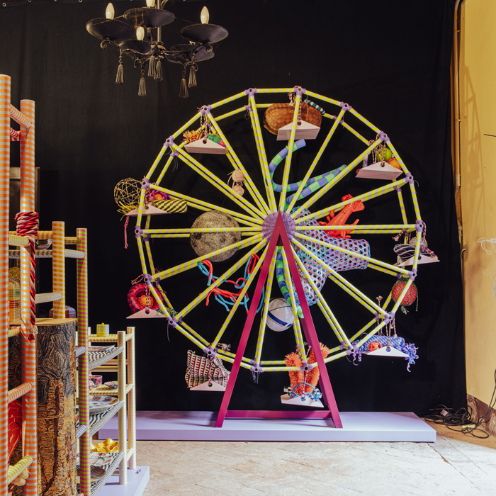
Elvis Post Opblaashelicopter Show. Photo by Piergiorgio Sorgetti, Alcova Milano
At first glance, the collaborative efforts of designers Simone Post, Elvis Wesley and Adrianus Kundert seemed to contrast the highly crafted decoration of the baroque interior, but arguably the outlandish extravagance of their colourful creation represented a modern-day take on the 17th-century Italian style. Having loaded up a van with samples, prototypes and one-offs from their respective studios the intention of the space, equipped with a mini Ferris wheel, was to highlight the craft behind their individual practices. At the heart of all the work on display in the bright and playful fairground was the beat of a shared love for the readymade and reclaimed materials and objects, themselves predominantly made from boldly coloured plastics.
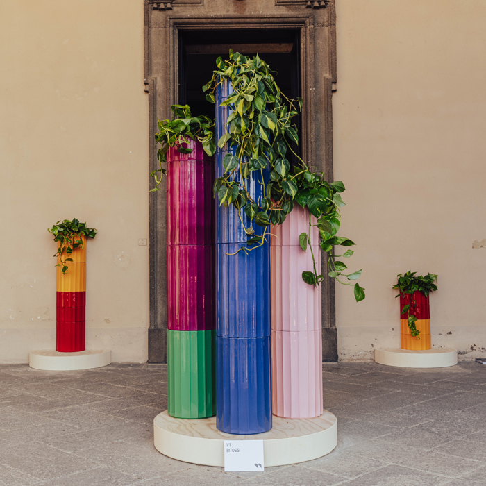
Objects Of Common Interest Bitossi. Photo by Piergiorgio Sorgetti, Alcova Milano
It wouldn’t be Milan Design Week without a strong showing of ceramic surfaces and products and Objects of Common Interest bought with them a collection that draws on both Italian and Greek traditions with the material. Following in the footsteps of designers including Ettore Sottsass, Nathalie Du Pasquier and Faye TooGood, OoCI collaborated with long-established Italian ceramic manufacturer Bitossi Ceramiche to create the new collection, titled Torsi. It comprises of fluted planters that can be stacked to form totemic columns inspired by those found in the grand architecture first conceived in the Mediterranean region. Colourful glazes add a contemporary feel and make each unit a striking piece in its own right, while also allowing for mix-and-matching.
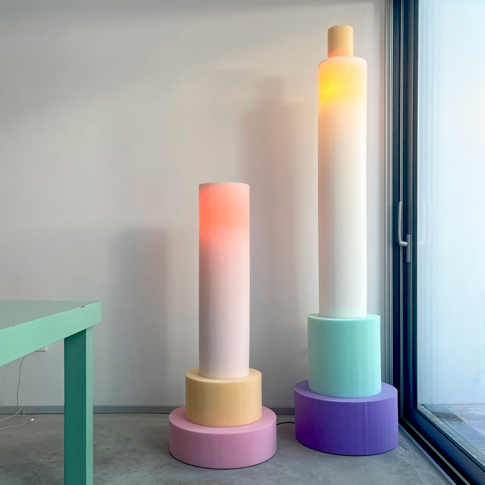
Schuimlampen prototypes, Ricardo en Jeffrey. Photo by Sven Jansse
Dutch designer Sven Jansse’s creations share a similarly totemic form, only Schiumlampen lack the solidity of Torsi – in fact, they’re rather on the soft side. For those with a grip of the Dutch language, this will come as no surprise as the title translates to ‘Foam Lamp’. But this juxtaposition is a deliberate one, and the playful use of the material is intended to contrast the column-like forms, which is pushed further by the soft pastel shades of the squidgy material. Our expectations of what is ordinarily used as a filler in upholstered seating and furniture are entirely turned on their head by the gentle warm glow that radiates from within. The open-cell structure of foam naturally allows for air to move freely through it, which is one of the reasons that is yields and moves under pressure from our bodies so effectively. But as it turns out, there is at least one other use for foam that has, until now, yet to be fully explored.
A little more studio
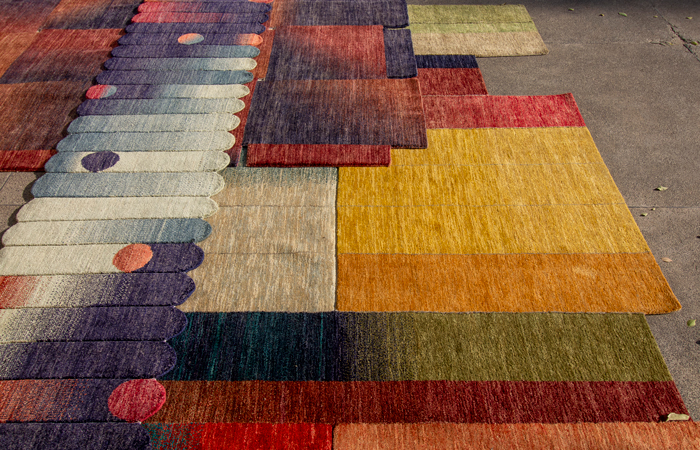
Jansse was one of many cutting-edge designers and practices taking part in the Isola Design Festival, originally founded during Milan Design Week back in 2017. It has quickly established itself as a leading light within the programme, while travelling the globe to participate in events including Dubai and Dutch Design Week, in addition to Material Matters during last year’s London Design Festival. It came with its own theme, and This Future is Currently Unavailable is intended to inspire action by moving away from existing forms of destructive design and manufacturing. A prime example of this came from multi-disciplinary practice *alittlemore studio, whose collection of rugs carries a damning visual narrative told by the coloured yarns within the weave. As the title suggests, the Smog Rug collection is informed by air pollution recorded in the studio’s native Pakistan. Skilled artisans craft alternating swathes of colour from hand-dyed wool in patterns akin to the ‘warming stripes’ used on Greta Thunberg’s The Climate Book, only here the design communicates the difficulties faced in the region, as the design duo explains:
“The labor-intensive process of carpet making mirrors the hardships endured by farmers desperate to ready the land in time for the next sowing season – in their fervor burning expansive swathes of land that pollutes the land and sky for weeks on end, slowly sapping the once bountiful Punjabi soil of its nutrients.”
Mapping the natural seasonal and humanmade changes to the land through morphing assemblages of colour, these rugs remind us that it really is time to rebalance the harmony between humans and nature.