


Nissen Richards Studio Completes Interpretation Design of the National Portrait Gallery
Founded in 1856, the National Portrait Gallery tells the story of Britain through portraits, using art to bring history to life and explore living today. From global icons to unsung heroes, the Collection is filled with the stories that have shaped, and continue to shape, a nation. After a three-year closure, and £41.3m investment, the gallery opens its doors to reveal a tremendous transformation!
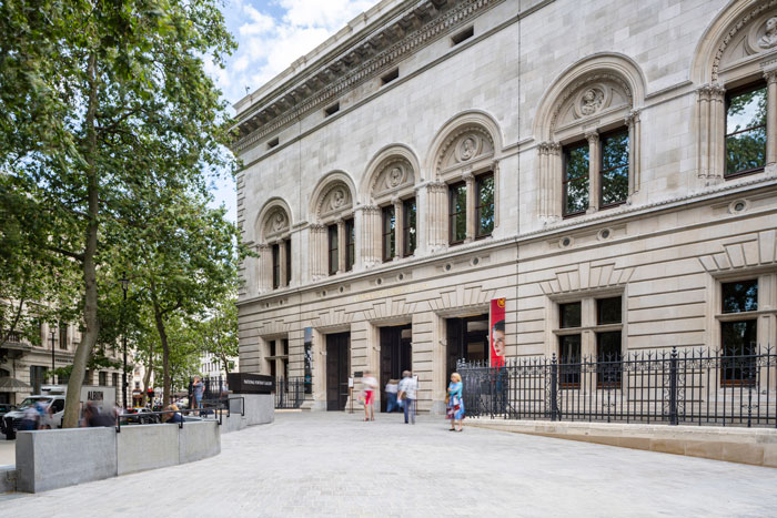
 Before they’ve event stepped through the door a visitor’s experience has been transformed by the new architecture plan developed by Jamie Fobert Architects, crowned by a new entrance and forecourt on the north façade of the Gallery which has been designed to be a high-quality civic space for both the public and gallery visitors.
Nissen Richards Studio is a RIBA National Award-winning architects’ practice and exhibition design studio, working with many of the world’s greatest cultural institutions. It is no surprise that these sector leading designers were called upon for the gallery’s interpretation Design.
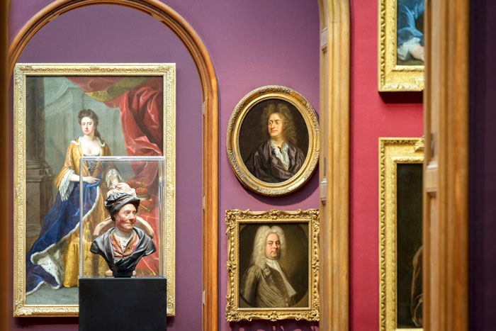
Ondaatje Wing
‘Inspiring People’, the multi-million-pound project to transform London’s National Portrait Gallery, is now complete, following a three-year redevelopment of the Grade I listed building and redisplay of over 1000 artworks. The building was re-modelled by Jamie Fobert Architects, with Purcell acting as Heritage Consultants, whilst Nissen Richards Studio were the scheme’s Interpretation Designers, working on the redesign of the permanent galleries, including the dynamic new colour scheme and the permanent exhibition design, as well as guiding the vision for the overarching visitor experience. Nissen Richards Studio additionally created setworks for the display of the Collection, information panels and digital screens, plus a new family of showcases and plinths. Jamie Fobert Architects and Nissen Richards Studio team had a very fruitful collaboration on the new furniture which inhabits all the galleries.
“Nissen Richards Studio was appointed to the ‘Inspiring People’ project in September 2020, at the height of the Covid pandemic’ Pippa Nissen, Director of Nissen Richards Studio, commented. ‘It was wonderful to win such a major pitch at that point in time. The architecture team had been on board for some time and it was a pleasure at every stage to work closely with Jamie Fobert and his team. The scale of the brief, whose contents had been assembled over many years by the Gallery’s curatorial team, was a huge immersion process for our studio. Getting to know the Collection in depth was absolutely key to our approach.”
National Portrait Gallery Interior Redesign
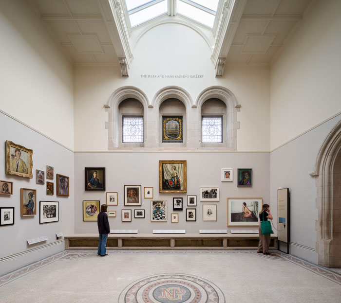
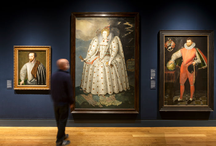
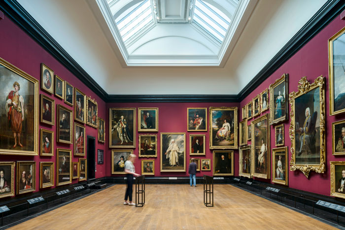
For Nissen Richards Studio, the interior project included working with the Gallery’s project team to realise the ambition for a complete re-hang of the Gallery’s incredible Collection. This included a newly-composed chronological approach and a comprehensive top-to-bottom re-hang in order to display works that were relevant to a wider range of audiences, including bringing out stories about people traditionally under-represented in the Collection and improving the gender balance of artists on show. Set amongst the Gallery’s best-loved paintings are also an increased number of light-sensitive works on paper, including photography, dating from 1840 to the present day.
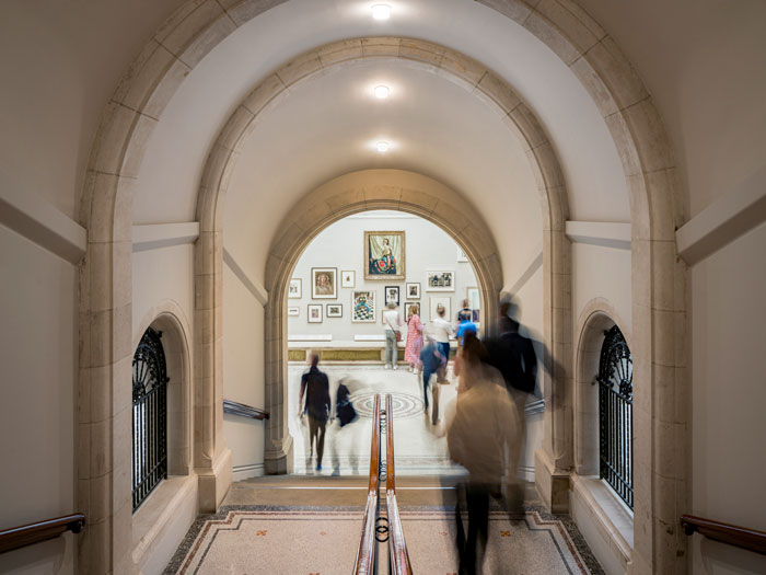
The historic stair has been refurbished with a gallery at the entrance to the Weston Wing
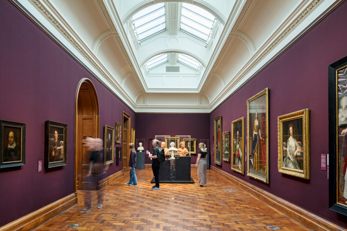
The Gallery’s exciting new sequence of wall colours – some painted and some, on the third floor, in fabric, using a matt pure wool finish by specialist, Suffolk-based manufacturers Gainsborough – was devised and tested in close consultation with the wider team by Nissen Richards Studio, along with new display furniture, interpretation panels, showcases and plinths.
Fabric wall coverings by Gainsborough
“The colour scheme took a long time to establish’ Pippa Nissen commented, ‘but its character really defines the project. We made a principle of using colour as a way of gently helping people find their way through the space, so that the galleries within a certain time period use the same main colour, whilst also shifting tonally through the spaces within each time grouping. At new openings through the spaces, the visitor can see both across time and through a series of different colours in a single enfilade. We took inspiration from the Thorvaldsens Museum in Copenhagen, Denmark for this principle, where saturated colours are used for their series of galleries.”
Visitor Experience – Walk-through
Nissen Richards Studio’s role as Interpretation Designers was to approach the spaces as a complete and integrated design package, whilst also engaging with audiences in multiple ways and considering the totality of the visitor journey. Ensuring pacing and balance within the architectural characteristics of each building section, as well as within each time period and individual gallery, often with different styles and light levels, was a highly fine-tuned design challenge.
Entrance area sculpturs greet visitors
The new entrance sequence includes the addition of a cluster of plinths that greet visitors on arrival like a crowd of sculptures from past and present, whilst a large-scale, dynamic, digital display on the escalator wall marks the beginning of the visitor journey. Throughout the galleries, design display solutions that highlight key portraits and give them new prominence include lightboxes with large-scale photography, integrated digital screens and new vertical display showcases that hold highly light-sensitive works, ensuring an equality of emphasis for these works.
Newly opened windows in Room 29
On the second floor, the original perimeter windows that had been blocked up for many years were re-opened as part of Jamie Fobert Architects’ vision for the building, so it was important to underscore this change and make sure those rooms felt to be light and fresh spaces. Nissen Richards Studio worked closely with long-term collaborators, lighting designers Studio ZNA, to fine-tune the lighting approach to these galleries.
Room 1 on third floor
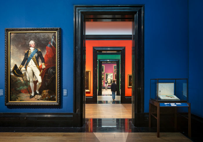
The strongest colours were used for the fabric-lined galleries on the third floor, helping visitors navigate and connect these spaces. For example, there are three blues, three reds and three greens used here, as well as a crossing room in a deep red. These are bespoke colours, which feel to be of the period but also work well with the Collection, and were fully tested in situ during the development process. In one direction, visitors see all the tones of a single colour and in the other the visitor crosses through time and therefore also crosses colours.
Duveen Wing
The Duveen Wing on the third floor is in a notably-different architectural style, dating from the 1930s and featuring marble door surrounds and detailing. The colours in the enfilade here are particularly bold to meet this context, ranging from bright blue and bright orange to deep red and bright green, ranging from bright blue and bright orange to deep red and bright green, giving this suite of rooms a very different and particularly bold feel.
On the second floor, on the North-facing external galleries, especially following the return of natural light through the opened-up and restored windows, a Farrow & Ball paint colour was used in The Blavatnik Wing to connect the spaces – Green Smoke. In the three rooms without daylight, a bold, darker colour is used to draw the visitor in – Brinjal. A central long gallery with paintings on both sides is in a quieter tone – Dovetail, culminating in Dame Laura Knight’s key work at the end of the central axis of a gallery painted in Charleston Grey.
The dramatic hang in Room 18
There is a shift of colour within the contemporary rooms in the Ondaatje Wing that are painted in a luminous Cornforth White, with colourful, fabric-lined screens. The Weston Wing keeps to the Cornforth White generally and moves from Farrow & Ball colours to accent colour walls by Little Greene in Hicks Blue and Theatre Red, with the latter used for a room dedicated to death masks – including the masks of Williams Blake and Wordsworth, as well as Marc Quinn’s famous blood head self-portrait. The more flexible, ever-changing display of the ground floor – The National Lottery Heritage Fund Gallery – needed to have a neutral background and so is in Cornforth White once again, as is Room 33, up the historic stairs where a more contemporary hang, focused on female self-portraiture, is located.
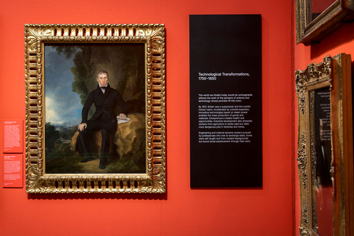
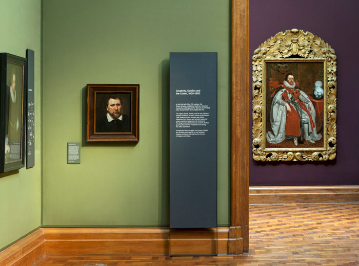
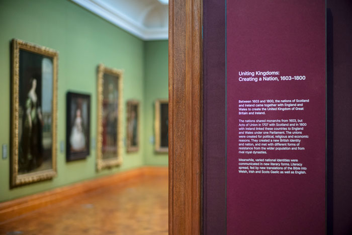
Information Hierarchy
Room Totems and Other Information Panels
Room 4, with Room 3 behind, with room panel set into metallic frame
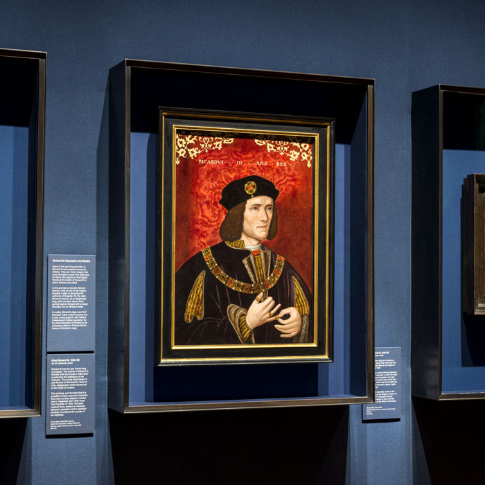
Each room features a 2.2m-high interpretation panel, designed by Nissen Richards Studio. These look and feel freestanding but are actually pinned to the wall at the rear. All have a cool-toned, darkened patinated brass surround, manufactured by Capisco, with some additionally featuring a patinated metal ‘foot’. The decision on which to use depended on working with the given architectural features, including datum or skirting lines, which vary in the different spaces, whilst there is no skirting at all in the more modern Ondaatje Wing. In places where the rooms are slightly narrow, some panels are hung directly onto the wall.
‘The interpretation panels are tall and striking because it was important for visitors to locate them easily, especially in rooms which can be entered in two, three, even four ways’ Pippa Nissen explained. ‘They are part of the overall family of furniture and always compliment the colour of the walls. The panel itself is deep blue in the blue rooms, for example; deep red in the red rooms and a shade of charcoal in the green rooms, whilst a pale stone colour was used for the lighter rooms.’
The panels themselves were made in materials from two different suppliers, in order to obtain the exact shade required. Some are made from Richlite and some from a product called Paper Stone. Both have good eco credentials, with Paper Stone, for example, a composite of recycled paper and natural resin. The panels then have a leathered or waxy finish, added when Displayways did the text printing and then sealed them.
Room 3, with view into Room 4 on third floor
A secondary level of information is displayed on section panels, float-mounted from the wall. These are in Through Material, which has an embedded colour, rather than just a top layer. As these are 12mm deep panels with exposed profiles, the colour was therefore also visible from the side.
Finally, there are the individual painting titles. These were applied to stock paper wrapped around card with a shadow gap and then float-mounted, with raised text. Some titles are in stock colours and others were printed in specific colours to match the surrounding walls.
Box Frames
New box frames protect and amplify fragile works
For the smaller paints in the Gallery’s Collection, a family of box frames was designed to give them added presence. Some boxframes are glazed, whilst others are open. Some feature patinated metal on both the interior and exterior of the frame, whilst some have only metal on the exterior, with a fabric internal frame lining. This decision is determined by the artwork’s individual conservation requirement. In some cases, the external box frame is also a little oversized to ensure the track lighting doesn’t create a shadow on the painting.
Showcase Tables
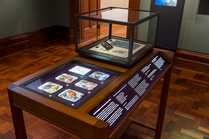
New timber table case holds works on paper with accessible angled information label
The concept for the showcase tables was developed by Jamie Fobert Architects and incorporates the chamfered corners of Ewan Christian’s original architecture. These were further developed by Nissen Richards Studio, together with the curators. Extensive accessibility testing took place for these, ensuring the height of the showcases for wheelchair access was correct, whilst the legibility and visibility of shapes, labels and typefaces was fully considered. The setting of the information panels at an angle to enable easy for all was particularly important. A whole set of variations of the showcase table was further developed by Nissen Richards Studio, responding to the content developed by the Gallery.
On the third floor, for example, the material palette for the tables is a rich, dark walnut burl veneer, with a slightly mottled look. For the Duveen Wing, the tables are also dark, whilst for the second floor, the chosen wood is iroko. All the showcase tables are of uniform height, with the base of each 900mm from the floor. Each showcase has a side hood which allows viewing from both sides and creates a very minimal look overall. The patinated brass frame of the display element encloses a sloping internal section for accessibility. Chunky mounts were avoided and the display has been kept very elegant with just the use of rod or bar lighting.
The tables are used for photography and prints and to allow the possibility of showing more sensitive works. There are over 30 tables in total, including some with an AV device for, eg, clicking through a book of Victorian street photography. These look very simple but are complex pieces of equipment with all controls and dimmers sealed below. For tables that are internally lit, the information panel is backlit for clarity, using Duratran, which sit between a sheet of Perspex and the lightbox. When externally lit from the track lighting, the information is on transparent film with a matt transfer set into patinated metal.
Vertical Display
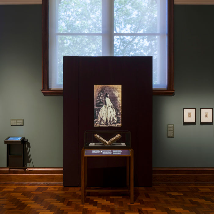
New screens housing photographs sit in front of newly exposed windows status
There are also some freestanding wall cases and screens for vertical display. These took inspiration from Carlo Scarpa’s screens in his gallery designs, including Castelvecchio in Verona. These elements, up to 2.2m in height, sometimes contain or hold just a single artwork. They proved particularly suitable for the expanded Collection brought to the fore as part of the re-hang. They could either be hung from the wall or used to contain portraits, depending on scale and are a part of the exhibition design, but with the qualities of pieces of furniture. They also allowed for the transformation of galleries and viewpoints, including vistas along a series of spaces to a particularly important work. On the second floor, where the opened-up windows are large in scale, only very small artworks would have been possible between or below the windows, whilst these can stand in front of these along key vistas.
Other wall-mounted showcases are included in the galleries of miniatures, death masks and daguerrotypes. The internal background for these are fabric, with some that look like shot silk but are in fact a conservation-friendly faux silk from the James Hare range.
Plinth Design
Different forms of display from paintings to sculpture and from text to digital interpretation
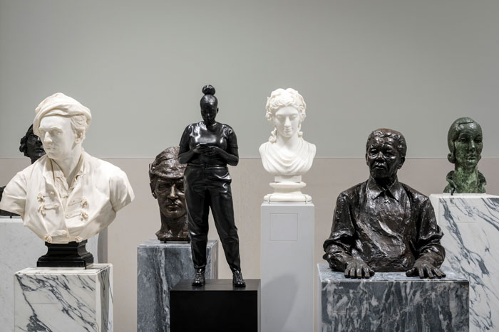
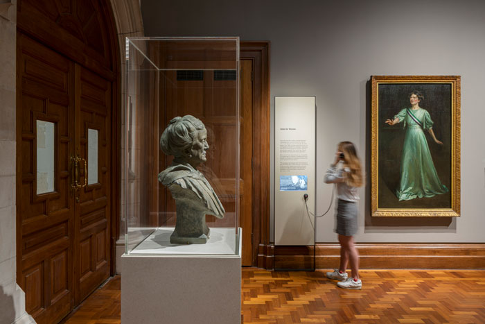
Plinths feature throughout the Gallery, creating connections across time. They present busts from the Collection at head height to give the impression of ‘meeting people from the past.’ The form of the plinths nod to the original marble plinths, but are in a more contemporary iteration. Nissen Richards Studio selected the marble directly with suppliers Diespeker & Co to ensure the right textures. There’s a mix of circular and square plinths overall, with some subtle design moves, including a shadow gap at the base and a routed detail at the top. Marble was used wherever possible, but, where there’s a hood (meaning inbuilt access panels were needed) or more neutral tones, a matt-sanded solid surface HI-MACS material was used instead.
There are also clusters of plinths for added dynamism with the sculptures they host arranged to face in different directions. A large cluster, including sculptures in bronze or stone, faces and greets visitors in the new entrance area. The curators worked particularly hard here for the right mix of time periods and representation. The plinths also feature a very subtle labelling detail. These are routed out a very thin border with matt transfer layer in order to create a seamless finish. Where the marble is a simple form, these are transparent and where the marble veined, a slight wash is used.
Pippa Nissen concluded:
“This has been a once-in-a-lifetime dream project for me personally and the culmination of a lifetime’s work in theatre and architecture. It encompasses everything I love about our work at Nissen Richards Studio – paintings, sculpture, photography, colour and people!”
Alix Gilmer, Inspiring People Project Director, said:
“The Inspiring People Project has comprised the largest and most complex redevelopment in our history and I eagerly look forward to welcoming visitors back through our new doors. Thank you to Nissen Richards Studio and our brilliant collaborators for their work on this project, which has transformed the way our visitors will navigate and experience the new National Portrait Gallery.”
Photography by Gareth Gardner for Nissen Richards Studio