


Brand Identity: BCFA becomes Commercial Interiors UK
After over 50 years supporting the commercial interiors sector the BCFA secured the future of the association, enabling them to be even louder in sharing knowledge, education and providing business support in everything from exporting to sustainability, by launching a new brand identity, and their new name, Commercial Interiors UK.
A new strategy for the association was drafted and, in order to deliver that strategy for their members, a new visual identity was required. Branding Designer Vanessa Marchant-Williams was entrusted with the responsibility to create a new identity for Commercial Interiors UK and our Design Insider team caught up with Vanessa to find out more about her process.
How did you start working with Commercial Interiors UK (formerly the BCFA)?
I have been lucky enough to work with the Design Insider team for a number of years, working on their logo refresh, social media campaigns and various other projects.
The team then kindly put me forward to pitch for a project for the BCFA, which I won and so I began working with them on various projects including the Berlin and Dublin OPENs, Clerkenwell OPEN, the Showroom Directory and many more.
Over this time, I have come to get a strong understanding about the role the Commercial Interiors UK plays in the thriving and ever-changing commercial interiors landscape, championing the best of UK interior product design and sustainable manufacturing.
And, so onto the rebrand…. Can you tell us more about that?
I was thrilled when I was approached to look at the brief for rebranding the BCFA to become Commercial Interiors UK.
The working group, led by Chairwoman Carolyn Mitchell, worked together to draft a new strategy for the association. Alongside the new strategy, after deep thought, research and discussion, the decision was made to change the name from the BCFA to ‘Commercial Interiors UK’, with the feeling that this was a more inclusive and contemporary update to the name.
With the new name decided.. let’s talk more about what inspired the new branding?
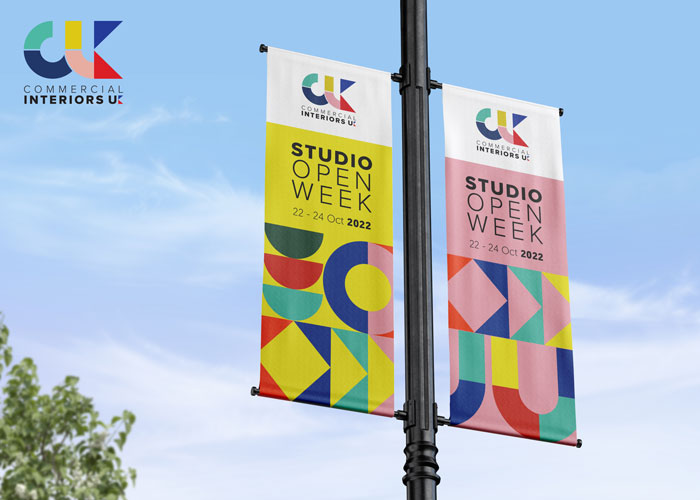
My first step was to establish exactly what was going to underpin the rebrand. I came up with 3 visual pillars, Adaptability, Vibrancy and Timelessness. I knew that the new branding had to work well across the 3 key member offerings; Knowledge and Education, Connecting the Community, and Business Support, whilst looking cohesive and vibrant to stand out in an already design led visual landscape… tough competition!
With the three visual pillars established, I could move onto the fun part. Inspiration came from two of my favourite movements in design, the Bauhaus movement and the Mid-Century movement. Two classic design eras that have remained timeless and vibrant for the past 70+ years. Bauhaus typographic and Mid-Century design principles are still highly relevant today, as are the colour palettes and shapes used across both eras.
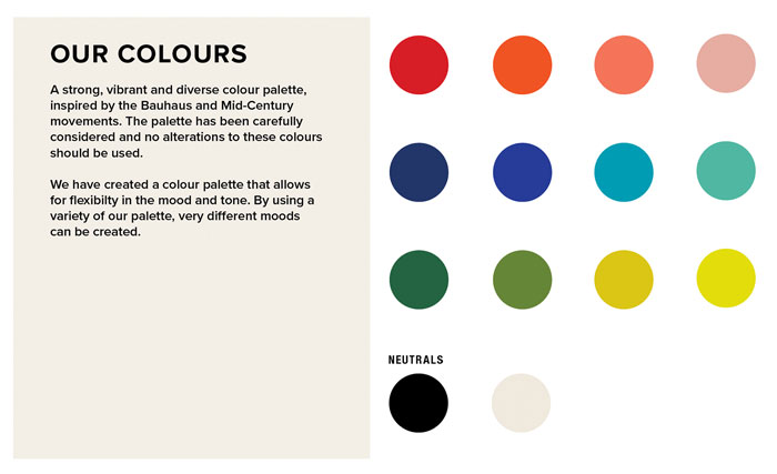
The colour palette is an integral part of the rebrand. Each colour was carefully considered to sit well within the palette. The beauty of this new colour palette is that it can be used in various iterations to create very different moods and feelings. I was keen to avoid a colour coding scheme, as I wanted to keep the palette adaptable, so within the brand guidelines there are suggested combinations to evoke very different looks and feels. The pink proved to be the hardest colour to get right, finding the sweet spot between bubblegum pink and muddy pink, but I am happy with where we ended up!
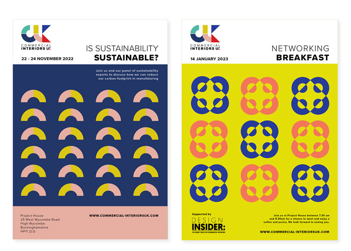
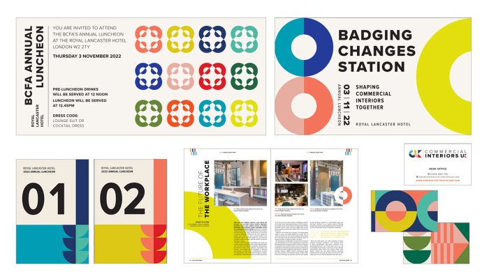
The strong graphic shapes again, are highly adaptable and can be used to hold either a solid colour, or an image of a product or brand. Drawn from the Mid-Century aesthetic, they have been chosen carefully to look balanced and clean. Careful consideration was given to these shapes and how they can be used strategically to subtly represent various offerings. For example, in the images below, I have shown how they can be used to represent a talk, with chairs in rows listening to a speaker, or as tables at a networking event. The shapes also sit perfectly alongside the new tagline ‘Shaping the Future of Commercial Interiors’.
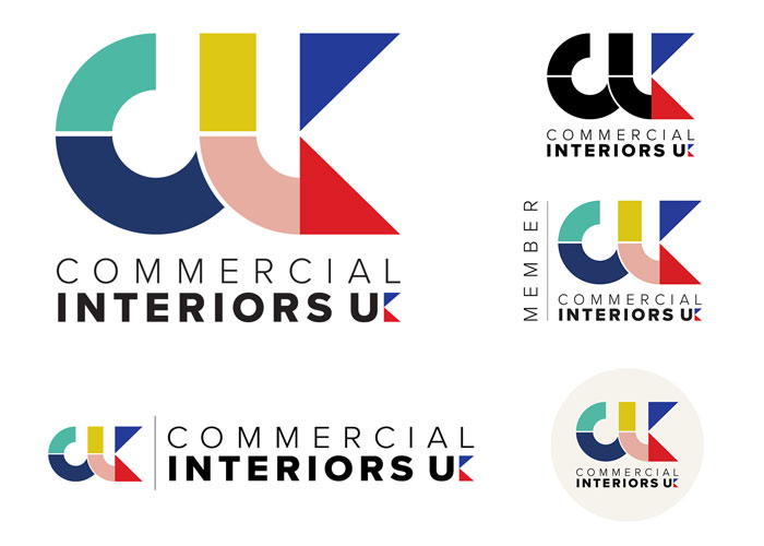
An important consideration was for the logo to promote the advancement of the UK’s creative talent in the Interiors sector. I was determined to avoid any Union Jack clichés and so instead, designed the blue and red ‘flag’ as the letter K, as a more subtle nod to the United Kingdom.
The horizontal keyline through the logo itself was added to give air and light to the logo, and to highlight each shape clearly. Combined with a clean, geometric san-serif font, the logo looks fresh and contemporary, but will stand the test of time too!
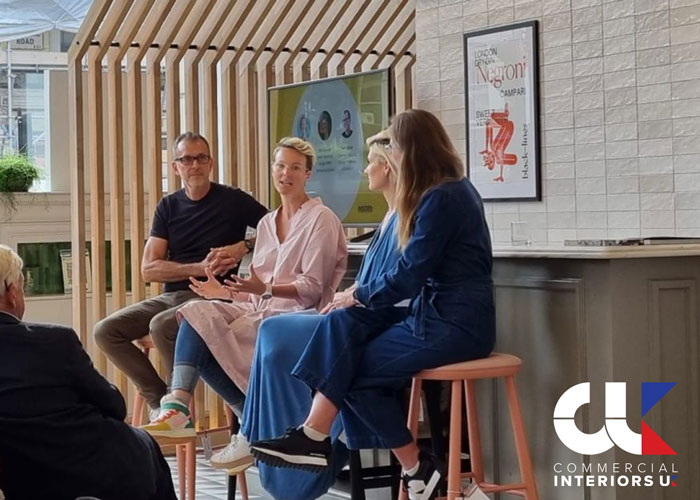
It was wonderful to be able to showcase the new branding at the recent Annual Luncheon at the Royal Lancaster Hotel and to hear the positive feedback from Members first hand. I am so grateful to have had the opportunity to work on this project and look forward to working on future projects with Commercial Interiors UK and seeing the branding develop over the years to come.
Can you tell me a little bit about you and your background?
For as long as I can remember, I have always been interested in the world of design. I’d ask for Interior Design books for my birthday presents and would always save up my pocket money to buy Design magazines. So I was thrilled, many years later, to Graduate from Bath Spa University with an Honours Degree in Graphic Design. It was a fantastic University filled with design masters who taught design ‘the traditional way’.. pre computers! There was even a traditional letterpress print studio where we learnt about the intricacies of typography .After graduating in 1999, I worked in various design studios, first in London and then later moving to Sydney, Australia.
I stayed in Sydney for 13 years, working as a Graphic Designer for a number of small to medium design studios, before entering the very different world of inhouse corporate design, working for large Professional Services firms (Maquarie Bank and Ernst & Young).
Despite on the surface, these being less ‘creative’ roles than studio work, I learnt so much about brand values, the importance of brand guidelines and keeping the stakeholders (client) happy without compromising good, creative design!
I moved back to the UK with my Australian husband and our 2 young boys in 2015. Since then I have been working as a Freelance Graphic Designer in Chichester, West Sussex. I love the flexibility this affords me, and also gives me the chance to work with clients on projects that I really feel I can add value to.