


Colours For the Year to Come
It feels like a lifetime ago that I emphatically wrote:
”2020 has a certain ring to it; the staccato rhythm of the repeated number is direct and distinct. Connotations of clear and precise vision are pertinent…its time that we look ahead with sharp focus and start making conscious and challenging decisions in the way that we manufacture and consume.“
This year will certainly be one for the history books but perhaps not for the reasons, I was so hopeful of.
The entire world has become an almost entirely unpredictable place to be and looking ahead to the future in the hope of making plans, at times, feels fairly futile.
But, as the dawning of autumn brings changes in colour across the natural landscape, sections of the design world continue to offer predictions for the colours to look out for, and to use, in 2021. This is particularly relevant to our interiors, with numerous paint manufacturers now sharing a similar format for delivering their “Colour of the Year” and associated colour palettes.
Sounds rather convenient for a section of the manufacturing world that is dependent upon consumers with a desire to decorate – be they people starting a project at home or designers creating commercial specifications. But, whilst it cannot be denied that the whole process is very much a clever marketing device, deployed at a time of year when the majority of those in the northern hemisphere are getting their heads around spending the majority of the next 6 months or so indoors, there is a lot more to it all than simply picking nice colours and selling paint.
I can say this with a degree of confidence because I was once again involved in the putting together of Dulux’s Colour Futures international colour trends forecast for 2021, which launched at the start of October (and we’ve already started work on 2022.) And whilst each company will go about things in slightly different ways, and no doubt have some form of agenda to consider, the process has become a relatively universal one. Essentially it involves a panel of industry specialists, who come together to share their insights of the lifestyle trends that they have picked up upon within their industry or region. Significantly, these drivers are considered for how they will affect the way we live in the near future – in most cases that’s in 2 years time. With this scope of thinking a selection of diverse narratives for the near future are formed and it is from these that colours are then considered.
Indeed, as I can testify from my personal experiences with Dulux Colour Futures, it’s a human-focused process.
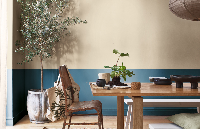
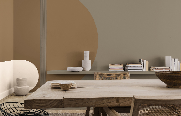
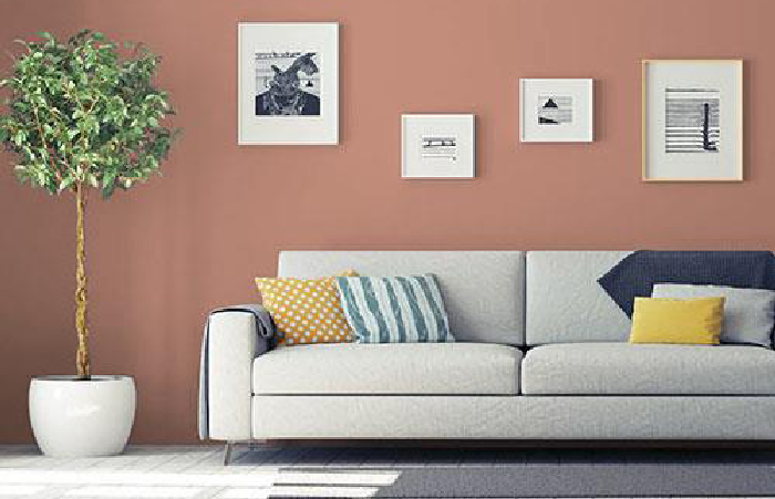
With an unparalleled level of adversity felt around the globe, myself and the rest of the internationally formed panel sought to underline the strength that we can draw from nature as well as our collective growing desire to align more with the planet. This led to the selection of Brave Ground as Colour of the Year, and the elemental tone is both warm and neutral whilst offering the opportunity for the other 4 associated palettes; Earth, Trust, Timeless and Expressive to shine. Even with after the unprecedented breakout of the pandemic, the narratives and underlying urges they suggest still ring true; we seek balance, sanctuary, past wisdom and future hope as well as the chance to express ourselves. And what’s more, we seek the connection and comfort of nature and our homes more than ever.
If the selection of a brown shade seems outlandish or deliberately divisive, it may be worth looking at other predictions because Dulux aren’t the only paint brand to point towards that end of the colour spectrum. Urbane Bronze is Sherwin Williams’ selection for their Colour of the Year, and it’s an even darker shade of grey-brown. But what’s most telling is that the narratives behind the selection, in places at least, reflect some of the key factors found in Colour Futures. Taping into nature, creating down-to-earth tranquillity and creating a connection to nature are the common concepts, and there are once again 4 vaguely familiar colour narratives with associated palettes within the Colormix Forecast – Sanctuary, Encounter, Continuum and Tapestry.
Surely crossovers to such human-focused predications point to the forecasts representing a zeitgeist for 2021?
Further proof can certainly be found in the predictions made by Johnstone in their Voice of Colour forecast. “Brown is the new grey” is arguably the most blunt appraisal of the collective assumption that we’ll be turning to warm shades of neutral browns in the near future – and it’s directness drives the point home. Once again citing a desire for balance and a heightened awareness of the importance of the wellbeing of people and the planet, Transcend is a warm hue with a red undertone. But it is a shade of brown nonetheless. It is selected as the Colour of the Year but is joined by earthy shades such as Big Cypress and Misty Aqua, which also create a 3-way Palette of the Year.
![]()
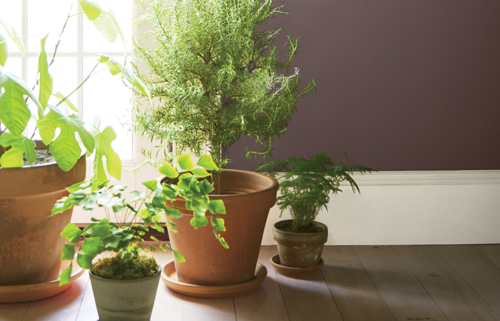
The surge in elemental colours clearly has a strong connection to the land; to soil and earth, but, as seen in Dulux’s Earth trend, oceans and natural waterways are also prime reference points when it comes to connecting with nature.
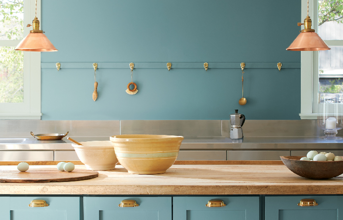
This seems to be evident in Benjamin Moore’s selection, Aegean Teal. The rich blue-green shade evokes the depths of the sea and the drivers behind it’s selection confirm this – once again inviting us to find harmony and balance and to reflect and reset. But if you’re now convinced that it’s actually an earthy shade that you desire to do so, don’t fear, Benjamin Moore have also selected warm neutrals tones of brown within their selection of 12 colours that make up this years predictions.
Whatever the shade selected, colour predications and proposed selections for next years Colour for the Year are born out of in-depth and considered research and represent a hopeful appraisal of how the universal influences that we are facing will help to shape our lives. It’s not a science but it’s not a rabbit out of a hat either. Colour predictions generally manifest as glossy marketing tools that feature a range of colour palettes with imagery of numerous high-end room sets. But ultimately this means is that any discerning designer or decorating enthusiast can take inspiration from the elements that they are drawn to; safe in knowledge that a collection of minds from across the globe have painstakingly considered, and often argued about, what are the biggest drivers in our lives and with it, the most suitable colours to bring the narratives of our lives.
With a great sense of uncertainty and continued discomfort expected across the globe, elemental and earthy tones certainly seem to represent the zeitgeist of 2021.
Comments