


Dulux launch Colour of the Year
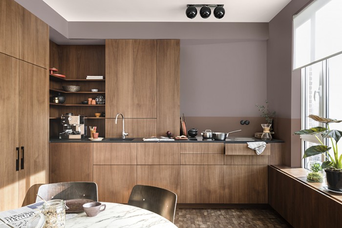
It had been announced! The planet has been scoured for the latest developments in lifestyle trends. Assessments have been made as to how they are impacting the way in which we live. And now the team of industry experts assembled by Akzonobel have made their colour predictions for Dulux Trade and with it, selected the Colour of the Year for 2018. Responding to times of great unpredictability and uncertainty the Heart Wood trend seeks to offer solitude and a warm, safe sense of home – no matter what space it is used in. The lead colour is inspired by beautifully warm wooden materials, which the team had noticed appearing in interior decorating and architecture around the globe.
The warmth of the lead colours, inspired by red tinted woods and tactile natural leather, offer a sense of comfort. They sit neatly with lighter neutral tones and soft shades of cocoa, with rich accents of inky blue – a flow through from last years Denim Drift palette, as well as deep purple in the mix. The palette exudes a sense of calm and serenity making it perfectly suited to residential and hospitality contexts, whilst still offering a soft and gentle option for education and commercial spaces.
Reflecting on the ColourFuturesTM colours and trends for 2018, Rebecca Williamson, Senior Colour and Design Expert, added:
“Dulux Trade’s colour of the year for 2018, Heart Wood, is incredibly versatile, and connects beautifully with the accompanying trend palettes for the year ahead. Providing the comfort and reassurance we’re all seeking, it’s the perfect antidote to the mood of the moment – channelling a real sense of calm and warmth during such times of uncertainty. We can’t wait to see spaces across the globe transformed into true sanctuaries.”
The annual launch event took place yesterday at the suitably superlative Spring Restaurant housed within the walls of London’s Somerset House. Along with Heart Wood, 3 other trends have been created in response to the key drivers: The Comforting Space, The Inviting Space and The Playful Space. Central to them all is the idea of creating spaces that offer comforting sanctuary amidst a world of uncertainty and constant information sharing. The event itself was a cozy affair with beautifully styled dining tables offering a sumptuous environment with which to see and hear about the trends, as well as tasting food inspired by them as created by Michelin Star chef Skye Gyngell.
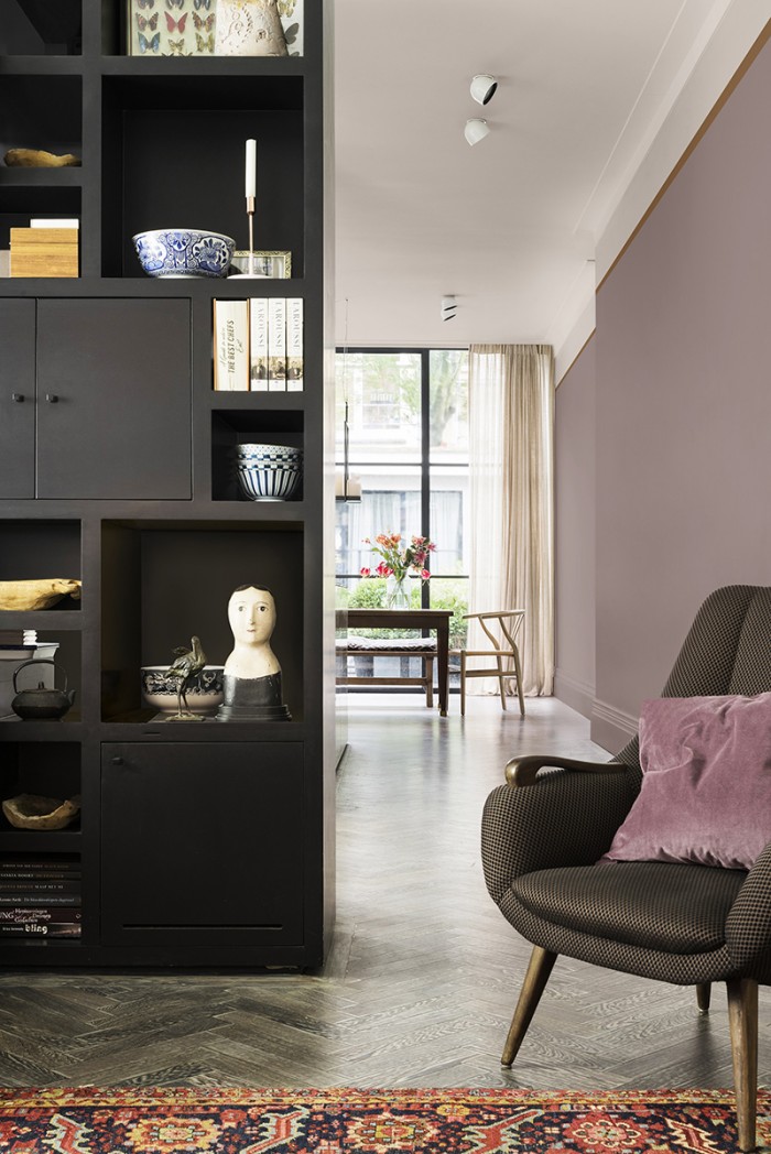
The Comforting Space has a rich and warm palette, which reflects a sense of grown-up living and the luxury of relaxation. With heritage hues such as terracotta and antique this palette radiates elegance and allows for rich textural combinations including warm woods, leather, silk and velvet.
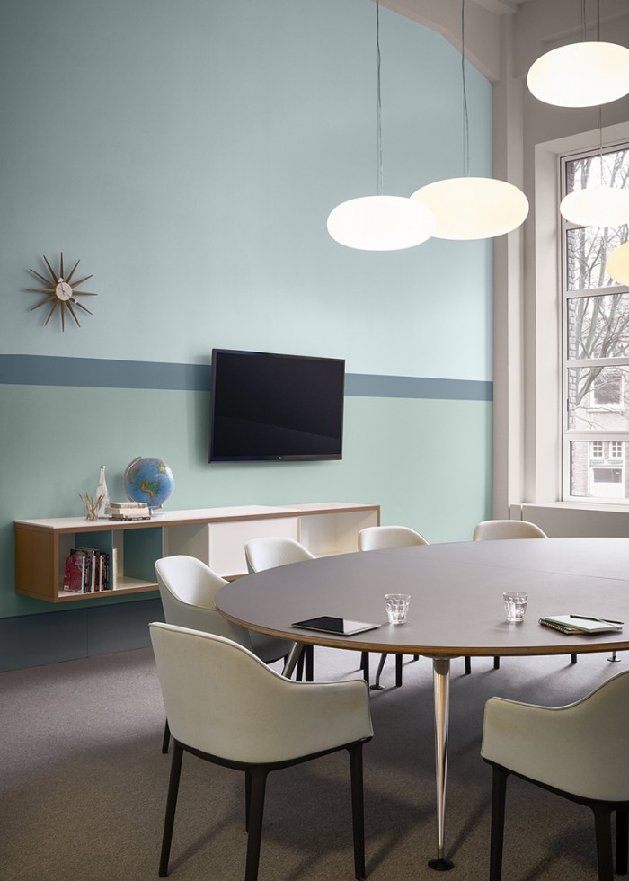
The Inviting Space offers cool shades of blue that are supported by sea green and pale neutrals at each end of the spectrum. With Heart Wood creating a subtle contrast right in the middle of the mix this palette helps to create easy going environments that foster clear-headed thinking. Developed with the healthcare sector in mind this palette allows for proportions of coloured surfaces to be utilised to indicate the purpose of a room, or to signal a transition to a different area.
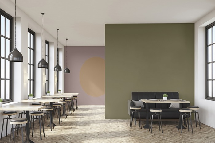
As the name suggests, the Playful Space is the most fun and exuberant of the trends. As with all of the palettes, the colours aren’t overly saturated or luminous, they are in fact rather more manageable and easier on the eye due to subtle grey tones within the mix of the colours selected. However, the Playful Space palette is still fresh and simmering with energy. Inspired by nature, the colours work well in most environments although the balance of synapse firing, imagination sparking yellows and greens alongside the more calming neutral tones lend this palette perfectly to the education sector. As well as this, it also offers a genuinely useful scheme when seeking to augment the principles biophilic design.
For more information about ColourFuturesTM 2018 visit the website