


Why So Blue?
The Design Insider Wellbeing campaign launched in January, encouraging members to share how they address wellbeing in their own business and the sectors in which they operate. As an association, we believe in the power of working together, so were delighted to hear how three of our members decided to collaborate on a joint mood-board challenging the perceptions surrounding the colour blue.
We asked the marketing heads from each company why they had decided to collaborate, and it became clear that they had not only enjoyed sharing ideas, but the process had positively affected their own wellbeing.
Megan Logan, Marketing ILIV, collated the ideas to produce the mood-board, and explained,
“We’ve been so restricted over the past 24 months in terms of travel and networking, it makes a refreshing and exciting change that we’re able to work together and share ideas, trends and plans for the upcoming 12 months.
“We’ve been able to pull on each other’s strengths and knowledge to work together in creating powerful and thorough ideas for our customer to grab ideas and feel inspired and confident to use blue in their schemes.”
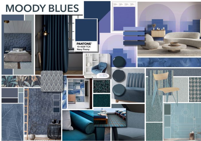
Eleanor Cardwell, PR and Marketing Manager, Newmor created the first Moody Blues board as part of their 2022 trends, so was delighted that other brands wanted to add to it. She said,
“It’s been wonderful to meet with likeminded brands to share ideas and insights. The opportunity to see inside our collaborators design, marketing and sales teams has been immensely valuable in developing our culture and creativity. We believe that collaborating is so important in terms of supporting other businesses, sharing knowledge, and continually looking for something new and interesting to offer our customers.”
Heidi Bruvik Westberg, Head of Global Marketing, Table Place Chairs, suggested building on Newmor’s Moody Blues trends as their first collaborative mood-board. She explained why it’s been so important working with like-minded people, “One of the many things I learnt during lockdown was the strength in collaboration. We all carry different experiences, tastes, perspectives, every one of them is valid, so why not pull out our best and combine them into something inspiring for others!
“From a Marketing perspective, the last two years has been a be a particularly challenging time for creativity. I believe our collaborative approach encourages creativity, as it’s supportive of one another and of course carries equal benefit for our content calendars.”
Eleanor’s explains how the blue palette relates to Design Insiders Wellbeing campaign, “We’ve been looking at Wellness this February. We’ve seen lots of gorgeous trend boards featuring cosy neutrals, biophilic design, and organic textures and we wanted to come at the Wellness concept from a different angle. We chose blue as a reflection on the rejuvenating effects of the sea and sky, and in contrast to the idea of the ‘January Blues.’ In colour theory blue is known for its overall positive associations, symbolising peacefulness, tranquillity, and security.”
Megan agreed, “Blue has, in the past had negative connotations and associations attached to it such as ‘feeling blue.’ 17th January was coined as ‘Blue Monday’ the most depressing day of the year where people are feeling deflated after the festivities and are beginning to reset their resolutions, it was later adopted by the Samaritans as Blue Monday, encouraging people to talk about their problems and worries with people they love to bring people together.
“We wanted to reinvent blue, banishing the stigma and bad press and give it a new name, representing the sea, sky, space and nature and pulling on how we can enliven interiors.”
Heidi summarises, “We are by no means trying to reduce the importance of Blue Monday, it’s an essential day to acknowledge that this time of year is not easy for many. But blue is also calm, peaceful, and tranquil.
“A blue palette can induce a silent calmness that we yearn after busy periods. A minute to take it easy on ourselves, to pause and re-set our minds into the following months’ challenges and opportunities. It’s ok to be quiet while we figure out what this year means to us.
“Open blue skies and oceans offer a calm canvas to reflect, think and plan. These elements also bring the thrill and anticipation that spring is on the way. Everyone has a different experience through January and February, so it’s essential for workspaces to create a place for calm contemplation, where we can take a deep breath before building our absolute best year.”