


10 Themes we Found at WOW!house 2026
WOW!house has always offered designers a rare kind of freedom. Without the usual constraints of a private client brief, each room becomes a place to test ideas, sharpen a studio’s voice and show what can happen when designers, brands, makers and creative partners are invited to push a concept further. Across this year’s rooms, that freedom translated into spaces rich with narrative, atmosphere, craft, memory and surprise.
From reimagined heritage to female-led narratives, from theatrical escapism to quietly detailed craftsmanship, these are the ten themes we found at WOW!house.
-
Heritage, reimagined
One of the clearest themes to emerge at WOW!house was that heritage is at its most exciting when it is actively reinterpreted. Designers were not using history as a fixed reference point, but as a language to edit, layer and bring into the present. Across the rooms, tradition appeared through country house references, Art Deco influences, antique forms and established decorative codes, yet the strongest schemes resisted nostalgia in favour of something more personal, contemporary and alive.
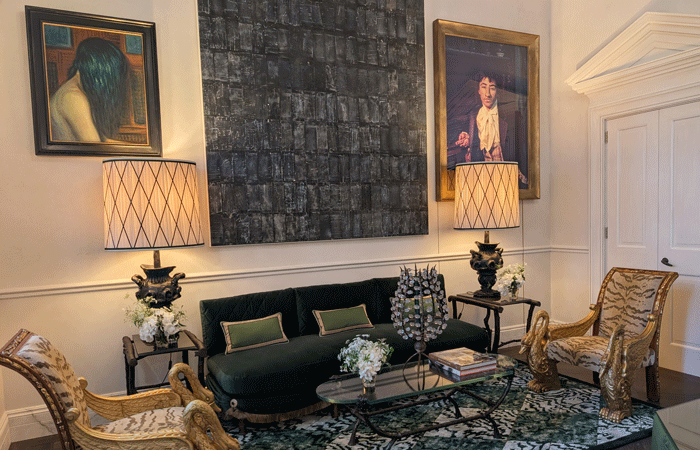
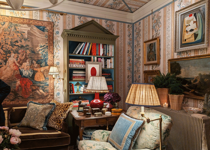
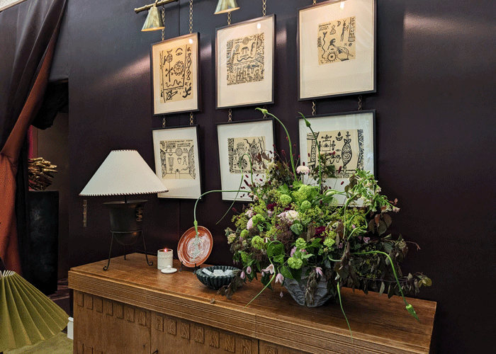
Entrance Hall by Francis Sultana ‘The Art of Arrival’
In Francis Sultana’s Entrance Hall ‘The Art of Arrival’, the idea of the English country house was disrupted by contemporary art, including a Cindy Sherman portrait described as “a nod to a 19th century traditional portrait,” creating what the speaker called “the balance of the contemporary and the historical meeting.”
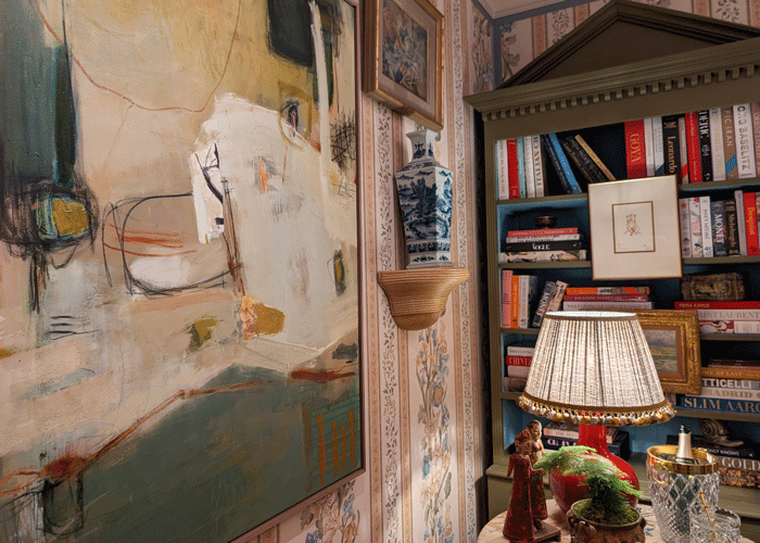
In Albion Nord’s Drawing Room ‘Custodians of Craft’, the design married tradition with youthful design, creating a room that reflected Albion Nord’s position as a young studio bringing fresh energy, confidence and contemporary ease to a formal interior typology.
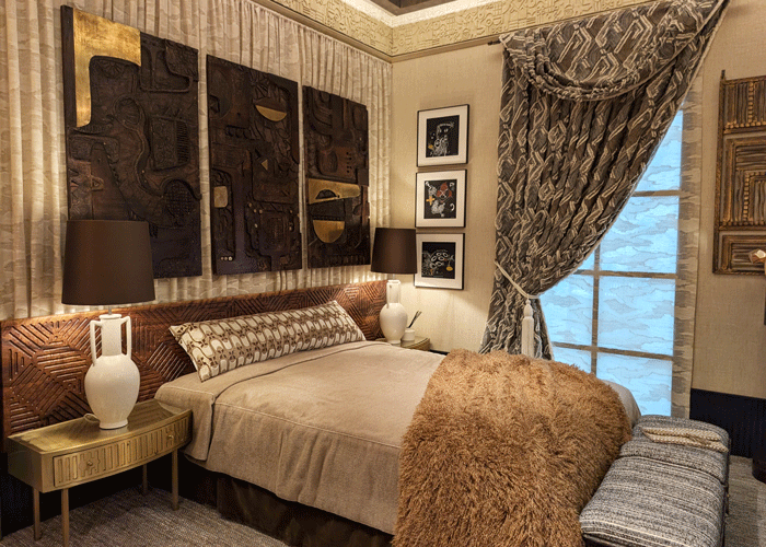
Misia for Casamance Group Bedroom Suite by Henri Fitzwilliam-Lay ‘A Place to Dream’
In the Bedroom Suite ‘A Place to Dream,’ Henri Fitzwilliam-Lay referenced “very strong Art Deco heritage” which became the foundation for a globally informed scheme, drawing on African and Japanese references to create what the designer called “a modern day translation of the Art Deco.”
Together, these rooms showed heritage with momentum: rooted in the past, but shaped for the present.
-
Female-led narratives
Many of the rooms began with an imagined female character, giving each space a sense of identity before the design details were even described. These interiors were shaped around rituals, moods, independence and personal histories, allowing the room to become a portrait of its imagined inhabitant.
Salvesen Graham The Collection Primary Bedroom by Salvesen Graham ‘Soft Strength’
In the Primary Bedroom ‘Soft Strength’, Salvesen Graham’s muse, a woman in her mid-40s, was at the heart of the concept, with books, travel references and creative details used to make the room feel like “her personal retreat.”
Black Edition at Romo Speakeasy Salon by Studio Duggan ‘Hidden Pleasures’
In the Speakeasy Salon ‘Hidden Pleasures’, sponsor of the space, Emily Mould of The Romo Group, described a “discerning female” who works hard, plays hard and uses the room for art, work, cocktails, games and late-night entertaining. The space also launched Black Edition’s new product, Imani.
In Sean Symington’s Withdrawing Room ‘The Joy of Living’, the speaker described an American client whose collection had been gathered from England, London, France and New York, creating a transatlantic room where “nothing” was kept “safe or best.”
Together, these spaces showed how a room can become far richer when it is designed around a life, not only a function.
-
Interiors as portals
A strong sense of escape ran through the house, with designers using their rooms to transport visitors into another world. The effect was theatrical, but also emotional, inviting people to step away from the expected and enter somewhere more intimate, imaginative or heightened.
In the Powder Room, Mark Andrew titles “Room with a View” which takes visitors “through the wardrobe into Narnia,” using fantasy, reflection and detail to turn a compact bathroom into a jewel box.
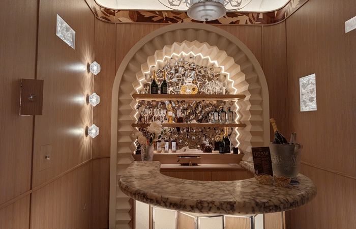
Lalique Home Bar by Elicyon ‘Box of Delights’
In the Lalique Home Bar, Charu Gandhi of Elicyon described a “box of delights,” where pockets within the joinery revealed moments of Lalique across different eras.
Helen Shaw of Benjamin Moore described the wider WOW!house experience as moving between “mini worlds,” with each room transporting the visitor through its own materials, colours, textures and point of inspiration.
Together, these rooms showed the power of interiors to shift atmosphere instantly, making each threshold feel like the beginning of a new story.
-
Craft as feeling
Craft appeared throughout the house, but rarely as a technical point alone. Designers spoke about handwork, materiality and making as a route to atmosphere, intimacy and emotional connection, allowing visitors to feel the presence of the maker through the room.
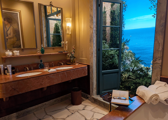
Samuel Heath Primary Bathroom by Rigby & Rigby ‘Bathing Beauty’
In the Samuel Heath Primary Bathroom ‘Bathing Beauty’, Jason Stewart of Rigby and Rigby described a Japanese-inspired space focused on “authenticity” and “materiality,” with brassware details that celebrated both British craftsmanship and Japanese hand tool references.
In Albion Nord’s Drawing Room ‘Custodians of Craft’, Ben Johnson pointed to Turnell & Gigon Group’s hand-blocked fabric and a rug made from individually assembled pieces, using crafted elements to build warmth and character into the room.
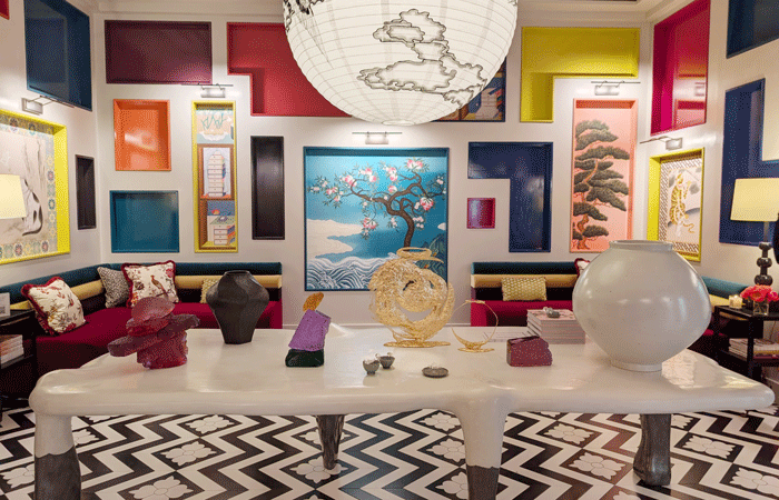
Benjamin Moore Minhwa Salon by Young Huh ‘Colour Pop’
In the Benjamin Moore Minhwa Salon ‘Colour Pop’, Young Huh utilised Benjamin Moore paint to create minhwa (Korean folk art) paintings by Fromental, bringing the space to live with character and colour. Collectable design pieces were displayed on a central table.
Together, these examples showed craft as something felt through touch, atmosphere and detail, rather than admired from a distance.
-
Considered layering
Layering was one of the dominant design languages across WOW!house, but it did not always mean maximalism. The strongest examples used layers of furniture, fabric, art, antiques, lighting, colour and texture to make spaces feel collected, expressive and lived in.
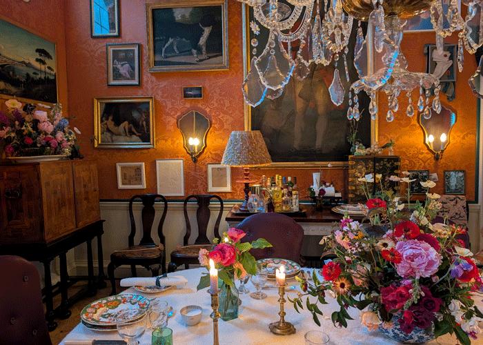
Schumacher Dining Room by Max Rollitt ‘Feast your Eyes’
In Max Rollitt’s Dining Room ‘Feast your Eyes’, Max described the joy of mixing historical periods, mismatched cutlery, varied artwork and unexpected details so that the room felt “authentic” and as though “someone actually lives here.”
Zardi & Zardi Withdrawing Room by Sean Symington Design ‘The Joy of Living’
In Sean Symington’s Withdrawing Room ‘Hidden Pleasures’, the mix of wallpaper, fabric, tapestry, trimmings, fringing, lighting and collected pieces was described as a showcase of the studio’s skill in mixing “patterns, textures, the layers.”
In the Bedroom Suite ‘A Place to Dream,’ Henry Fitzwilliam-Lay described the room as a layering of Art Deco, African, Japanese and Brutalist influences, avoiding pastiche through warmth, texture and material richness.
Together, these rooms showed that layering works best when it feels accumulated, intentional and personal.
-
Moments of discovery
Several rooms were designed to reward close attention, asking visitors to look again, open something, notice a shift or discover a detail slowly. This sense of discovery gave the rooms depth, encouraging people to stay longer and engage more carefully.
Shepel’ Library by Roisin Lafferty ‘Quietly Does It’
In the Library ‘Quietly Does It’, Roisin Lafferty described the space as “a cabinet of curiosities,” with a hidden desk, built-in sofa, integrated display and a sensory room that offered “a glimpse into the inner mind of a designer.”
In the Lalique Home Bar ‘Box of Delights’, Charu Gandhi described joinery with “pockets” that could be opened to reveal different moments of Lalique across the room.
The Parlour by Martin Kemp Design ‘Circle of Intrigue’
In The Parlour ‘Circle of Intrigue,’ Martin Kemp described a room that would “reveal” itself over time, with details including a single different table panel and the mix component styles used for the studio’s newly launched furniture collection.
Together, these spaces showed that the most memorable interiors are often those that do not give everything away at first glance.
-
Rooms for intimacy and conversation
Many designers returned to the idea of sociability, but in a softened and more intimate form. These were rooms for cocktails, tea, quiet conversation, games, evening light and lingering, where grandeur was balanced by comfort and ease.
Turnell & Gigon Group Drawing Room by Albion Nord ‘Custodians of Craft’
In Albion Nord’s Drawing Room ‘Custodians of Craft’, Ben Johnson wanted to revive the drawing room as an everyday space, imagining someone having a cup of tea alone, putting their feet up or entertaining with cocktails in the evening.
In The Parlour ‘Circle of Intrigue,’ Martin Kemp described the room as a place for “conversation” and “dialogue,” using an embracing circular format to encourage people to sit, talk and stay.
Zardi & Zardi Withdrawing Room by Sean Symington Design ‘The Joy of Living’
In Sean Symington’s Withdrawing Room ‘Hidden Pleasures’, the imagined client used the room after dinner for drinks, games and relaxed entertaining, making the withdrawing room feel relevant within a contemporary home.
Together, these rooms suggested a renewed appetite for spaces that bring people together without losing intimacy.
-
Functional spaces with emotional depth
Bathrooms and kitchens were treated as emotionally rich rooms, rather than purely practical spaces. Designers explored how everyday rituals can become atmospheric, sensual and memorable when function is paired with materiality, lighting, story and care.
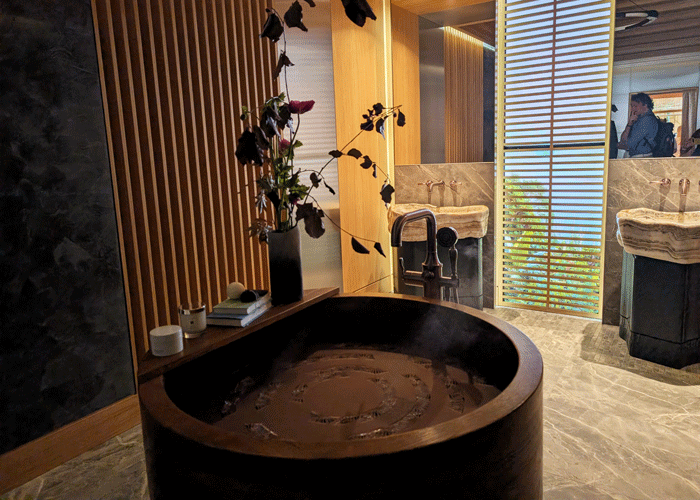
Ca’ Pietra Bathroom by De Rosee Sa ‘Heat of the Sun
In Ca’ Pietra Bathroom ‘Heat of the Sun’, Claire Sa described the bathroom as a nostalgic 1960s and 1970s Mediterranean hotel-inspired space, designed to feel like “a room I want to be in” rather than somewhere to simply brush your teeth and leave.
In the Samuel Heath Bathroom ‘Bathing Beauty’, Jason Stewart of Rigby and Rigby used steam, digital scenes, Japanese bathing references and crafted brassware to create a sensory experience around the rituals of bathing.
Martin Moore Kitchen with Samantha Bartlett ‘Natural Ingredients’
In the Martin Moore Kitchen ‘Natural Ingredients’, Samantha Bartlett and Richard Moore described a space that could change through the day, from morning coffee to evening entertaining, through lighting, soundscape, timber, stone and soft curves.
Together, these rooms showed that practical spaces can carry just as much atmosphere, pleasure and design ambition as any formal interior.
-
Collaboration as creative force
WOW!house repeatedly highlighted the value of creative partnership, with designers, brands, makers and manufacturers working together under intense time pressures to produce something ambitious. The most compelling collaborations felt generous, experimental and full of shared trust.
Martin Moore Kitchen with Samantha Bartlett ‘Natural Ingredients’
In the Martin Moore Kitchen ‘Natural Ingredients’, Richard Moore described the partnership with Samantha Bartlett as “very collaborative,” adding that working with another creative offered “a really joyous opportunity.”
Black Edition at Romo Speakeasy Salon by Studio Duggan ‘Hidden Pleasures’
In the Speakeasy Salon ‘Hidden Pleasures’, Emily Mould of The Romo Group said she loved seeing a designer bring “fresh eyes” to the brand’s products, allowing different designs to “sing” in new ways.
In the Lalique Home Bar Box of Delights’, Charu Gandhi described working with Lalique through a contemporary architectural lens, embedding panels, lighting and crystal pieces into the joinery so the brand could be experienced through discovery rather than display alone.
Together, these rooms showed how collaboration can move a concept beyond presentation and into shared authorship.
-
Intentional technology and analogue escape
Technology appeared across WOW!house, but so did a desire to step away from it. Some rooms used digital elements to heighten mood and atmosphere, while others embraced a more analogue, nostalgic or tactile way of being.
Phillip Jeffries Morning Room by Ara Cosgrove ‘Take it Slow’
In the Morning Room ‘Take it Slow’, Sara Cosgrove described wanting “a fantasy space where there’s no technology,” returning to magazines, drawing boards, faxed orders and the creative mood of an earlier design era.
In the Samuel Heath Bathroom ‘Bathing Beauty’, Jason Stewart of Rigby and Rigby used digital screens to show scenes from Japan, Thailand and New York, helping visitors imagine the products in different global settings.
In the Martin Moore Kitchen ‘Natural Ingredients’, Richard Moore described lighting and soundscape as part of the room’s shifting atmosphere, allowing the kitchen to move from morning coffee to evening entertaining.
Together, these rooms showed that technology is most powerful when it is used with intention, while its absence can be equally expressive.