


Colours: Provoking Emotion
A thrilling book can excite you, a scary movie can shock you, but a less obvious way of getting you to feel something is through colour.
Colour is powerful tool that any Interior Designer must understand and consider for any project. It is a communication tool that can influence mood, signal action and can even be associated with a person’s health!
Every colour conveys a different meaning and a unique message, influencing us both physically and mentally. 95% of the time, the influence of colour takes place outside of our conscious awareness, making its impact that much more powerful as we do not even realise how, when and why we respond the way we do.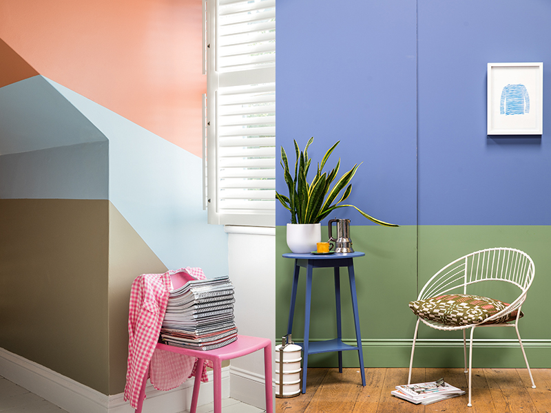 Leatrice Eiseman, Executive Director of Pantone Colour Institute says that the way colours affect us correlates to that colours’ behaviour in nature. Pantone has conducted decades of research on how people react to different hues and what they find most fascinating is that just as some responses have stayed fairly constant through time, others have changed considerably or have moved on and evolved.
“Colour and culture are intertwined”
– Laurie Pressman, Vice President of the Pantone Colour Institute
Charlotte Cosby, Head of Creative at Farrow & Ball told us that everyone’s perception of colour is different, and it can be seen as one of the greatest forms of expression. A person will build their own associations through colour and this is how unconscious feelings and emotions are drawn from colour.
As much as you may want to associate a colour with the same emotion or feeling – blue is always cold, red is stimulating, yellow rooms are always welcoming and green creates restful spaces. You just can’t think like that. Individual preferences and associations mean that every person can react to a colour or combination of colour in different ways. You could say it is totally based on context and the environment it’s being viewed in.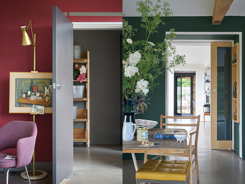
COLOUR FACTS
“Yellow has been enduringly popular since the 18th century but it was only in the 20th century, when the influential interior designer Nancy Lancaster used the colour extensively, that it really entered the mainstream. Yellow never fails to create a hopeful and optimistic atmosphere and the striking Farrow & Ball hue Yellowcake is a perfect example of that.”
– Charlotte Cosby
Dulex selected, Heartwood – An earthy toned, mellow hue – and Pantone selected bright and bold, Ultraviolet for their colours of 2018. The first being very comforting and homely and the other being a shade to boost inventiveness and imagination.
How important is colour in an interior scheme and why?
Laurie Pressman says;
“Colour is the single most important design element in creating spaces that reflect mood and style. With an ability to calm and soothe or convey drama and excitement, there is no other element that has the ability to transform a space from formal to romantic or classic to exotic with the stroke of a brush the way that colour can.”
The colours used in an interior scheme are so important. You must consider how the space is going to be used and the ambiance you are trying to create. Strong colours create a dramatic and intimate atmosphere – great for entertaining and the Maximalist trend we have seen appear this year. Soft and soothing colours are perfect for creating a relaxed and calming environment – Do I hear Minimalist?
For more insight into colours and how they are selected – Check out our film on the Alchemy of Colour with Peter Gomez, Head of Design at Zoffany here
Comments
Hello!
Just read through this article and I couldn’t agree more! I did my MA- Furniture Design from Bucks New Uni, and my dissertation was about colour in furniture and how it affects the users. I also designed and built two products, by reversing the traditional design process, and started with a colour, then proceeding to select a product based on that colour, to design and make.
Very interesting read, thanks!
Hi – Thanks for you comments. Glad you enjoyed the article.