


Jim Biddulph & Laura Perryman in Conversation
A love for materials and keen interest in contemporary technologies has led Laura Perryman along an interesting and fairly unique path within the world of design.
Having studied Printed Textiles at Loughborough University and then at the RCA, Laura was picked up by big name tech brands such as Nokia and later trend agencies like WGSN before she set-up her own colour and material design (CMD) research studio/consultancy in 2016 at Blackhorse Workshop, Walthamstow.
Colour of Saying is a consultancy for brands and businesses using insight and trend forecasting for which Laura’s knowledge of colour and material techniques and technologies make her a perfect guide to successful and considered aesthetic choices.

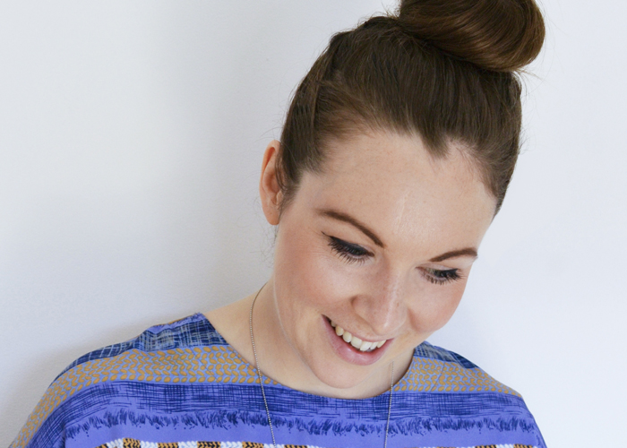
I caught up with her at Blackhorse Workshop to find out more about her fascinating research led practice.
JB: So what is it that you get up to here Laura, what does an average day consist of?
LP: Not one day is the same. I normally start with research as this underpins lots of the work I do. I’m either looking for a design direction for one of my clients or reading up on a subject that I need to speak about at the next event. I work with different people across industries and time-zones. So normally I will have at least one or two international calls a day when I’m working in my office. I work around these points breaking down activities into short bursts. I might have to pull out a colour palette, collate a trend moodboard or select a series of target surface finishes connected with research themes.
JB: Your specialism is still a fairly unique one, have you seen a shift in awareness in clients?
LP: I have been lucky enough to work for brands as diverse and forward thinking as Nokia, Toyota, Speedo and Habitat and this has given me a unique understanding of colour, material and surface application across multiple industries on a commercial level. I’ve also gained experience working for trend agencies such as WGSN and Global Color Research, where I was Director of Colour Consultancy Projects for 3 years. As CMD (Colour, Material, Design) is now an established design discipline, it’s presence is calling for a greater sense of consideration and sensitivity to how colour and material choices are made across surface design, consumer products, textiles and architecture.
JB: So how do you go about helping to make these informed colour and material choices?
LP: Well, often colour is overlooked or left to the last consideration when a product is finally finished, so the studio focuses on colour and finish as starting point for which the design or experience to be built. I’ve helped diverse and forward thinking companies introduce new colour collections in paint and coatings and helped global packaging retailers marry colour with emotive flavours and aromas of food and drink.
JB: That must involve a lot of research, particularly across such a broad spectrum of industries?
LP: Well yes, but that’s one of the things I love about my job. Anticipating future shifts leads to design outcomes that will stand the test of time but also help companies future proof ideas and products. Research into trends, making processes and benchmarking innovative design and manufacturing approaches helps companies tangibly see what’s on the horizon. The studio’s approach is bespoke to clients needs, not one presentation or report will be the same, we have the time and approach to curate content that is really unique to each industry or application. Processes include market analysis, desk research and industry insights to create visually compelling and actionable information.
JB: You, like me, have a love for and fascination with surface materials. Can you tell me a bit more about your approach when it comes to materials?
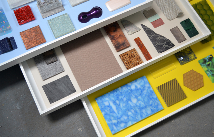
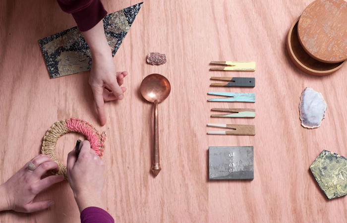
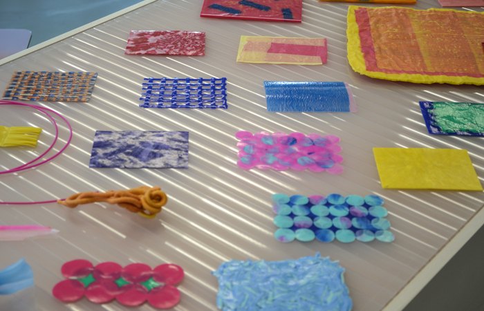
LP: Tactile references and physical samples are incredibly key for the companies we work with. Benchmarking and looking to what is happening across other industries is an insightful way to help drive new thinking. We often create physical texture and material samples from scratch, working in collaboration with model makers, designers and artists. This helps form ‘signature’ or unique palettes for companies. Building up a global materials collection, is an important part of our research, it keeps us informed, but also creates an important resource that often acts as an important impetus for discussion and collaboration.
JB: And of course, another shared passion is colour, which is right there in your studio name. What is your relationship with colour, how does it affect the design decisions that you make for companies?
LP: Colouring a material can completely change it’s perception, usage and value. Subtle shifts in shade can completely change how you view or perceive or interact with a product or surface. For me colour is an emotional, sensory tool, which is often completely misjudged. Its potential is not always fully realised, and it takes time, dedication with process and an implicit connection with application to fully realise it’s powerful effects.
For clients, we also try to deeply understand what their processes are, how they are making colour with products and for what purpose. We often present a point of view and a palette (that is backed up with research and thinking) that challenges and questions, but ultimately offers lots of exciting tangible solutions. We aim to offer colour choices and finishes which can be ‘owned’ by brands and we often connect that and show applications across all company touch points for a fully immersive effect, from physical products to digital UX interactions, as that is what Colour Branding really is.
JB: Down the years I’ve seen you speak a number of design events and thoroughly enjoyed the Colour Via exhibition you created during last years LDF. Are these viewer-interactive types of events an important outcome for you?
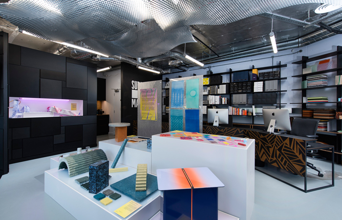
LP: Our approach is always bespoke so not one outcome is the same. We often give talks and lectures at universities and international trade shows and industries events on the powerful impact of colour. Colour via is a good example of this. I aimed to make a thought-provoking tactile experience of disruptive material colouring processes.
The visual display featured eight pioneering designers and companies who are responding thoughtfully to the complex questions posed by waste and toxicity, but who use colour and colouring processes as a lens or method.
This exhibition brought together fresh and important voices of designers who are challenging mass colour manufacture and crossing industry boundaries in pursuit of more considered practices and cleaner applications.
For more information about Laura and Colour of saying visit the website.