


The dynamic flow of data informed the concept for SpaceInvader’s workplace designs for leading financial data analysis company
SpaceInvader has completed the office design a leading financial data analysis company with over 70 offices worldwide, including UK offices in London, Aberdeen, Bracknell and Tetbury.
The company’s dedicated Manchester team had previously been in a co-working office when it came to SpaceInvader to design its brand-new working environment, including bespoke artworks, wayfinding and graphics, to be housed in the No.1 St Michaels development in central Manchester. Developed by Gary Neville’s Relentless Developments, this high-profile office building by architects Hodder and Partners proved a draw for many companies in the region looking for central, state-of-the-art premises.
SpaceInvader was appointed to the project in December 2023 and briefed to create a permanent working environment with plenty of built-in flexibility and space for future growth. The new offices were to be collaborative and connected and not too corporate in feel, with a focus on delivering an energetic, technology-centred space where people would really want to spend time. In practical terms, the 1,837 sq m office needed to provide 127 traditional desks with added collaborative settings, both formal and more relaxed, along with meeting rooms, a town hall space, generous break-out areas, a multi-faith room and a returning mothers room.
“The project also required a thoughtful and deep-rooted approach to sustainability” John Williams, Founder of SpaceInvader commented, “and it was SpaceInvader’s approach to this area of the work that really gave us the edge – and won us the pitch.”
The client encouraged out-of-the-box thinking from the design team and the development of a concept that would line up with the organisation’s spirit of discovery, reflecting a culture that is driven by curiosity and collaboration.
“The company’s offices are all location-specific when it comes to design, so we were able to build a concept from the ground up, reflecting both the client’s specific needs and the local context” Bethany Gibson, Associate at SpaceInvader explained.
The Design Concept
The SpaceInvader process began by dialling into the core nature of the client’s data analysis business, researching the earliest computers and particularly focusing on Alan Turing, the great mathematical and computer pioneer with a strong link to the city from his time working at Manchester University.
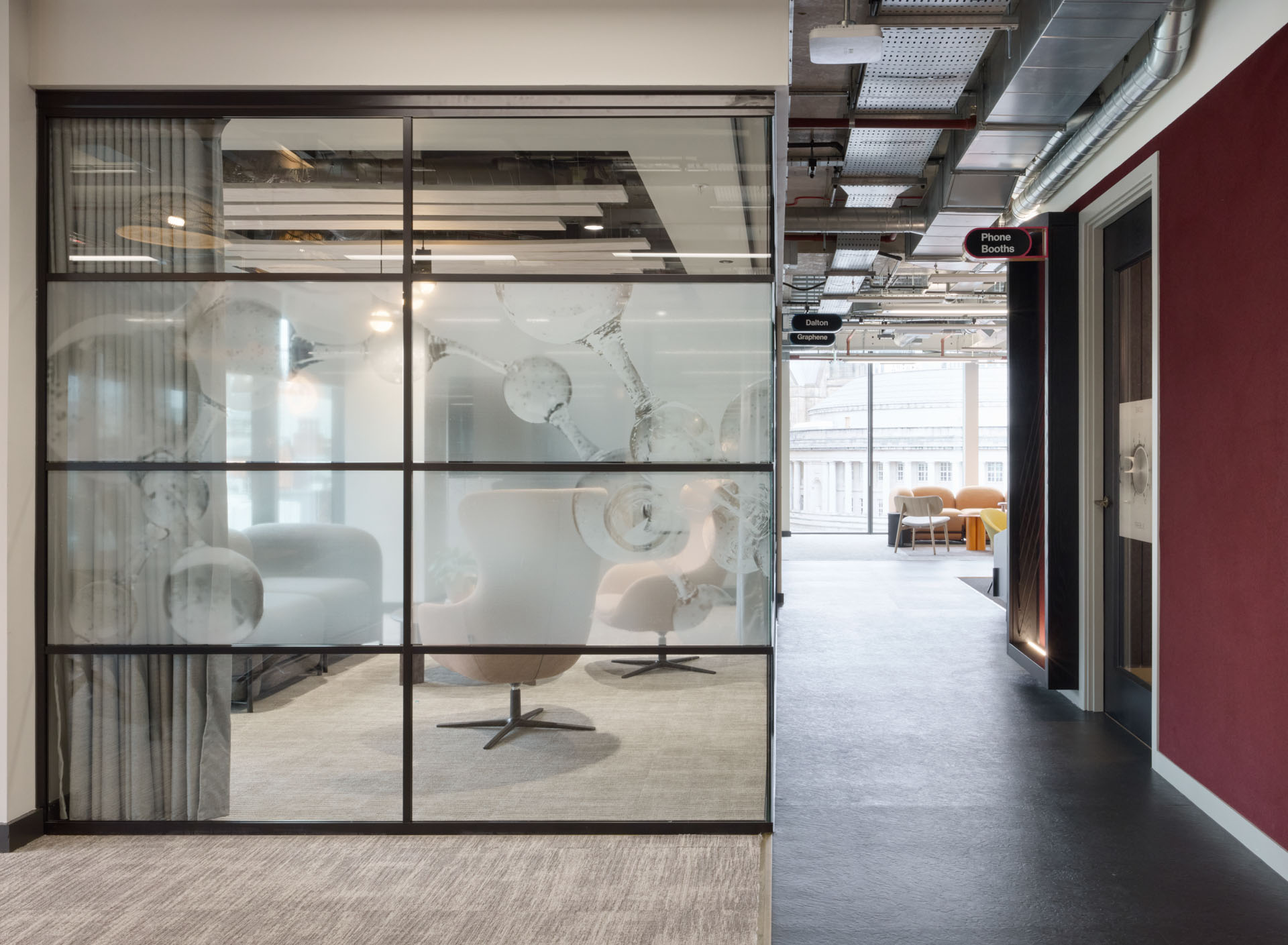
Turing’s Bombe machine, famously used to crack the Enigma code during World War Two, inspired the colour palette and some of 3D shaping throughout the space, as well as being one of the elements that inspired SpaceInvader Branding and Graphics Associate Jenny Crossland in her development of the scheme’s graphics and artwork. Jenny devised bespoke manifestations relevant to each of the client’s localised meeting names, all based on Manchester’s history, identity and culture (Pankhurst / Turing / Bee / Lowry / Graphene / Dalton), as well as creating bespoke artworks for the project.
“Where possible, I linked the signage and art prints with the original interior concepts, creating synergies across both so that different applications would still feel cohesive” Jenny Crossland explained.
“The manifestations, locker prints and a number of the artworks are based on the idea of differing perceptions, so that up close you may only see coding or dots, but the view from a distance allows you to see the bigger picture. Alongside the data-inspired concept, we further layered in Manchester’s industrial and musical heritage to the graphic treatment, with amplifier dials referencing the shape of cogs in some manifestations and other musical elements expressed through a mechanical lens as a new way to tell the story.
Some artworks depict industrial locations in Manchester and others are blueprints of musical equipment, such as the synthesizer model linked to the sounds emanating from the city’s famous Haçienda nightclub.”
Key elements from Alan Turing’s work that influenced the interiors concept included looking at the input and output of data and the idea of cogs moving at different speeds, but working together for the same ends in a continual process of discovery and progression. The team was inspired by the speed of data travel and also by the ways data can be visualised, including surges and falls of momentum.
This concept was translated into dialled-up (high energy collaboration), dialled down (focus and concentration) and surge (social) spaces. The goal was to create an overall immersive and energising design that resonated with the pulse of data fluctuation. Additional spaces were designated as cogs-in-motion (brainstorming) and connection (meeting) areas.
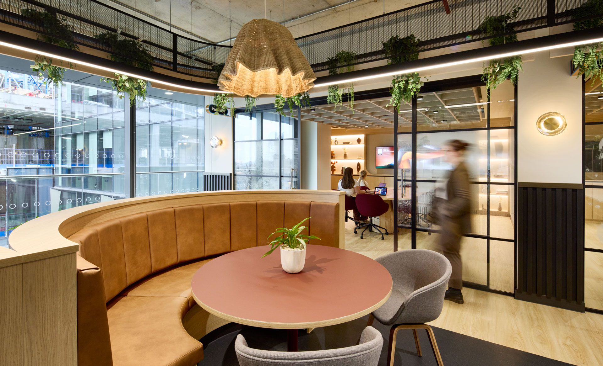
The influence of Turing’s Bombe Machine also generated other elements of the scheme, including the repetition of circular patterns, the rich reds and dark browns of the colour palette, contrasting metal and bronze elements, and also the materials used, with particular shapings woven through the joinery, lighting and furniture. Red tones also came from the client’s branding, whilst citric injections of yellow, orange and green were introduced sparingly for areas of pronounced upbeat energy.
‘Dial Up’ areas include long collaborative tables, set diagonally to the standard work desks to break up the space and encourage collaboration in the open environment. The integration of planting around these was introduced to help increase productivity and creativity. It was important in the scheme that everyone should feel like an insider, with maximum visibility at all times across the floor. There is very little in the way of dividers in the space plan for this reason.
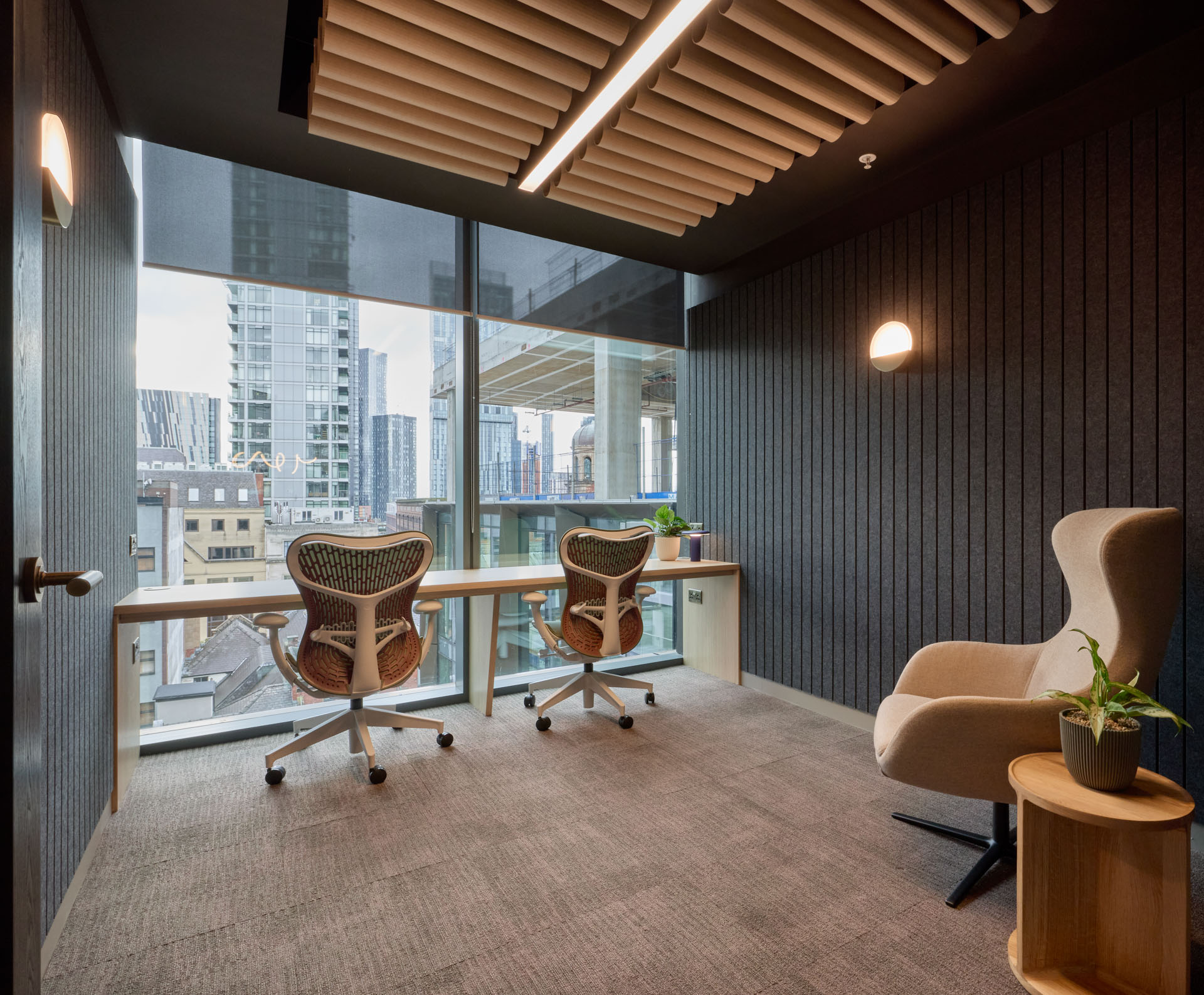
‘Dial Down’ areas are about discovering and uncovering pockets of quietness throughout the space plan, marked out with a ‘darker mode’ colour palette, including timber and smooth textures, along with softer lighting.
‘Surge’ areas meanwhile were approached as the heart of activity and social interaction in the scheme, designed for community and connection between colleagues and visitors. These spaces are denoted as energetic hubs and are blended, multi-functional spaces catering for a wide range of activities with enhanced colour, graphics and textures.
The ‘Cogs in Motion’ areas are zones of activity followed by dispersion; catalyst areas for ideas and creativity. They were to be a mix of semi-open and enclosed spaces with some flexible or temporary areas to allow a wide variety of activity.
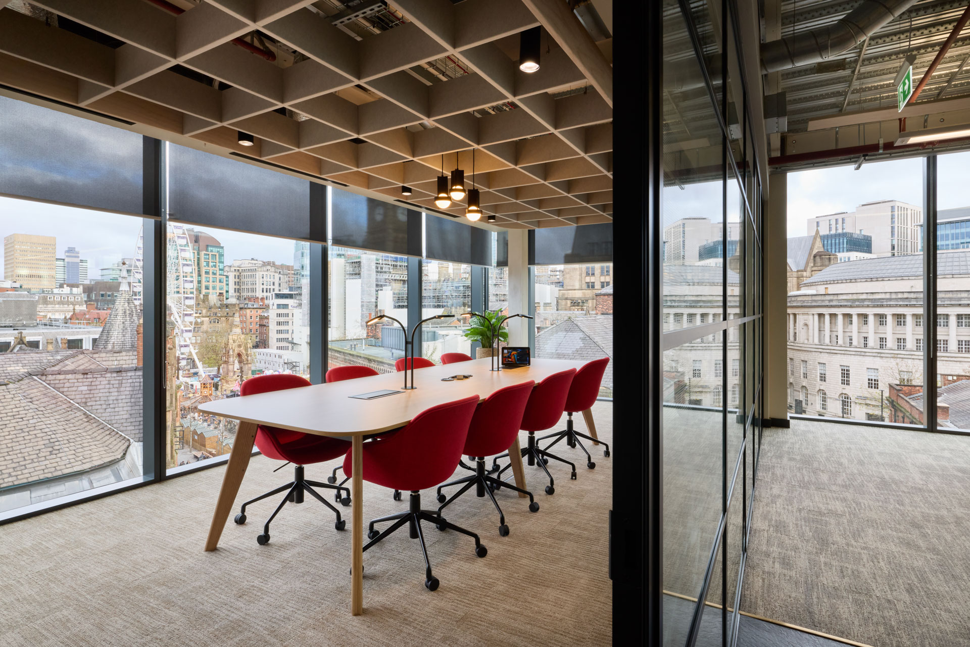
Finally, the ‘Connection’ areas would be spaces for partnership and togetherness, with their designs created to reflect high and lower energy meeting spaces, including smaller rooms for important discussions that were notably calmer in feel. The vibe overall would be edgy and industrial with technology seamlessly integrated to enable hybrid workers to plug into the mainframe.
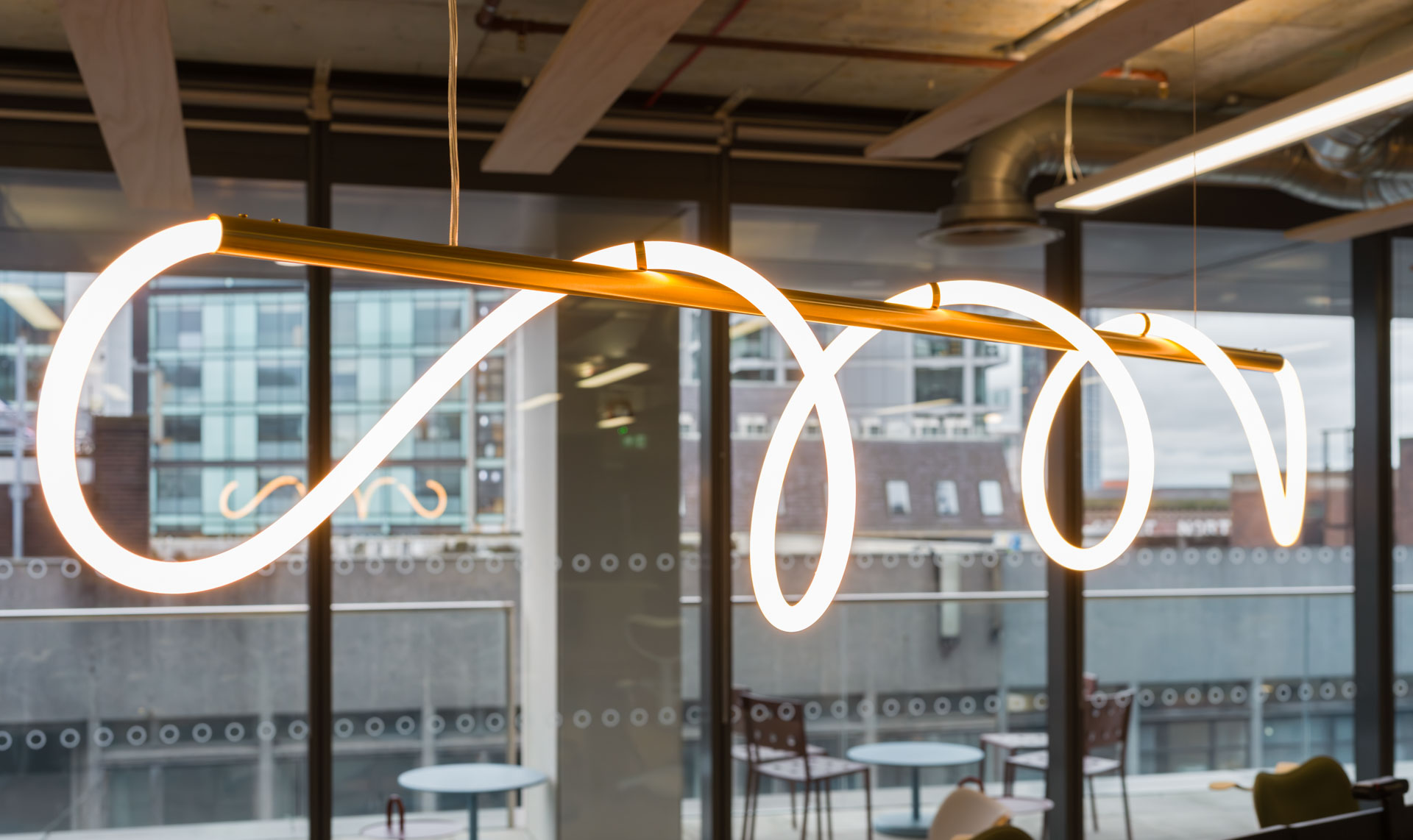
Furniture and lighting for the scheme also drew inspiration from the intricacies and mechanisms of Alan Turing’s Bombe machine. Elements such as repeated circular patterns, dynamic cogs, and intertwining wires are reflected in the choice of pieces, incorporating curved edges in diverse ways across different spaces and a dynamic lighting feature – the Squiggle Pendant from 101 Copenhagen – representing wiring, which is used in the general workspace.
With a strong sustainable element to the brief combining with SpaceInvader’s ongoing commitment to sustainability, products were specified with low embodied carbon and included FSC woods, recycled materials and recyclable to contribute towards a circular economy. Acoustic wood wool panels by Baux were used throughout the meeting rooms, for example. Throughout the process, the team knew that the scheme was to be submitted for BREEAM certification, which also fed into the design concept. As the fit-out was brand new for the building, a lot of Cat A lighting was retained, for example, along with the existing open ceiling soffit.
Design Walk-through
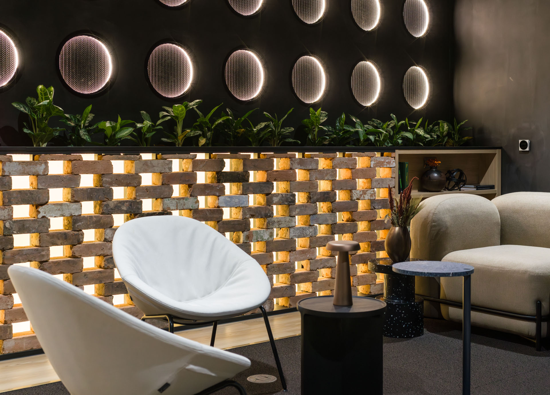
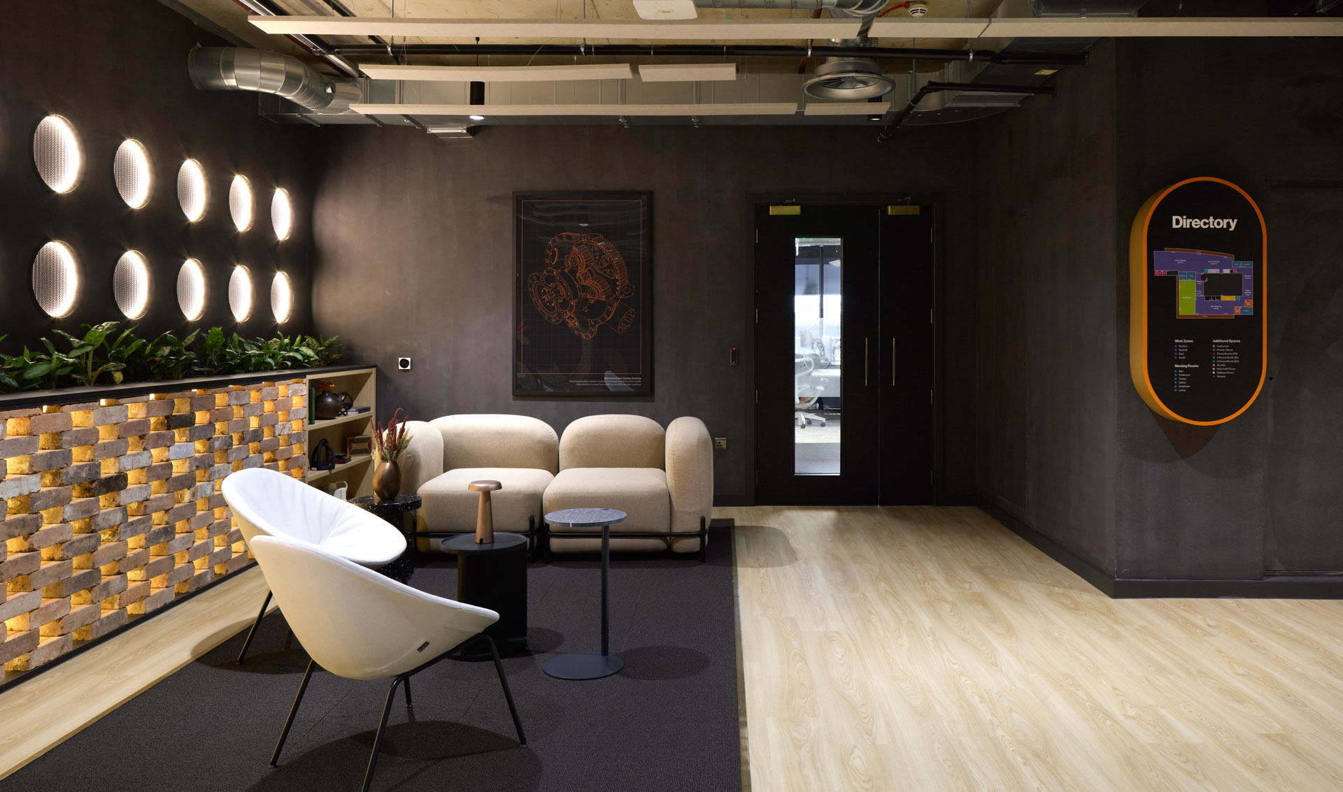
As visitors arrive in the welcome area, they are greeted by some of the key features of the design scheme. Across the back wall, a bespoke joinery piece features layers of back-lit bricks, referencing the abundant use of brick as a building material in Manchester, paired with timber shelving for the display of accessories. Directly above this low-level feature sits planting, backed by a dark wall treatment featuring portholes, inspired by machine cogs.
In front of the feature wall, a loose furnishings area offers seating on arrival for guests with a receptionist who will come through into the space and greet all visitors. The welcome space directly borders a 4-person interview room.
The flooring treatment in the scheme, introduced here, is a mix between LVT wood-effect floor tiles from Tarkett for the entrance and social areas, with rubber flooring (Concrete Effect Rubber Flooring by Nora) used for the walkways and carpet in the office areas (ReForm Shadowplay by Ege), chosen for comfort and acoustic aspects.
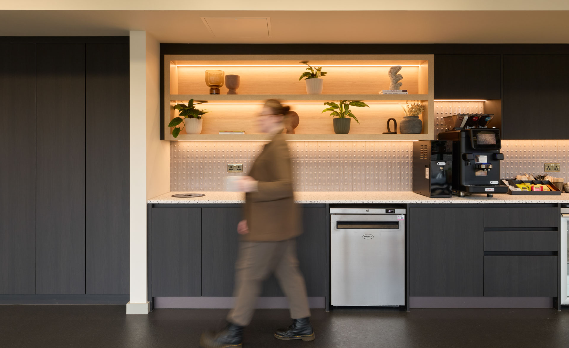
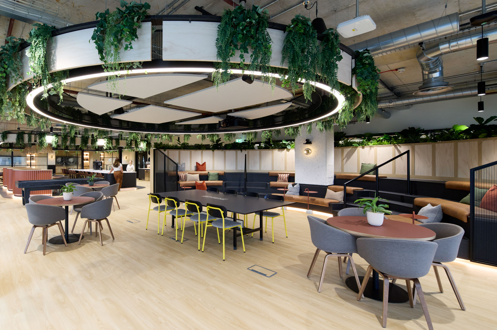
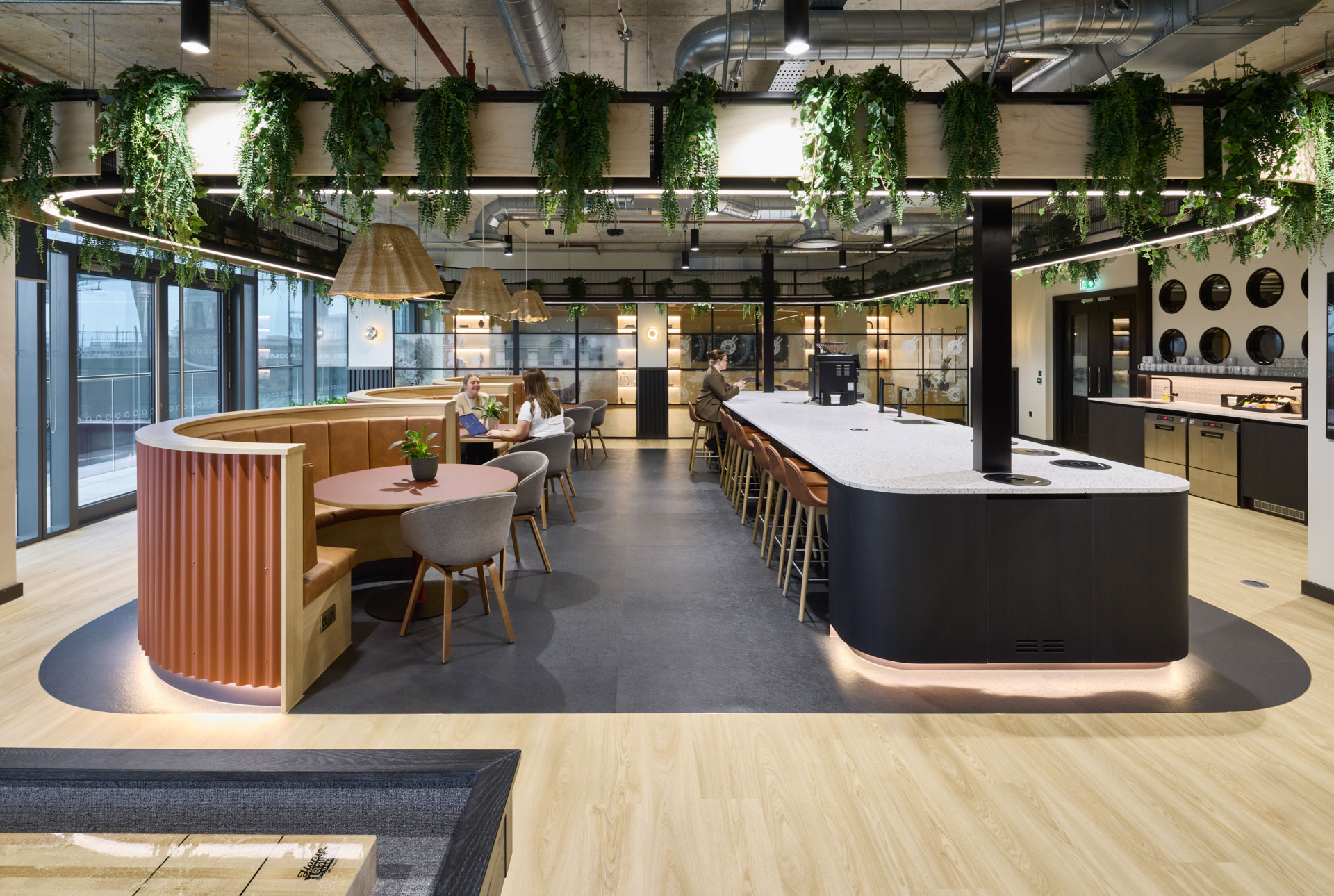
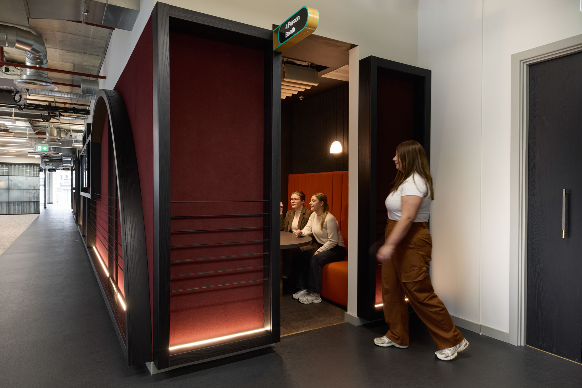
The social space, located immediately beyond the welcome area, has a special ceiling feature to help ground its lengthy teapoint/bar and series of three booths, which feature corrugated terracotta-coloured metal to their outer sides, inspired by Manchester’s industrial heritage. The ceiling feature, inspired by the idea of an exploding cog mechanism, also has integrated acoustic and light features, as well as vertical mesh with inset planting.
The teapoint-bar features a Durat solid surface counter and a wrap to the front in black wooden laminate, with nine Muuto bar stools at the counter. The reverse of the welcome area porthole wall upper wall is painted white in this area, whilst porcelain tiles to the base of the column and beneath the porthole door have a deliberate vintage industrial feel. Feature pendants over the booth tables are by Pia Design for Biohm, in a range made from waste coffee and orange peel.
Two 8-person meeting rooms at the far end of the space have a refined treatment including Baux wood wool panels with patterns etched into them to align with ideas of connection and the movement of data.
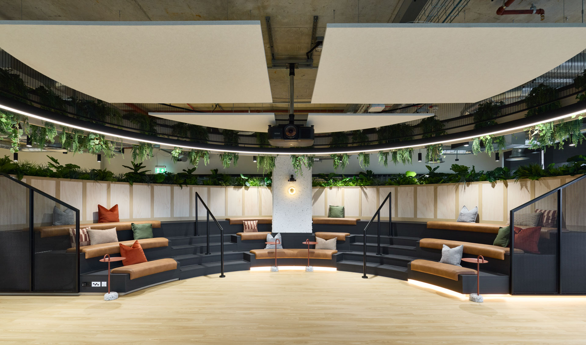
Directly alongside sits a larger social space, which can respond to function and be either collaborative or flexible, whilst also working as the office’s ‘Town Hall’. The space features three-tier amphitheatre seating in a dark laminate with a back panel with added acoustic functionality to the surface, but still with a timber effect finish.
There are automated black-out blinds if needed in this space, as well as a large drop-down screen, which sits within a circular ceiling raft, featuring planting and inset lighting. Directly below the ceiling raft, a long table has a bespoke printed surface, featuring a pattern designed by Jenny Crossland at SpaceInvader.
A final social area is the wraparound terrace, furnished for external use when the weather allows.
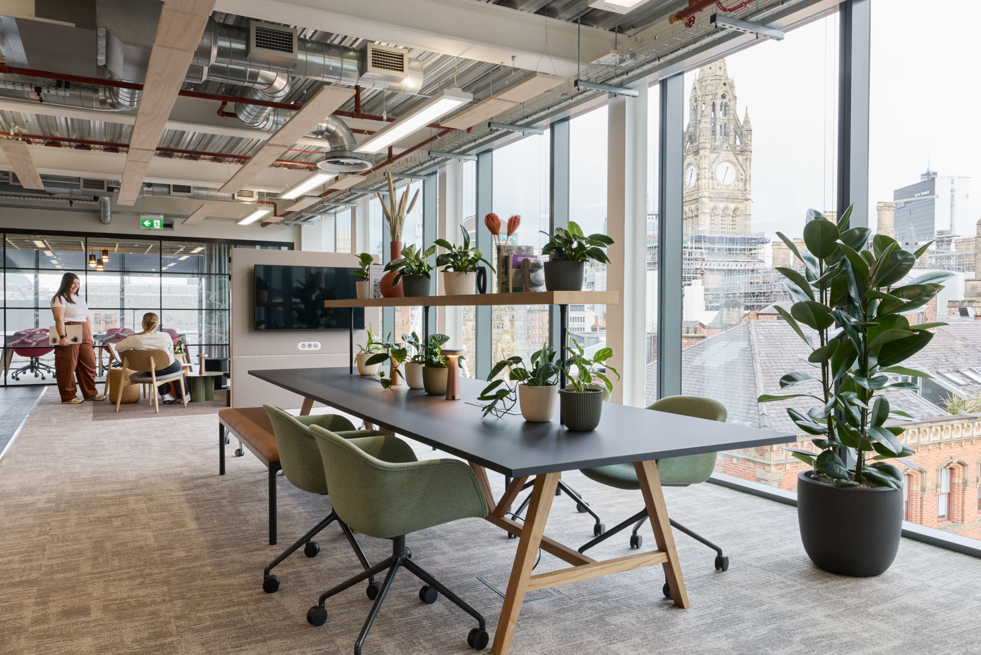
The scheme’s meeting rooms vary from more traditional large-format to 4-person lounge style rooms with lots of breakout spaces for more informal meetings. There are acoustic rafts in all the meeting rooms set within the plasterboard (by Acoufelt), whilst timber and natural materials soften the spaces.
Collaborative areas feature brighter colours for an injection of energy, using higher colour saturation, whilst more focused work environments feature a darker palette, so that the colour becomes more readily identified with certain tasks.
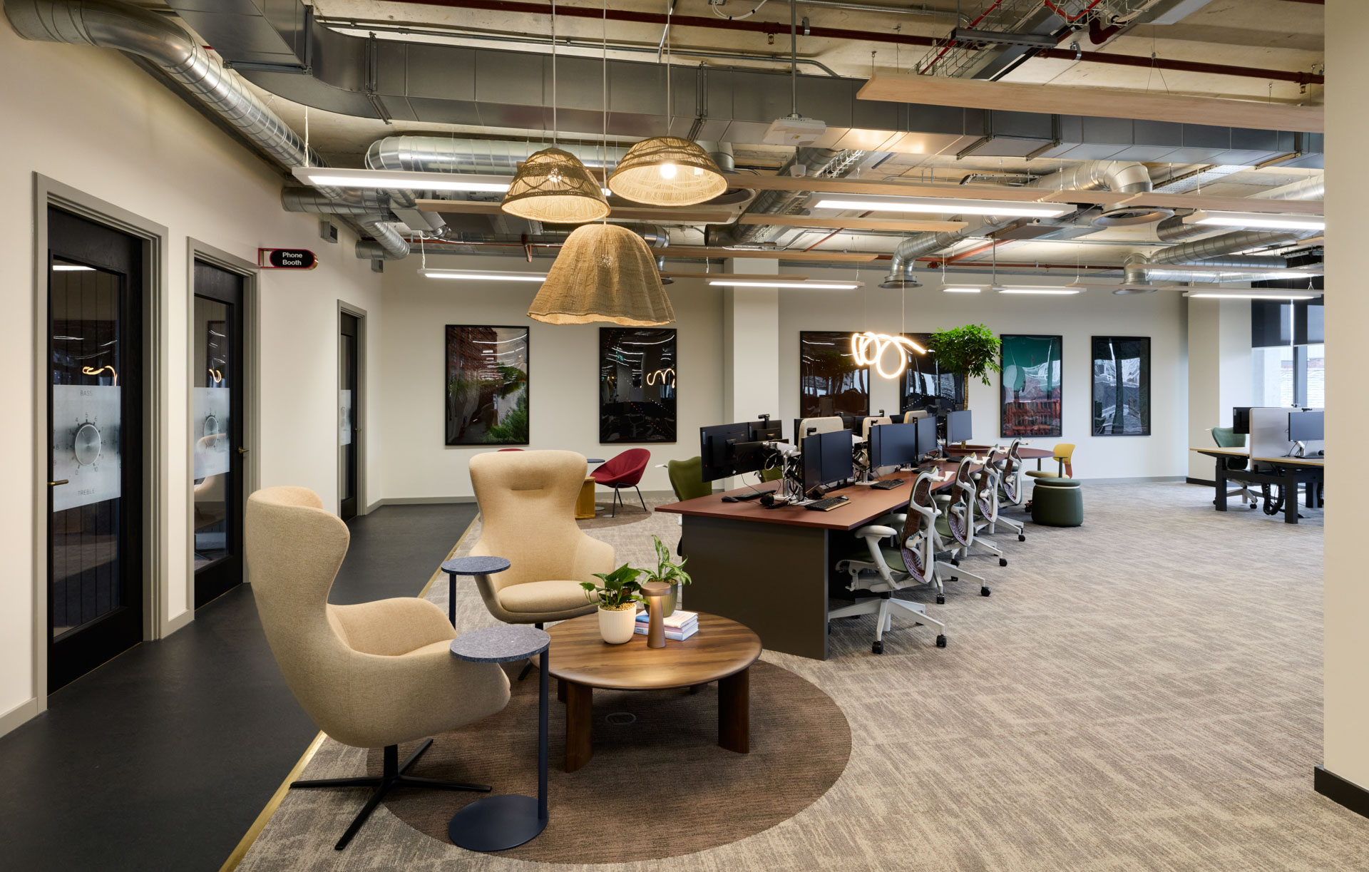
The open workspace features timber acoustic rafts arranged in a pattern inspired by the rise and flow of data and which also counter the effect of the open soffits. The angled collaboration desks have a deep red surface and a looping Squiggle Pendant above, so that they are immediately distinguished and invite a different mindset for users.
A full wall of data screens ensures the rise and fall of real-time data is visible to all at all times. The screens are set into a joinery wall with rope stretched to form patterns across the space, backed with Autex acoustic panels. Incidental tables soften and add a domestic note to the space, sitting below further pendant clusters with recycled shades by Pia Design.
Brainstorming areas are delineated by different furniture settings and brighter colours using a citric palette. Moveable whiteboards allow for team thinking. Light-touch divider screens sit around certain furniture clusters, made from concertinaed recycled paper, which can stretch and contract according to need.
The wayfinding and signage for the scheme all adhere to the overall design concept and use capsule shapes influenced by the rounded forms within the interior concept. A medium-bold sans serif typeface is used for lettering to ensure legibility. Materiality also aligns with the interior palette, using brighter pops of colour over the top.
Credit: Andrew Smith of SG Photography