



Nissen Richards Studio designs ‘Childhood in War’ – IWM London’s major exhibition for summer 2026
Imperial War Museum has opened its leading exhibition for summer 2026 at IWM London. Childhood in War focuses on the impact of war on children and is additionally notable for being the first ever UK exhibition to look specifically at how war affects and shapes younger lives.
The exhibition and graphic design for the exhibition are by architects and exhibition designers Nissen Richards Studio, a London-based practice with a global portfolio and over fifty creative awards to their name, including three RIBA National Awards. IWM and Nissen Richards Studio have collaborated on six previous projects for both IWM London and IWM North.
Childhood in War, which runs until 28 February 2027, is located on the Museum’s third floor in the larger of IWM’s temporary exhibition spaces, featuring nine, individual room-sets totalling just under 500 sq m of space. Aimed at both adult and family audiences, the exhibition draws on the IWM’s extensive materials archive relating to conflicts involving Britain and the Commonwealth since the First World War.
Exhibition material is variously drawn from: the First World War / Second World War / Korean War / The Troubles / The Falklands Conflict / The Yugoslav Wars / Siege of Sarajevo / War in Afghanistan / the Syrian Civil War / the War in Ukraine and the Sudanese Civil War.
The exhibition aims to help family visitors understand and discuss conflict and will also appeal to young people and adults interested in the lives of children affected by war, with over 450 million (more than one in six) children in the world currently living in areas affected by conflict.
Content includes objects, personal testimony, AV, plus hands-on and interactive experiences, designed to be robust enough for the target audience and ranging from full-wall board games to a large-scale evacuee train carriage, integrated across familiar settings from children’s lives. The latter include kitchens, bedrooms, living rooms and classrooms – everyday environments which underline the impact of war on everyday life, from children’s play and schooling to their health, safety and life at home. A full programme of events and activities accompanies the exhibition.
“This exhibition represents a unique and important perspective on conflict” Pippa Nissen, Director of Nissen Richards Studio commented. “Our approach, which makes extensive use of graphics and interactives, allows children as well as adults to access sometimes hard-hitting information in a thoughtful and considered way, whilst strongly establishing a sense of place that can be immediately understood by younger visitors. The ‘normality’ of the room-sets allows children to understand how little it takes to move from normality to conflict, relating to their own lives by starting with family life settings.”
3D Design Approach
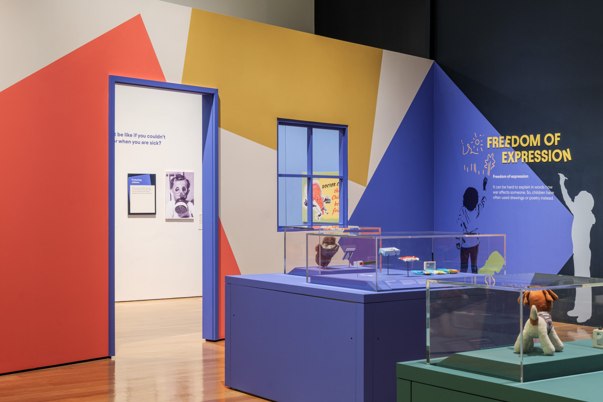
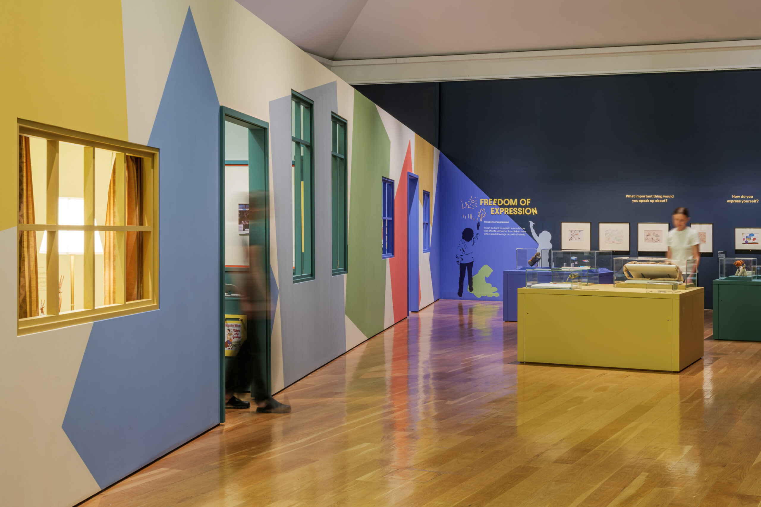
Using a colour palette inspired by the objects on show, the exhibition mixes bold colours with tonal shifts and colour-washing, often used to suggest a shadow or the imprint of the past. These moments of subtle, altered colour convey a sense of absence. The principle of colour ‘washing’ is used throughout as a means of abstracting the sets and creating a lively and dynamic visitor experience. Each room-set features a graphics base colour combined with secondary and highlight colours. Materials, meanwhile, range from the domestic, solid and familiar to the papery, bold and abstract.
The design setting and colour inspiration have a tinge of nostalgia, with the palette mostly taken from World War Two and the Cold War era, but ones that are nevertheless universal and recognisable to children today. The ‘bedroom, for example, features objects from the two world wars whilst the ‘living room’ features more content from the cold war with a more 60s/70s feel.
“The rhythm of the exhibition is created through people, places, play and moments of pause” Phoebe Flatau, Senior Lead Designer at Nissen Richards Studio explained. “A host of characters guide the visitor through the spaces, illuminating key objects and themes in each section. The sets, both full and abstract, create points of immersion and discovery, whilst other areas prompt play through interactives. Throughout the journey there are occasions to pause and reflect on more serious content through the lens of graphic provocations.”
Graphic Design Approach
“War turns the lives of children upside down and the exhibition’s graphic concept reflects this”, Emily Lannin, Graphic Designer & Illustrator at Nissen Richards Studio explained. “We have used shapes, typography and graphics that are often a little bit ‘off’ – either asymmetrical, precarious, offset, crooked, uneven, slanted or irregular”
As part of the graphics approach, three children were photographed in a variety of poses at the outset, with their silhouettes then either stencilled or screen-printed onto the room-set walls. The graphic ‘children’ greet visitors and act as their guides, leading the way through the exhibition.
“The figures of children were created as a way of easing the difficulty of the subject matter for child visitors” Pippa Nissen explained. “They act as guides and indicate to children where and when there is something do, read or watch, giving children permission to act in a certain way and to relax and be guided through the whole experience.”
The outlines of the children also serve to underscore the difference between normal life and conflict, with the child who is enjoying a normal, active, carefree life seen playing and at peace, whilst the child affected by conflict has a filled-in and less personal silhouette and is often seen to be inactive, either turning away or looking down in a state of introspection.
The graphics team took its lead from the exhibition’s 3D design to ensure cohesiveness. For example, where the room-set is painted, graphics were digitally printed to colour-match the particular shade. Because of the family audience, typology is often large format (up to 144 pt font size), arranged on the walls in block print for both legibility and impact. The graphic design and typography were also inspired by children’s books, as well as by board games, making use of simple drawings, along with the silhouettes of children, a stencilled approach and analogue materials.
Collaging is used for the exhibition’s 3D models, which are located in five of the room-sets. These all use images from the IWM archive and serve to create a sense of place for where conflict has occurred, illustrating more directly the impact that conflict had on the lives of children. The models also ground the exhibition content to work alongside the more fictional elements of the exhibition.
Literary Trail
A literary trail forms one element of the interactivity for children, with a total of six books alluded to on literary plinths with a sheet given out to visitors and stamps for each book to be added each time the individual book is located, with a cover, synopsis and highlighted quote used in each case from:
Armistice Runner by Tom Palmer
When the World Was Ours by Liz Kessler
Safiyyah’s War by Hiba Noor Khan
The Breadwinner by Deborah Ellis
Wave Me Goodbye by Jacqueline Wilson
You Don’t Know What War Is by Yeva Skalietska
Design Walk-through
An introductory panel sets up the exhibition’s themes, based around children’s rights, as set down by the United Nations, where children ‘should be allowed to play, learn and express themselves safely’ and where the visitor will encounter ‘stories of hope, danger and perseverance’ from children across the globe who have already encountered conflict.
Room One – Right to Play
The first full room-set is a bedroom, with the design inspired by films containing real and fictional accounts of a children’s bedroom, including Empire of the Sun, Childhood of a Leader and The Little Princess, in a room-set that features a sloped ceiling, akin to an attic room, and panelling to the walls, deliberately mixing ambiguity with nostalgia. Object showcases and moments of AV are embedded into the space, creating a sense of discovery.
Room Two – Fun and Games
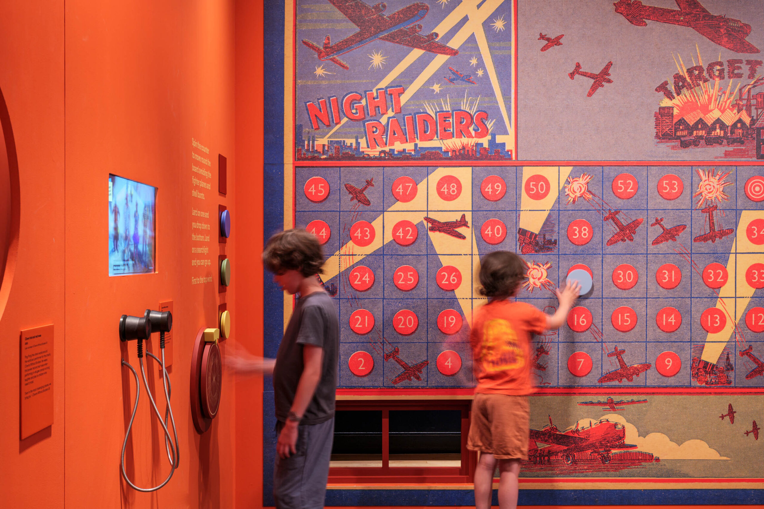
This room features a life-sized wall board game with bright orange walls, and tone on tone colour, with square and circular apertures holding objects.
Room Three – Indoctrination
The feel here is darker, with a wall display area in the centre in the shape of a giant X, offering visitors smaller moments within a larger setworks build. Double sided inset showcases contain pockets of information in a subtly imposing, aperture-filled space.
Room Four – Safe from Violence
This set-up is along corridor initially and quite dark with the subject matter of migration / immigration, showing lines of travel from different war zones. Visitors are led along by the graphics, with the lines creating a rhythm taking you through.
Room Five – Safe from Violence (part two)
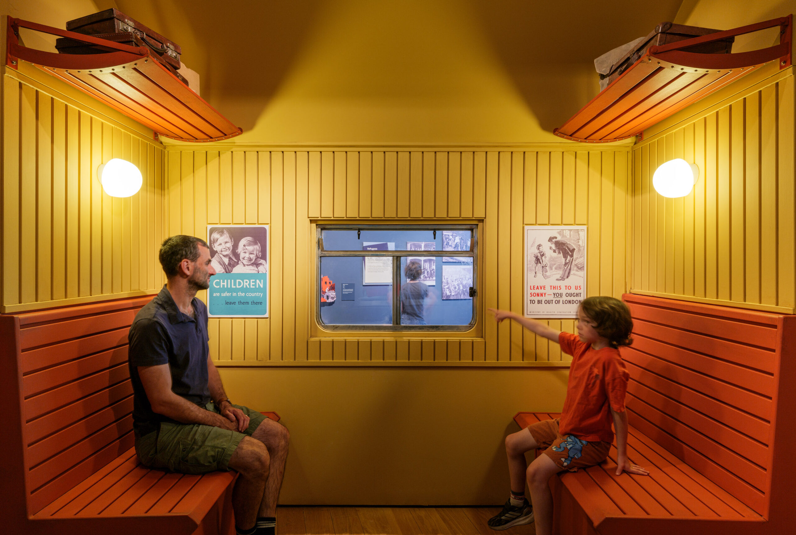
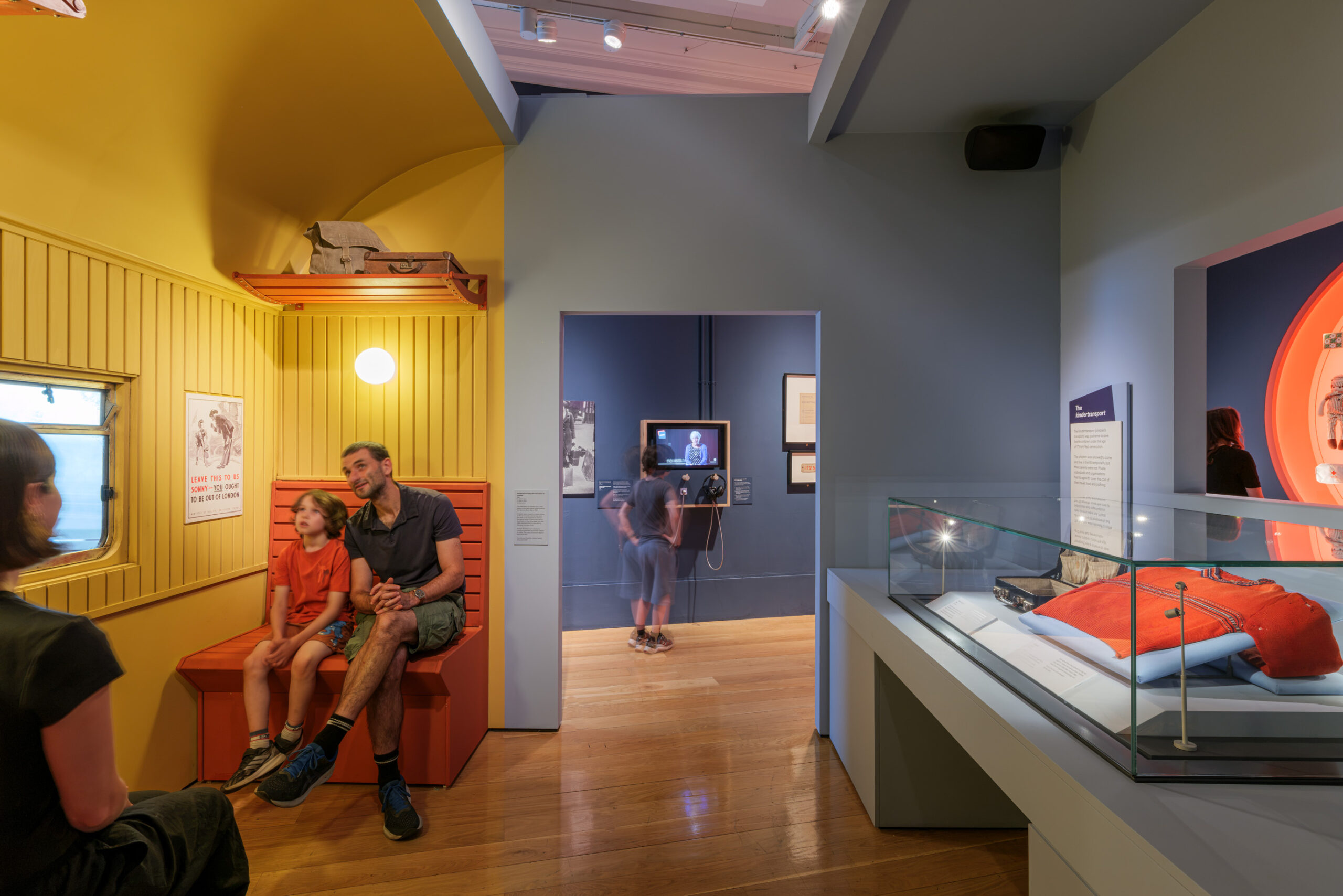
The major object of the room-set is in centre here – an evacuee train carriage to peek into or sit inside. A glowing display asks kids what they would take with them, were they to have to evacuate at speed, whilst graphics on the outside depict children with luggage.
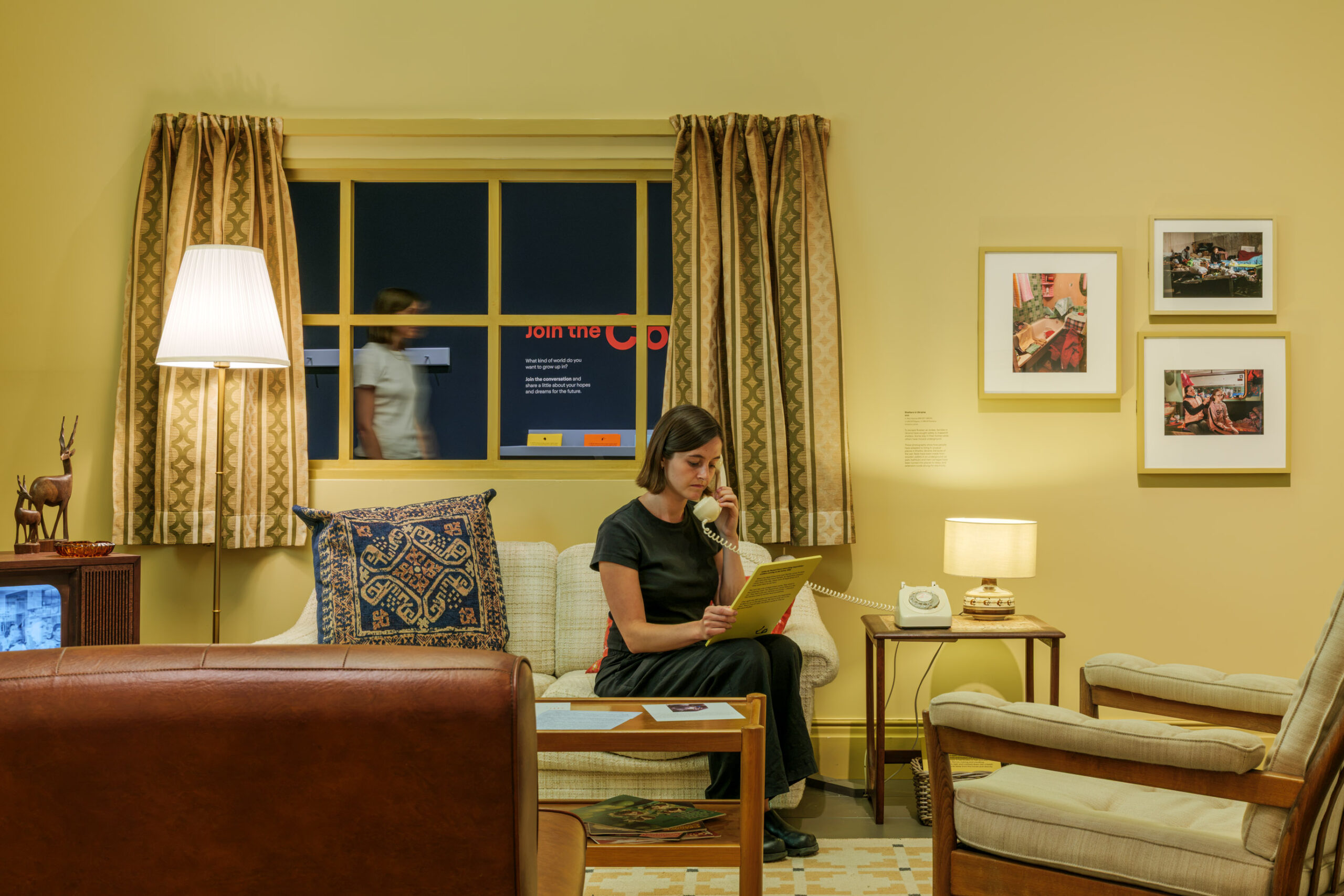
Room Six – Home
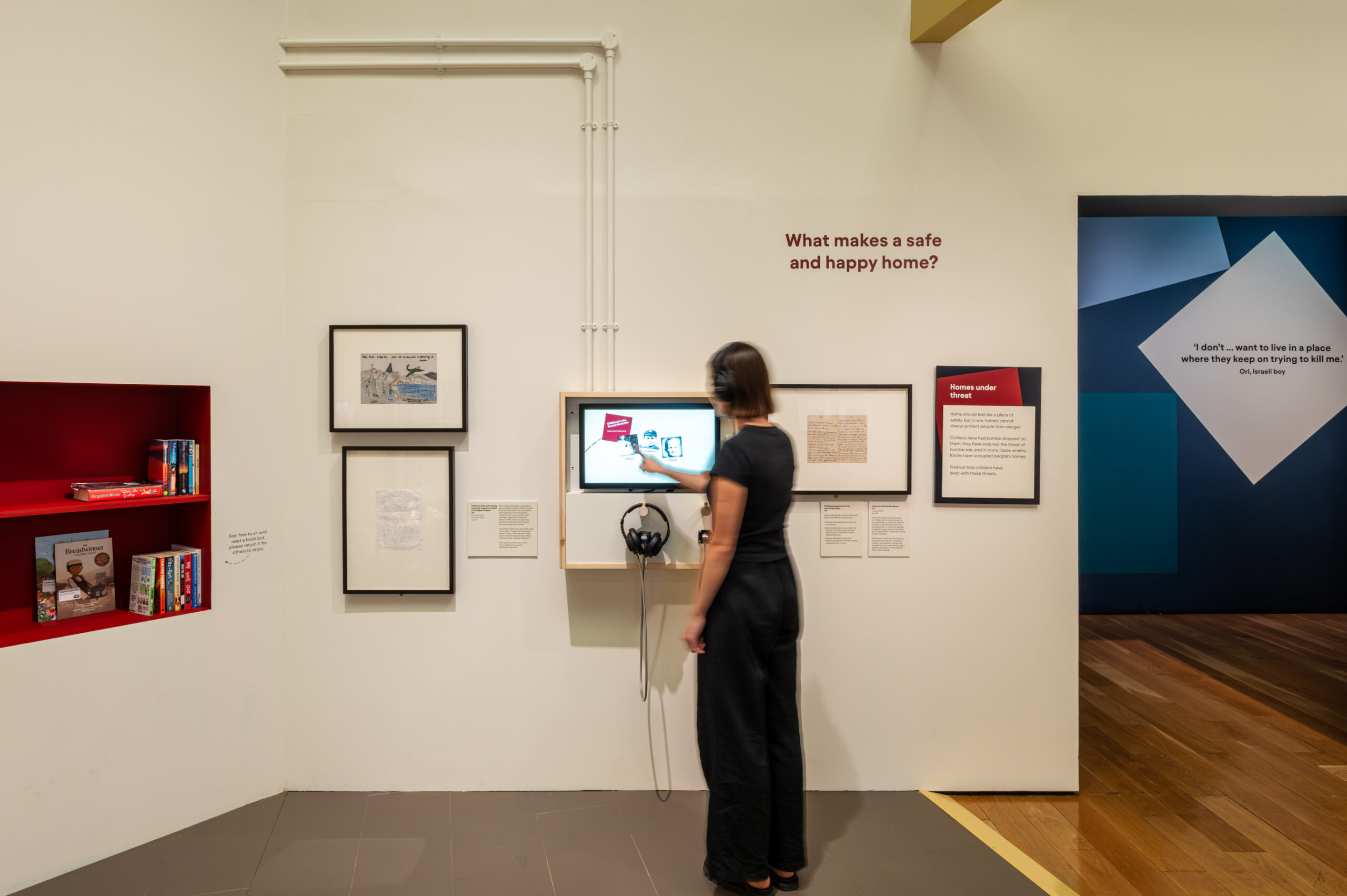
Specific colour tones here were inspired by the 60s/70s and the Cold War era. A degree of abstraction is incorporated via a slightly ghostly and tonal treatment. The room contains lots of props, from living room furniture (sofa and armchairs) to a bookcase, themed on books about war, whilst also forming part of the exhibition’s literary trail.
Room Seven – Education
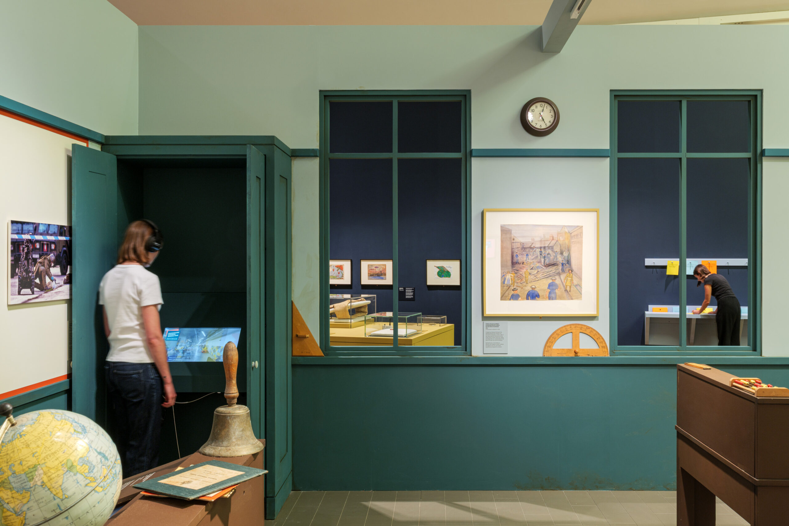
This room-set recreates a World War Two-era classroom, with specially-built furniture ‘aged’ by a specialist scenic painter. The room features several AV interactives and the spoken testimony of both teachers and students who have experienced conflicts situations.
Room Eight – Health
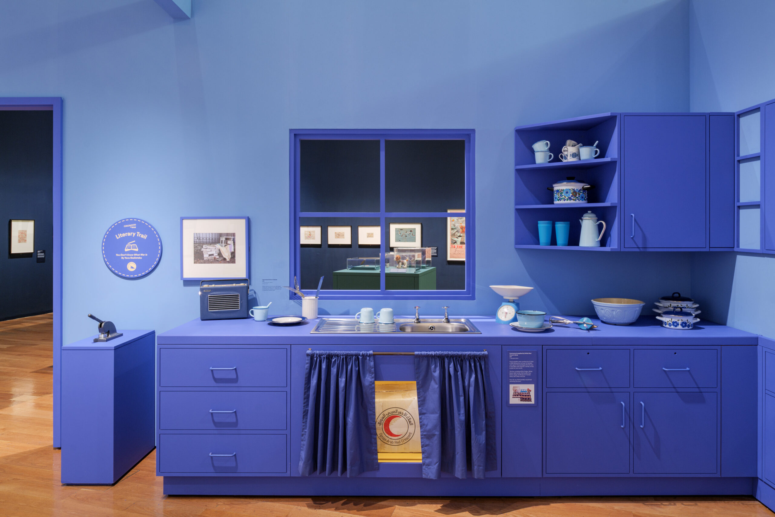
This room-set is in the form of a kitchen with both 3D installations and relief outlines of worktops and kitchen utensils along its walls. Cupboards and drawers can be opened to reveal showcases and interactives.
Room Nine – Freedom of Expression
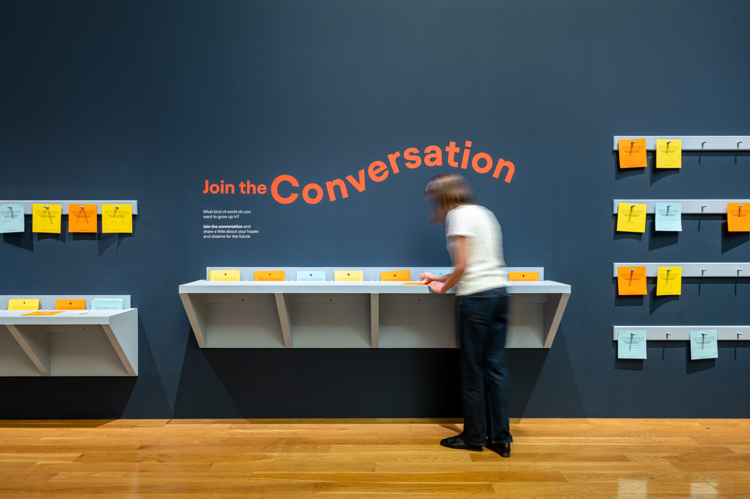
The final ‘outro’ room features beautifully-lit children’s drawings and artworks, with visitors invited to leave their own feedback or drawings using square coloured paper to write or draw on, in response to UNICEF’s ‘Poems for Peace’ project:
‘What are your hopes and dreams for the world you want to live in?’