



How a leopard, a bowler hat, and four forgotten Londoners became the brand identity for The Derby London City.
The Derby London City, a Curio Collection by Hilton hotel on Great Tower Street, brings a new kind of hospitality to London’s Square Mile, rooted not in the area’s modern financial reputation, but in the older traditions of guild craftsmanship and civic duty.
Opened in April 2026, the 234-room property overlooks St Dunstan in the East Church Garden, where centuries of City heritage meet a contemporary hotel identity designed to be discovered in layers. Aylott + Van Tromp (AVT), the international design and branding studio, developed the strategic positioning and complete visual identity system for The Derby, crafting a brand narrative that extends from the stained-glass installation behind the horseshoe bar to the leopard marque hidden on the interior of an in-room teacup. AVT’s role extended beyond visual identity into storytelling and guest experience: the studio’s heritage research created the characters and narratives behind the hotel’s restaurant, bar rituals, and monthly programming, while its creative direction shaped the collateral, wayfinding, and guest room details that carry the brand story from arrival to check-out.
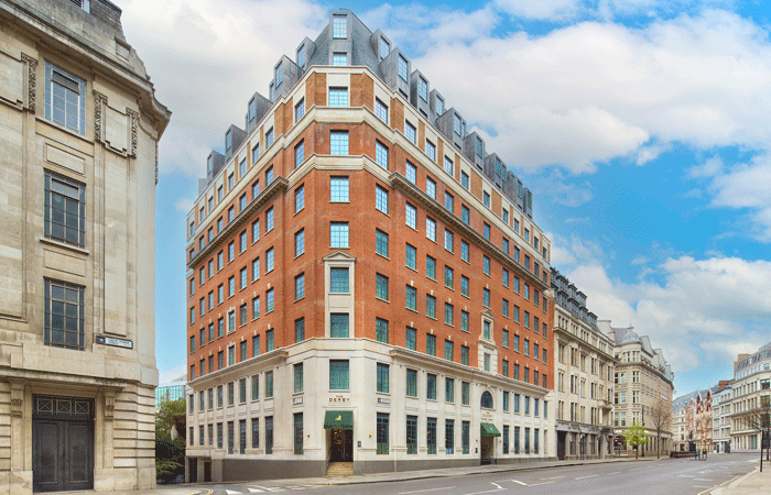
Aylott + Van Tromp reframes the City of London’s financial heritage for a new Curio Collection by Hilton hotel.
The strategic challenge
London’s financial district presented a specific brand positioning problem, since the modern association of banking and finance skews negatively towards greed, excess and exclusion. However, the City’s guilds and livery companies were originally engines of civic good, funding schools, almshouses, and public works, and helping to set standards of quality and craftsmanship that built the commercial reputation that made London a global centre of trade. Banking itself was an act of community stewardship long before it became a byword for excess, so AVT’s answer was to reframe the modern perception by recovering these original values of philanthropy, integrity, craftsmanship and civic duty, and building a contemporary hotel identity around them.
The approach required navigating a competitive landscape that includes The Ned (1920s banking glamour), Vintry & Mercer (merchant heritage), and The Hoxton (lifestyle positioning). Each occupies distinct territory, with AVT positioning The Derby between them — heritage-rich without being retro, lifestyle-driven without being informal — by targeting independent travellers, professionals, and creatives who value authenticity over conventional luxury.
“Once we’d decided to build the brand around the City’s original values rather than its modern reputation, everything opened up,” says Nathan Aylott, co-founder of AVT. “The bowler hat, the guilds, and the leopard’s head hallmark are all symbols with real depth, and gave us an identity system that could carry genuine meaning rather than just looking the part.”
A brand identity built on hidden histories
The hotel’s name is drawn from the bowler hat, known colloquially as a derby, which became the uniform of 19th-century financiers in the City. AVT paired this with a second reference, the leopard’s head, the historic hallmark of the Goldsmiths’ Guild, which has represented quality, artistry, and excellence in London’s trade guilds for centuries. These two elements combine in the hotel’s brand marque, a leopard wearing a bowler hat, and from there, AVT built an identity system designed to thread through every aspect of the guest experience.
AVT’s heritage research identified four historical figures connected to Great Tower Street and the neighbouring church of St Dunstan in the East, each of whom informs a specific brand signature within the hotel. Sir Robert Tate, a wealthy mercer and Lord Mayor who owned property on Great Tower Street, inspired Mercer’s Market, a monthly celebration of local artisans.
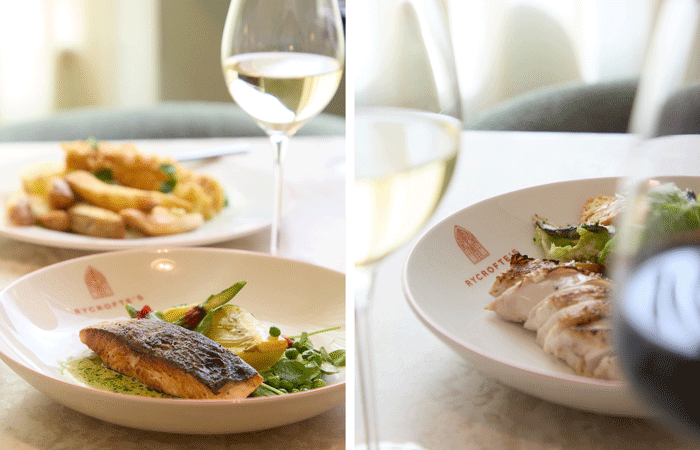
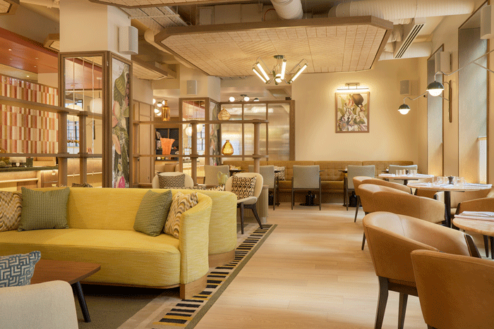
Holbech, who commissioned a stained-glass window for St Dunstan in the East in 1393, is the reference behind the hotel’s coloured glass installations. William Heryot, a draper and Lord Mayor, lends his name to the bespoke bathrobe programme in the suites. The fourth, Sir John Rycrofte, Sergeant of the Larder to Henry VII and Henry VIII, who is believed to be buried in the church garden next door, proved significant enough to warrant a complete separate brand identity. AVT developed Rycrofte’s as a distinct F&B brand for the hotel’s restaurant, coffee house, and bar, with its own marque, colour palette, and dedicated typeface. The result is a sub-brand that sits within The Derby’s visual world but has its own voice, positioned as both a hotel restaurant and a neighbourhood destination overlooking the church garden.
These are not decorative historical footnotes. Each was selected because their values of integrity, craftsmanship, civic responsibility and personal service map directly onto the brand pillars AVT established for the hotel: Legacy Re-imagined, Immersive Heritage, Modern Community, and Thoughtful Stewardship.
The visual identity system
The hotel’s ten-colour palette moves from warm off-whites and sand tones through gold, terracotta, and rich brown to deep forest green, teal, burgundy, and a near-black navy. The palette harmonises with the earthy tones of the interior design, while Rycrofte’s palette of jewel tones and burnished gold is distinct from the hotel’s earthy register but designed to sit within the same visual world. The typography operates on three registers. Sweet Sans Pro Bold carries the logotype and is used sparingly across headers, lending the brand name a confident, graphic presence. Canela, a warm serif, handles hero copy and introductory text as the storytelling voice of the brand. Quarion, a contemporary sans serif, provides a clean, functional layer for body copy. Rycrofte’s has its own dedicated typeface, Sk Payidar, across all F&B applications; a further signal that the sub-brand speaks in its own voice.
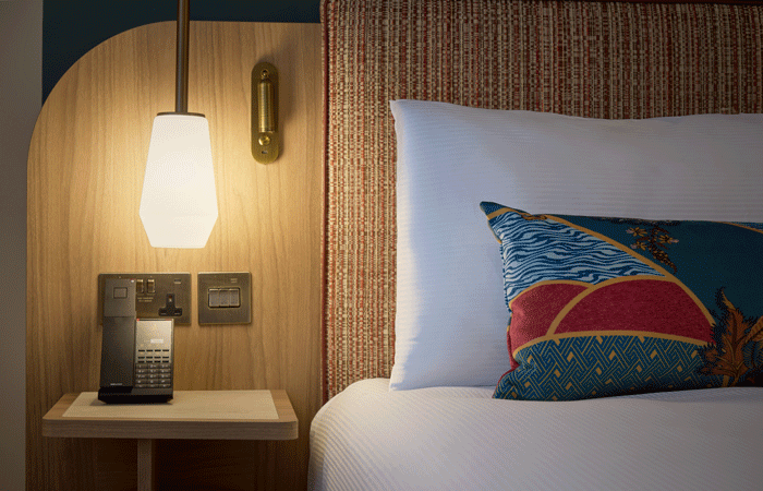
AVT developed a bespoke pattern system drawn from the leopard motif: abstracted paw prints and refined whisker details that appear across textiles, printed materials, and interior accents. Some are prominent; others are deliberately hidden, intended as quiet discoveries for attentive guests. The studio directed a tactile approach to materials, utilising textured leathers, linen-bound menus, gold foil on premium Colorplan stocks, blind embossing, and brass hardware that references the weight and permanence of bank vaults and safety deposit boxes.
The identity extends into three-dimensional wayfinding and signage throughout the hotel. Modular brass plates mounted on timber panelling carry directional information, room numbers, and accessibility signage in the brand’s material language of warm metal, clean typography, and considered placement. Exterior signage carries the master brand (the leopard marque on the hotel canopy and entrance) and the sub-brand (the Rycrofte’s gothic arch on a separate street-facing sign), reinforcing the dual-identity system at the building’s threshold.
Brand strategy in the built environment
What distinguishes AVT’s work on The Derby is how directly the brand strategy has translated into the physical hotel. Several AVT brand concepts are now built, operational elements of the guest experience:
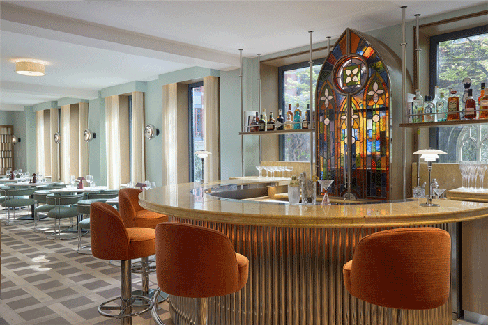
The stained glass bar installation: a bespoke stained-glass piece anchors the horseshoe-shaped bar in Rycrofte’s. The pointed arch form directly mirrors the Rycrofte’s brand marque; the logo has, in effect, become architecture. The installation houses the bar’s spirit collection behind the glass, with a discreet hidden panel.
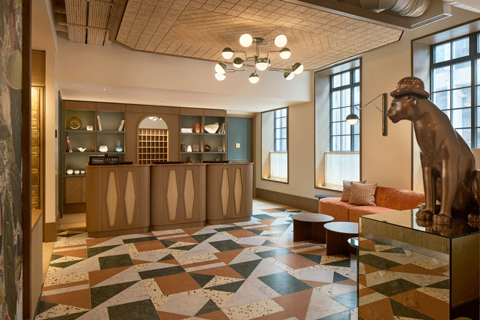
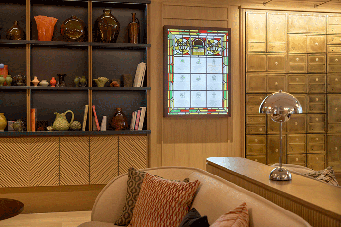
The Treasury Wall: a floor-to-ceiling installation of burnished brass numbered drawers and compartments behind the reception desk, inspired by safety deposit boxes. Conceived by AVT as an arrival ritual, guests are given keys to open boxes containing surprises.
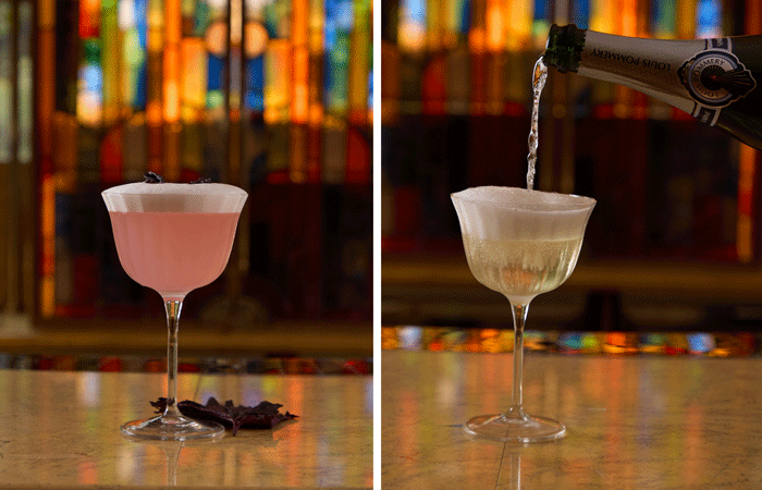
The Golden Hour: a nightly ritual at 5:10pm (the time referencing the hotel’s address at 5–10 Great Tower Street), when the team introduces a cocktail of the day.
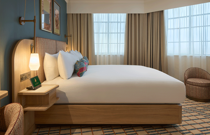
Elsewhere, AVT’s brand narrative has informed a backlit stained-glass heritage panel in the lobby, an afternoon tea ritual developed in partnership with Newby Teas, and Mercer’s Market, a monthly celebration of local artisans.
AVT’s collateral system carries the identity further still. Rycrofte’s menus use a bespoke arched die-cut form, with the gothic arch motif embossed in gold foil on deep forest green stock. Branded tableware carries the Rycrofte’s marque in terracotta against white. Door hangers use the leopard spot pattern as an allover print, and the same pattern crosses into the guest room environment as an allover textile on the Heryot bathrobes and throw cushions, where brand identity and interior soft furnishings merge. The wider collateral suite extends to business cards, key card holders, coasters, takeaway cups and packaging, gift voucher packaging, and staffwear direction.
“We designed the leopard motif to work as a thread through the whole guest experience,” says James Van Tromp, co-founder of AVT. “On the marque it’s prominent, but across the property it appears in different forms: embossed on a keycard, hidden inside an umbrella lining, and printed on the interior of a teacup you’d only notice mid-sip. It’s an identity designed to be discovered, not announced.”