


Style Library Contract: Colour Trend Report SS17
The Power of Colour
At the beginning of this year Style Library Contract shared 4 design trends they see has having the greatest influence in hospitality design during 2017: INDIVIDUALITY, BOUTIQUE CHIC, NATURAL SPIRIT and ARTISTRY.
This Trends Update examines the power colour holds in interior design. Three colour groups are explored alongside Pantone’s Greenery.
1. ZEN – confident, composed and enriched palette of sophisticated neutrals in matt and metallics effects.
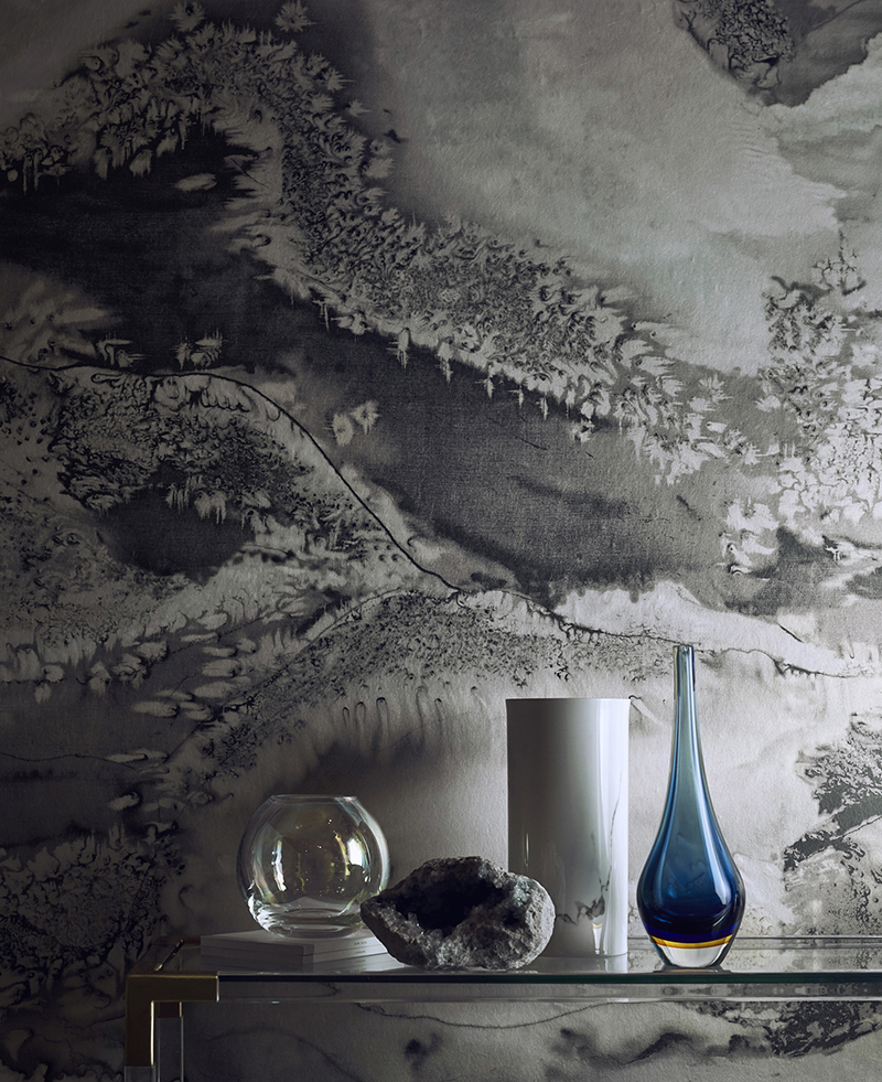 Zoffany is unique, captivating and effortlessly sophisticated. Intricate designs are presented in carefully balanced colour palettes from Zoffany’s Alchemy of Colour, ensuring artistic integrity is retained even in demanding contract specification fabrics and wallcoverings. For more information see our video we created with Zoffany Designer, Peter Gomez here
Pure Morris is a collection of iconic designs in a pared back, neutral palette, whilst maintaining the intricacies and integrity of the originals. In hues to appeal to free-spirits, truth seekers and quiet contemplators, this collection of fabrics and wallcoverings are perfect for a boutique hotel or contemporary heritage inspired interior.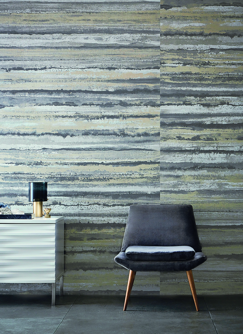 Moody metropolitan tones in subtle textures and combinations of matt and shine capture the essence of Anthology, a new generation of contract specification fabrics and wallcoverings. Sophisticated complexity that interior designers and hotel groups worldwide can easily access.
2. NOMAD – an exploration of our world, celebrating its bright hues and natural shades.
The word Harlequin means ‘varied in colour or decoration’, which sums the in-house studio’s eclectic design ethos perfectly.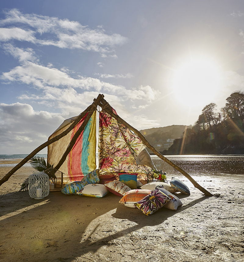 Driven by their love of colour, collections are inspired from around the world. A riot of pattern, colour and printing techniques create the gloriously vibrant Jardin Bohème collection. The intensity of colour found in nature is evident in Fauvisimo’s powerful colour palette which ranges from cobalt blues and deep magentas to moody greys, ontrend mustards, highlights of muted greens, blush pinks and honey shades.
The latest Harlequin collection, by Clarissa Hulse partners colour and pattern in joyful abundance. Lilaea’s colour combinations include on-trend forest and emerald, denim and indigo, fire and watermelon, cadmium and ochre, ocean and teal, silver and frost, sepia, citrus and ocean, accented with fabulous pops of neon.
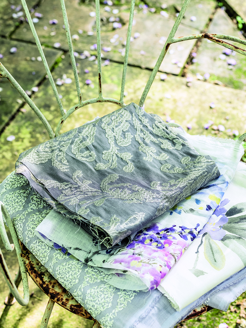
3. BLISS – joyful, charming, and endearing, these fun-loving sherbets and soft pastels are designed to delight.
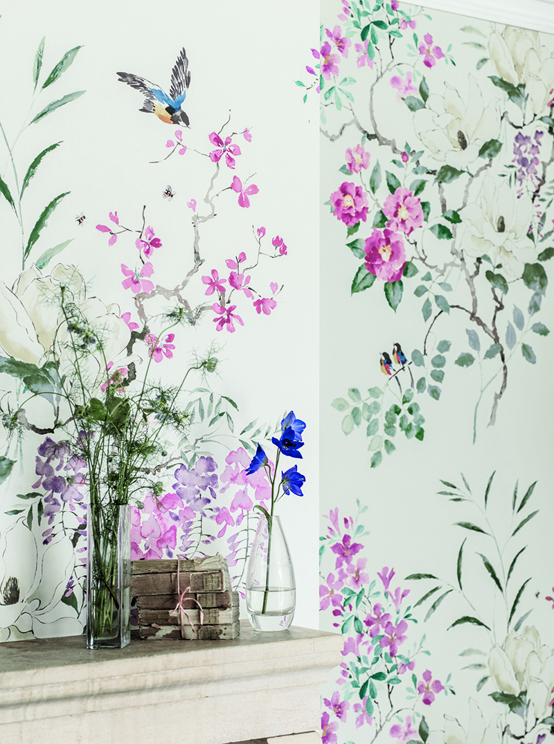 Sanderson’s classic palette of pinks, fresh greens, teals and lilacs lie at the heart of Waterperry, an impressionistic style of effortless fl oral designs. The coral colour palette mingles with silvers and greys. Lilacs, indigos, creams and mints sit well in this blissful collection. Designed with easy elegance to provide a calming and serene interior backdrop.
Harlequin’s Poetica is an enchanting homage to the natural beauty and intrinsic charm of England’s spectacular countryside and delightful cottage gardens. Drawn with a refreshing lightness of hand and tinted in watery hues, it creates a shabby-chic contemporary look for a romantic escape.
4. GREENERY – nature’s neutral, Pantone’s Greenery is a versatile “trans-seasonal” shade that lends itself to many colour combinations.
Style Library Contract is the commercial home of leading British interior brands, Harlequin, Anthology, Zoffany, Morris & Co., Sanderson and Scion. Providing a one-stop resource for interior designers, architects and specifiers around the world.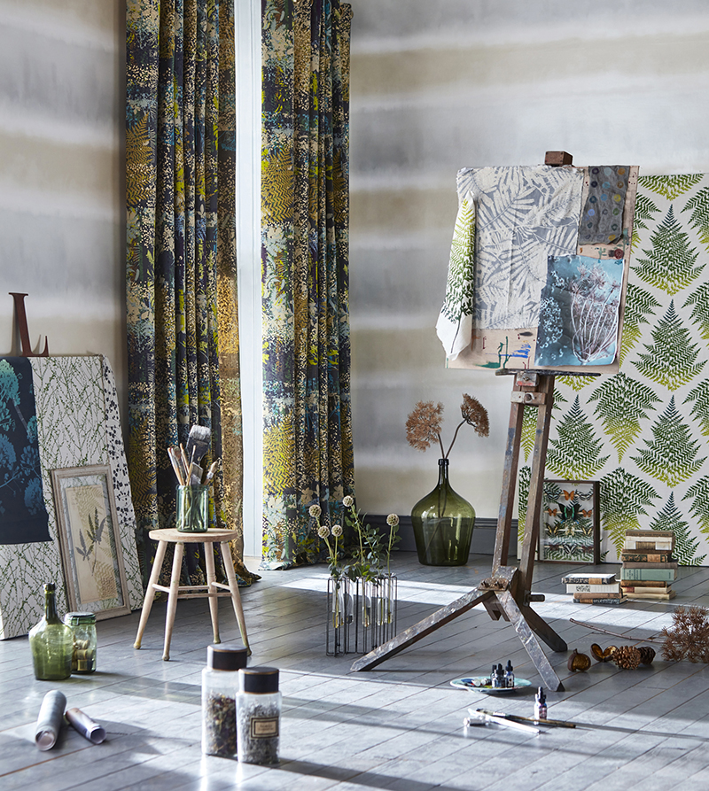 Each brand has its own in-house design studio resulting the most diverse, design-led product portfolio for contract interiors. Here’s what the studios had to say about Greenery:
Hannah Bowen, Head Designer for Scion explains,
‘Pairing green with icy, or inky blue will add warmth and depth to a scheme, when designing our SS17 ‘Noukku’ collection this was a palette we explored a lot. It’s not always about patterned designs, semi plains are really important for creating a cohesive look.’
As part of their Alchemy of Colour research, the Zoffany studio identified their own unique colour palette, which includes a dazzling malachite green. During this process Peter Gomez, Head of Design for the Zoffany Studio, experimented with a number of green shades and advises,
‘Be bold and use this colour in its purest form in a plain fabric, a great way to introduce a contemporary look is to champion green in a lustre effect against natural linens. Green really sits well off shades of sunstone and russets.’
Louise Draper, Lead Designer for Anthology believes in the finer detail,
‘Little touches are often what elevate a scheme, try mixing green with gold and bronze metallics to warm this hue. Add an extra dimension by injecting a strong colour alongside to add unique personality. If you’re thinking of using this colour for upholstery, ribbed velvets with a juxtaposing colour, for example yellow, will add a very smart and stylish look that’s ideal for any contemporary space or interior’.
To see more from Style Library Contract visit www.stylelibrarycontract.com